 Again a wonderfull asset for our bookshelf, “packed” with inspiration: THE ART OF PACKAGE DESIGN. A recent assembly of international designers is creating highly outstanding and savvy designs to complement the nature and function of a product. Editor Wendy Xu included the Atelier LaDurance Japanese Denim packaging in the publication that is about innovative packaging designs that functions beyond ‘simply product wrappers’. A creative treasure published by Gingko Press: www.gingkopress.com


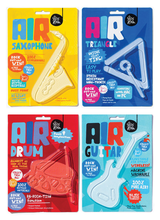 A fine example of what pakaging can do besides just containing and/or selling a product, given by Designworks Melbourne. These air-instruments are part of a ‘Play Air Campagne’, a campaign which helped raise money for an organisation called The Song Room. The Song Room is a charitable organisation who help ensure that underprivileged schools can allow their students to partake in creativity. Deservedly nominated for a Cannes Lions award for Promo & Activation.

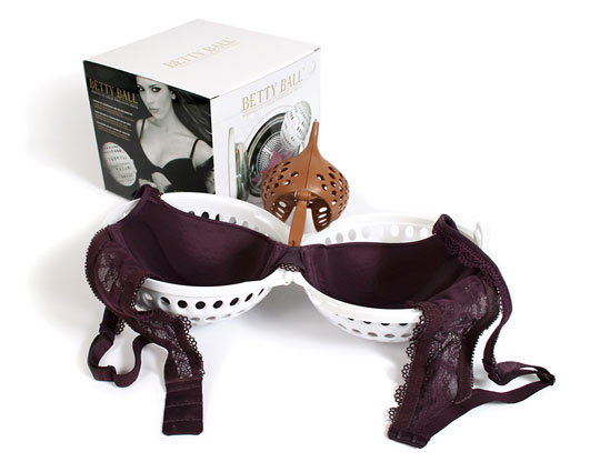
Why pay a lot of money for your beautiful bra and then have it ruined in your washing machine? The Betty Ball is the solution for keeping your padded or normal bras in perfect shape. Stepfive redesigned a golden/black packaging design with much attention to product experience and a luxury feeling. The Betty Ball was succesfully launched all over Europe.

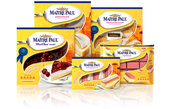 Preliminary to the rebranding of Carnaby into Maître Paul Professional, the whole range of Maître Paul’s pie boxes itself were renewed too. For the Dutch, French, English and German consumer market a new bright and yellow packaging design with a friendly festive and yet high-quality look was developed by Stepfive. The new boxes also have a renewed locking system and smaller windows to prevent them from freezing. This succesfull new packaging line includes seventeen flavors in various formats.

 Linera meat-products by Zwanenberg Food Group is a brand that stands for health, taste and honesty. For last years Linera rebranding, Stepfive created a complete new range of packaging design with emphasis on all their light products and a clear recognition and block formation in the storeshelf. This rebranding was successfully introduced at the Dutch consumers market.

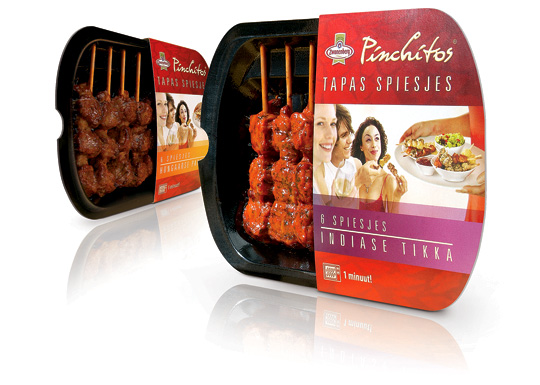 Health and convenience also becomes more and more important within the Dutch food industry. That’s why Zwanenberg Food Group choose for ‘the other way to snack’ with Pinchitos Tapas Spears: no chips, but a healthy and light meat snack, that only takes one minute in the microwave to prepare. Together with Boom Packaging, Stepfive created a fresh and open packaging design along with the Pinchitos brand identity for this healthy snack in five different flavors.

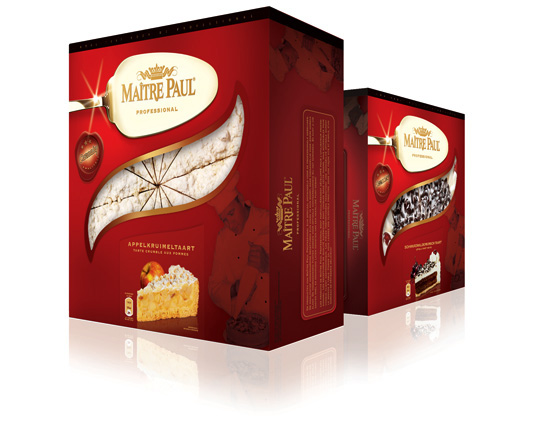 One of Maître Pauls successful private labels, Carnaby, is rebranded into Maître Paul Professional in the past few months. The Maître Paul Professional brand is aimed at the foodservice and cash & carry market. Their high-quality pies are unique in their kind, but accessible to all foodservice customers. The new packaging design made by Stepfive, reflects the high-quality and craftsmanship of the Dutch Maître Paul bakers and is developed in a range for 16 different products with 16 different labels.

 crEAte is the-must-have book for every designer connected to the world of food and beverage. Six chapters:’Food Activista’, ‘Wholehearted’, Smart Food’, ‘Packaging’, ‘Food Spaces’ and ‘Typologies’ deal with different aspects of design within gastronomy. An inspiring book published by Gestalten, Berlin 2008

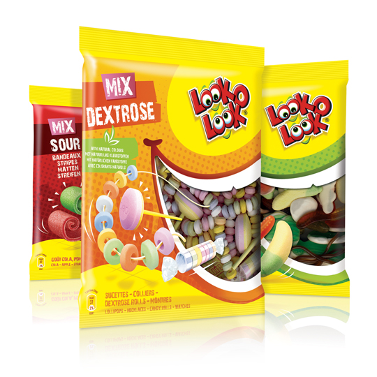 After a successful redesign of Look-O-Look’s Toppermix, the redesign and packaging for the familybags of Look-O-Look is done by Stepfive Communication & Design too.
The Dutch candy producer with ”The most delicious candies in one bag” wanted a fun and diverting familybag, appealing for all family members, young and old. Each different bag has its own colour coding, but all bags have the same window (a laughing mouth shape) and illustrated candies, drawn in comic style.

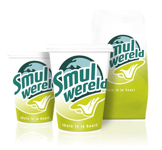 FFC (Franchise Friendly Concepts) is the largest independent Dutch food franchise organization with several success formulas. One of them: Smulwereld. The new logo created for their rebranding is modern with a healthy look and symbolizes the propositions. Along with this rebranding a complete range of disposables was designed. This rebranding was implemented in all 100 Smulwereld companies in The Netherlands, together with signings and interior adjustments.


