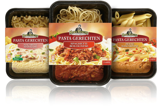
 For the Italian feel products of Aldi Netherlands the brand ‘Mama Mancini’ was created. Now Stepfive extended this range of products for Aldi with ready-to-eat pasta meals.
The carton sleeves have a new design and a tasteful visual of the traditional Italian food that�s inside the packaging.


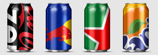
 Wondering how far you can push your packaging design to the limit? Designer Ewan Yap presents his ”Big Brand Theory” on Behance with some major and iconic brands (think Heineken, Coca-Cola, Pepsi, Red Bull etc.). His beautiful work is an experiment in brand aesthetics, and also informs us on the cropability of� logos in terms of image cropability.
Check out the cropability of a brand (or the guts to leave things out).

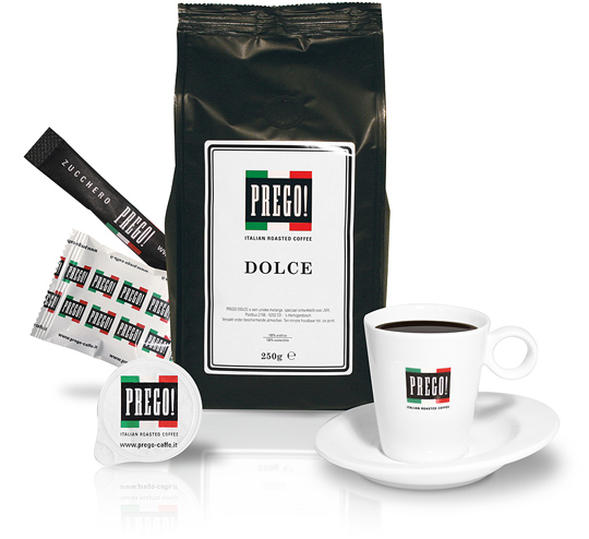
 JVH (a Dutch gaming & entertainment group) asked Stepfive to create a unique branding, identity and packaging design for their own roasted coffee that will be served in all of their casino’s in The Netherlands. This resulted in a manifest typographical logo with a strong Italian atmosphere.
The new logo is applied on milk cups, sugar bags, the coffee packaging of course and on a set of dishes. Two flavours are made this far: Dolce and Forte.


