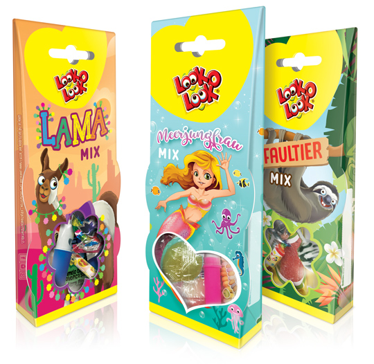
 For Look-O-Look we have, in addition to the successful Unicorn theme packaging, developed three new cheerful candy mix packaging designs for the German market. This packaging design is once again richly illustrated in three different trendy themes; a Lama Mix, a Mermaid Mix and a Sloth Mix. These candy boxes are superb for gifting and sharing as well. The window at the bottom of the packaging that can both hang and stand gives a good view on the mix of candies inside the package.
==
Voor Look-O-Look hebben wij in navolging van het succesvolle Eenhoorn themadoosje, drie nieuwe vrolijke snoepmix verpakkingen ontwikkeld voor de Duitse markt. Dit packaging design is opnieuw rijk geïllustreerd in drie verschillende trendy thema’s; een Lama Mix, een Zeemeermin Mix en een Luiaard Mix. De speelse verpakkingen zijn ideaal voor gifting en ook om samen te delen. De verpakkingen die zowel kunnen hangen als staan, geven door middel van de vensters onderin goed zicht op de mix van snoep binnenin de verpakking.


 With the brand ‘Pure Pracht’ Stepfive conceptualized a broad range of products for a big Dutch company in retail and foodservice. This brand emphasizes on the importance of a personal touch, that’s why the farmers, bakers and butchers are on the packaging itself. With their appearance they guarantee the quality of the products and the ingredients.

 Retailers and brands use packaging design of their products far too little as a marketing tool. ”The story of retail is a game of seduction in shelves. Consumers make their choice, brands and retailers are there to respond more” says Birgit Kamp of Tetra Pak Benelux.
Read more here (in Dutch).

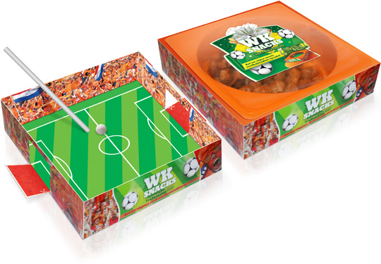 The countdown to the FIFA 2014 World Cup in Brazil has started, so merchandising and marketing campaigns are running overtime already. Zwanenberg Food Group asked Stepfive to create an original packaging design for their ‘soccer snacks’ in The Netherlands and to support the Dutch soccer team in Brazil. And so we did. The result: a carton stadium which can be used as a blow soccer board game! First take out the plate with the delicious snacks of course. Then cut out the goals with scissors. When this is done, the stadium is almost ready to use. Just take two straws, a little ball and let the games begin!

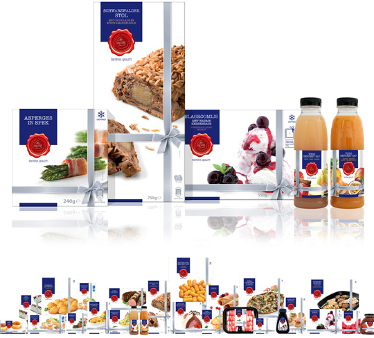 Earlier this year Aldi Netherlands asked Stepfive Communicatie & Design BNO to restyle their famous Prestige product line. This rebranding included a new logo, positioning and a complete new look for all the existing Prestige packaging design such as foils, carton boxes, tins, sleeves, pet bottles, labels etcetera. Next to it Stepfive also created a fitting shelf ready packaging (SRP) for all these Prestige products.
The result of (a very small part of) all this work is visable right here above, but within the next few weeks we’ll take a closer look at the new Prestige packaging design. So stay tuned!

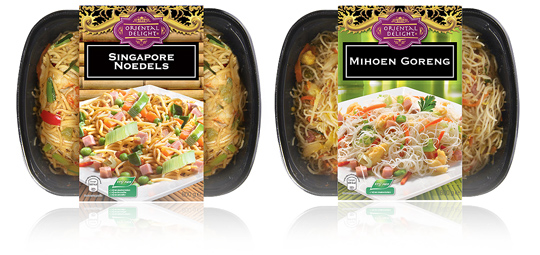 A new branding and an optimized design on the sleeves of Aldi’s packaging design for their Oriental Delight ready to eat meals. The sleeves contain a tasteful product visual underneath the striking new branding and have all the legal information on its bottom. To be sold in Aldi Netherlands.

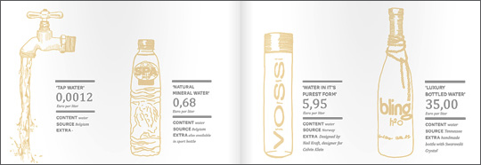 An inspiring and interesting brand new book by Dutch publisher BIS Publishers out this month about ‘the essence of retail branding and design’.
”Retail mirrors society and as society is constantly changing, retail has to be able to anticipate these changes in order to maintain its right of existence. In short; act, react or suffer! This book covers all the facets of retail branding, holistic formula development and the essential one-to-one relationship with your customers.” -> Buy at BIS Publishers or view large and read at ISSUU

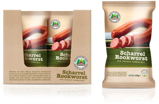 Following to the design of the frankfurters (see below), Stepfive also created the packaging design and the shelf ready packaging for Aldi’s free range smoked sausages. Packaging and carton tray of these sausages have the same ecological look & feel as the frankfurters to make it into a coherent range of products.

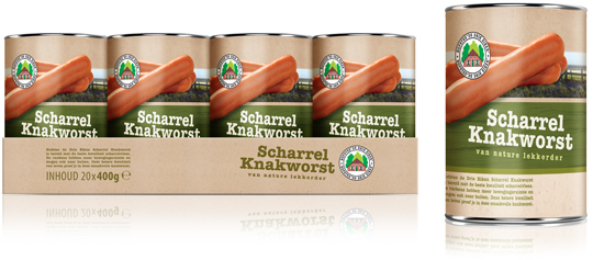 Stepfive created a new packaging design for the free range frankfurters (scharrel knakworst in Dutch) for Aldi. The new labels for these frankfurter cans and the carton tray are made with an identical and ecological look & feel to create a uniform and striking image for this shelf ready packaging (SRP) a.k.a. retail ready packaging (RRP).

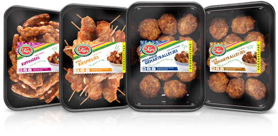 Chickenfingers, mini chicken skewers, Dutch meatballs and meatballs satéh. Four new products by Kips (a brand of Zwanenberg Food Group) of which Stepfive created packaging labels for. The labels have unique colours for each product and are placed right in the middle so there’s still a good spot on the delicious snacks.


