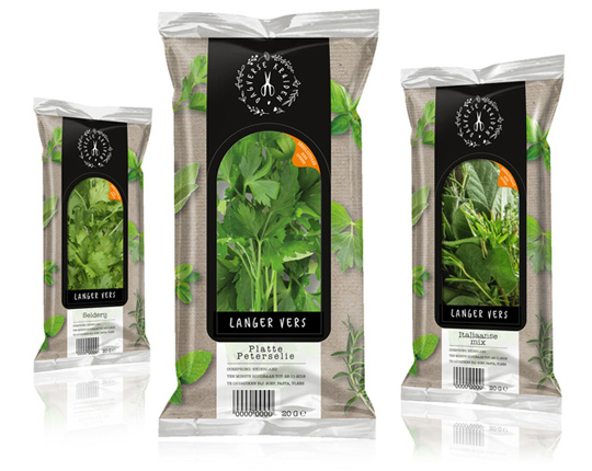
 Daily fresh, healthy and easy to use are the herbs in this new Aldi NL packaging. The foil is printed with a kraft paper look on which various herbs are visualized. The packaging is in fact printed with the name of the herb or herbs that are packaged in it. The large viewing window and the imprinted product name immediately show clearly which product is involved. The window itself is also the resealable opening of the foil, made extra striking by a contrasting orange color.
The branding of the Dagverse Kruiden logo was first developed and then implemented in the packaging design. The logo is always placed on stylish and black in a white color.
==
Dagvers, gezond en makkelijk in gebruik zijn de kruiden in deze nieuwe Aldi NL verpakking. De folie is bedrukt met een kraftpapier look waarop diverse kruiden zijn gevisualiseerd. De verpakking wordt namelijk ingeprint met de naam van het kruid of de kruiden die er in verpakt zitten. Het grote zichtvenster en de ingeprinte productnaam laten in één oogopslag meteen duidelijk zien om welk product het gaat. Het zichtvenster zelf is meteen ook de hersluitbare opening van de folie, extra opvallend gemaakt door een contrasterende oranje kleur. Gemak dient de mens immers en zo blijven de kruiden lekker vers.
De branding van het Dagverse Kruiden logo is eerst ontwikkeld en daarna geïmplementeerd in het packaging design. Het logo wordt altijd op stijlvol en ambachtelijk zwart geplaatst in een witte kleur.


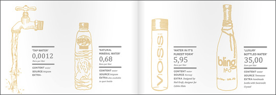
 An inspiring and interesting brand new book by Dutch publisher BIS Publishers out this month about ‘the essence of retail branding and design’.
”Retail mirrors society and as society is constantly changing, retail has to be able to anticipate these changes in order to maintain its right of existence. In short; act, react or suffer! This book covers all the facets of retail branding, holistic formula development and the essential one-to-one relationship with your customers.” -> Buy at BIS Publishers or view large and read at ISSUU

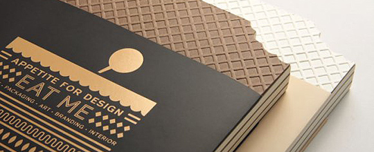
 Eating a pure experience of smell and taste? No longer. Nowadays it’s rather an effective agency to communicate and engage, an indication of cultural values, lifestyle, ispirations and imagination.
This showcase is complemented by fascinating insights in their forewords and case studies given by experts, entrepreneurs and practitioners, each distinct with regards to their experience in product, packaging, image-making, branding and interior design.


