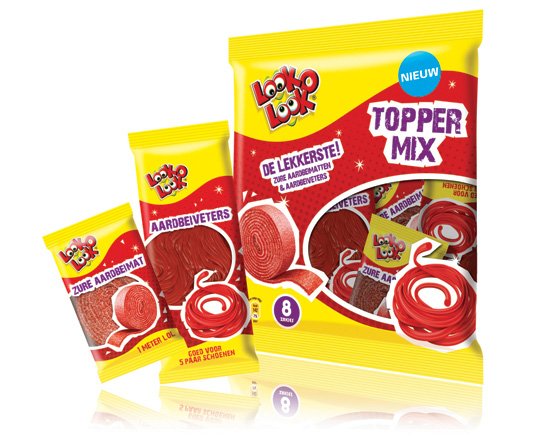
 ”The most delicious candies in one bag”. A new design in a tough and streetwise style that also fits to the regular Look-O-Look brand identity. The products: sour strawberry stripes and laces. This packaging design with a clear product communication is appealing for kids and tweens as it shows quite clearly ‘what’s in it for them’. Literally that is.

January 26th, 2011 | 03:27 pm

January 26th, 2011 | 11:57 am
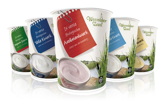
 Delicious and fresh curds on your shopping list every day! A packaging design that makes the difference and takes care of a distinct shop shelf impact with a bright and natural appearance.
The visual at the package shows us the origin of the milk used for the curds: National Park ‘De Weerribben’ in The Netherlands with its characteristic feather reed grass. The coloured shopping list is a powerful way to give all five sort of curds its own unique look.


