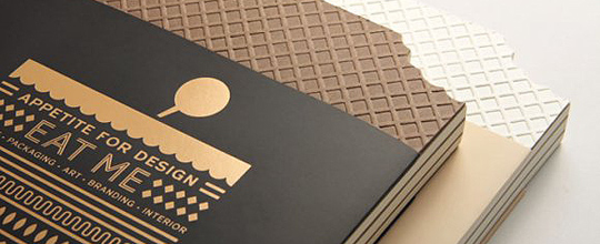
 Eating a pure experience of smell and taste? No longer. Nowadays it’s rather an effective agency to communicate and engage, an indication of cultural values, lifestyle, ispirations and imagination.
This showcase is complemented by fascinating insights in their forewords and case studies given by experts, entrepreneurs and practitioners, each distinct with regards to their experience in product, packaging, image-making, branding and interior design.


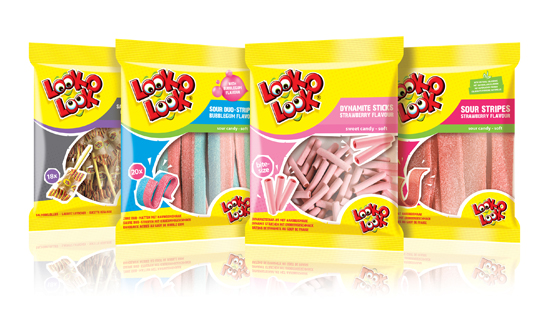
 After a successful redesign of Look-O-Look�s Flowpacks and Toppermix, the redesign and packaging for the international familybags of Look-O-Look is done by Stepfive Communication & Design too.
The Dutch candy producer with �The most delicious candies in one bag� wanted a fun and diverting familybag, appealing for all family members, young and old. Each different bag has its own colour coding, illustrated candies on the front (drawn in realistic style) and a large window for optimal visibility of the delicious candies.

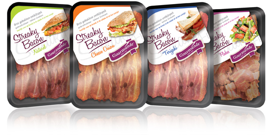
 Gourmande is the consumers brand of ‘henri van de bilt vleeswaren’, who produces deli meats from single meat cuts and convenience products. Stepfive rebranded the Gourmande logo and also created four remarkable packaging labels for their range of Streaky Bacon products. These labels come with much attention for branding and meanwhile have a spot on the visibility of the products. Each label has it’s own fresh colour setting for each different taste variety.


