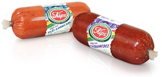
 For the Dutch company Kips (part of Zwanenberg Food Group), we designed a series of contemporary labels/banderols with optimum product visibility that convey top quality. Each label comes in a different colour setting for each different taste variety.


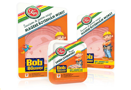
 The packaging design for the international figure Bob the BuilderTM baloney and liver pat� was created by Stepfive, commissioned by Zwanenberg Food Group. This delicious sandwich filling for children appeals not only to the youngest ones. Due to it�s strong presence, it also looks very desireable on the shelf. Bob the BuilderTM makes lunch and breakfast even more fun!

 For Look-O-Look, Stepfive developed a new and contemporary line of packages (for 29 different candies) which will replace the current ‘kopkaartjes’ (transparent candy bags). These new flowpacks are designed in a handy size and are easy to open, which creates optimal ease in use. The new flowpacks have a fun, fresh and strong packaging design which corresponds perfectly with the target group. The flowpack design also contains a clear product-communication and an optimal visibility for a maximal impulse, which really distinguishes this packaging in stores from it’s competitors.

In a world of tremendous fast growing digitalization, packaging design can’t stay far behind. Want to ‘feel’ a package and see it’s benefits without having the actual package in hands? Apps and other digital media provides us, in combination with regular printed media, an innovative and even better way of advertising.
Stepfive Communication & Design designed and developed a mobile and desktop website for Dutch candy producer Look-O-Look, to be reached by a QR-code at advertisements. Consumers and sales managers can digitally feel and navigate around the new package design at this site. In combination with printed and social media it gives Look-O-Look a wide spread and an effective campaign to show their brand and products.


