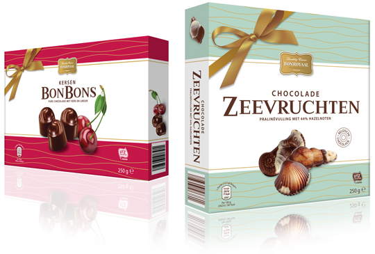
 The Cherry Bonbons and Chocolate Sea Shells Praline packaging design from Aldi NL have been redesigned. For the private label Bonroyaal a modern look has been created while preserving classical elements such as the golden bow. The new Bonroyaal line always has an appealing basic color, which in combination with white and golden line artwork looks festive. It therefore makes this packaging also extremely suitable as a gift.
==
De Kersenbonbons en Zeevruchten van Aldi NL zijn in het nieuw gestoken. Voor het private label Bonroyaal is een moderne uitstraling gecreëerd met behoud van klassieke elementen zoals de gouden strik. De nieuwe Bonroyaal lijn heeft altijd een aansprekende basiskleur, die in combinatie met wit en het gouden lijnenwerk feestelijk oogt. Het maakt deze verpakking dan ook uitermate geschikt om cadeau te geven.


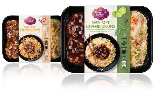 After the restyling of the Oriental Delight logo last year, the sleeves for the various 1-person oriental meals from Aldi NL were also redesigned. New, tasteful product photography from above has been made and placed prominently on the sleeves. The product name is communicated above the plate in clear colors and modern, sans serif typography. Icons have been developed for the spiciness, preparation time and for the number of people. The individual ingredients from the product are also photographed from above and positioned together with the other graphic elements on a bamboo mat that partly colors in the color coding of the product concerned.
==
Na de restyling van het Oriental Delight logo vorig jaar, zijn ook de sleeves voor de verschillende 1-persoons Oosterse maaltijden van Aldi NL aan bod gekomen. Er is nieuwe, smaakvolle productfotografie van bovenaf gepleegd die prominent op de sleeves is geplaatst. Je kijkt daardoor op het bord. In heldere kleuren en moderne, schreefloze typografie wordt daarboven de productnaam gecommuniceerd. Er zijn iconen ontwikkeld voor de pittigheid, bereidingstijd en voor het aantal personen. De losse ingrediënten uit het product die ook van bovenaf zijn gefotografeerd, staan samen met de andere grafische elementen gepositioneerd op een bamboe matje dat deels meekleurt in de kleurcodering van het betreffende product.

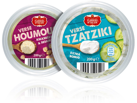 Stepfive was asked by Aldi Netherlands to redesign their private label Flavours of the Sun. A few years ago Stepfive already developed the name, branding and packaging design and now it was about time for something new. The packaging design is enriched with intense and bright colors that refer to the countries of the South. The wooden texture in the background and the tasteful photography of ingredients makes this restyle complete.
==
Aldi Nederland heeft Stepfive gevraagd een redesign aan het private label Flavours of the Sun te geven. Nadat Stepfive voor dit merk enkele jaren geleden al de naamstelling, branding en het packaging design had ontwikkeld, was het merk toe aan een opfrisbeurt. Het verpakkingsdesign is verrijkt met intense en heldere kleuren die refereren aan de zuidelijke landen. De houtstructuur op de achtergrond en de smaakvolle fotografie van ingrediënten maken deze restyle helemaal af.

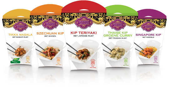 New ready-to-eat meals for Aldi’s Oriental Delight in a fresh and contemporary new packaging design. Each different take away meal has its own colour signing at the upper side of the box and a tasteful food visual on the front. The Oriental Delight brand was designed and conceptualized by Stepfive in an earlier stadium for several other products (see here) for Aldi Netherlands.

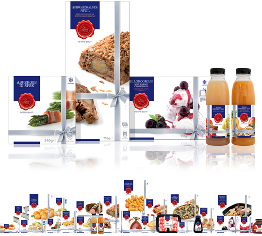 Earlier this year Aldi Netherlands asked Stepfive Communicatie & Design BNO to restyle their famous Prestige product line. This rebranding included a new logo, positioning and a complete new look for all the existing Prestige packaging design such as foils, carton boxes, tins, sleeves, pet bottles, labels etcetera. Next to it Stepfive also created a fitting shelf ready packaging (SRP) for all these Prestige products.
The result of (a very small part of) all this work is visable right here above, but within the next few weeks we’ll take a closer look at the new Prestige packaging design. So stay tuned!

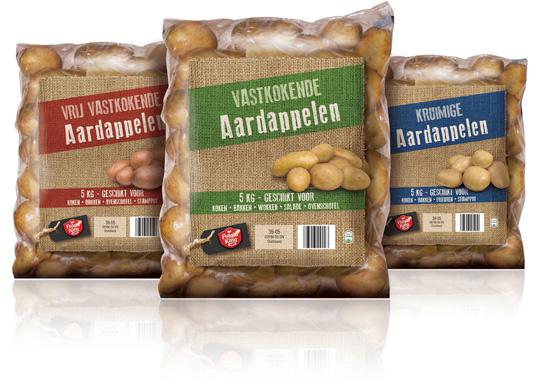 The look of several different products from Potato King, an already existing Aldi brand, is completely renewed by Stepfive for Aldi Netherlands. Above you can see some of the potato breeds that are now packed in a foil with jute suggestion on it and a tasteful product visual. Every single breed has its own colour signing to finish this authentic packaging design with a natural feel.

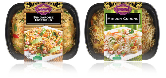 A new branding and an optimized design on the sleeves of Aldi’s packaging design for their Oriental Delight ready to eat meals. The sleeves contain a tasteful product visual underneath the striking new branding and have all the legal information on its bottom. To be sold in Aldi Netherlands.

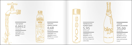 An inspiring and interesting brand new book by Dutch publisher BIS Publishers out this month about ‘the essence of retail branding and design’.
”Retail mirrors society and as society is constantly changing, retail has to be able to anticipate these changes in order to maintain its right of existence. In short; act, react or suffer! This book covers all the facets of retail branding, holistic formula development and the essential one-to-one relationship with your customers.” -> Buy at BIS Publishers or view large and read at ISSUU

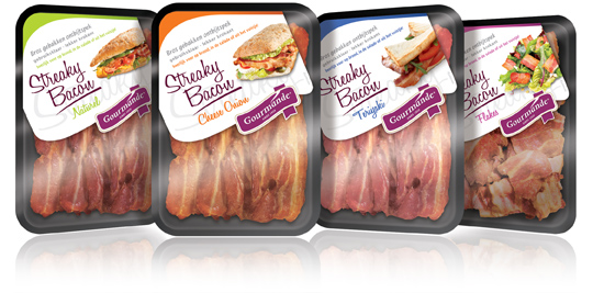 Gourmande is the consumers brand of ‘henri van de bilt vleeswaren’, who produces deli meats from single meat cuts and convenience products. Stepfive rebranded the Gourmande logo and also created four remarkable packaging labels for their range of Streaky Bacon products. These labels come with much attention for branding and meanwhile have a spot on the visibility of the products. Each label has it’s own fresh colour setting for each different taste variety.

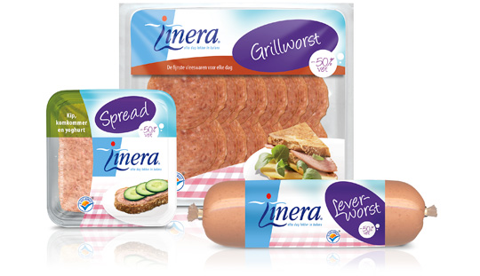 Linera is long known for it’s diet-related products. But The Times They Are A-Changin’ and so does our perception of healthy living, which is more based on a healthy diet as being a lifestyle then occasionally being on a strict diet. So Linera asked Stepfive to redesign the packaging design of their current line of products in order to fit this modern take on healthy living. Therefore, Linera set some basic rules: the Linera branding must not be altered. Nor should the focus on the target group, which consists mainly of female consumers. Furthermore, the design must be colourful and have an active feel to it.
We think we managed to do just that. We’ve gained Linera’s presence by adding a big purple oval in which the product-type is communicated. The result is this highly recognisable line of modern Linera-products that can stand the times for at least a number of years.


