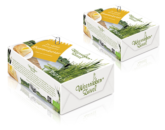
 In addition to this restyling, a new organic butter packaging design was created for Dutch company Weerribben Zuivel. Fresh and natural visuals on the packaging are showing us the origin of this organic butter: National Park �De Weerribben� in The Netherlands. These visuals and the coloured shopping list on top derives from the complete restyling by Stepfive of all the other Weerribben products and herewith makes it into a coherent and appetizing product range.


 A while ago, MOTI (Museum Of The Image, Breda) held an exhibit about packaging. This led to an interesting question: why is there currently a substantial shortage of packaging designers in the Netherlands? The answer can be found somewhere between �current art education is mainly focussed on the encouragement on autonomy instead of serving commercial goals�, and � as a logical result of this: �designers consider themselves belonging to a cultural avantgarde�.
In other words: packaging belongs to low-culture. Low culture = not sexy. Meanwhile, packaging specialized agencies (like ours) keep getting busier. So it�s high time to turn some persistent assumptions around by pointing out precisely how �sexy� the trade of packaging really is. After all, it evokes graphic design, (strongly based on psychology), marketing, brand-development, environmental matters, innovation and (brand)activation.
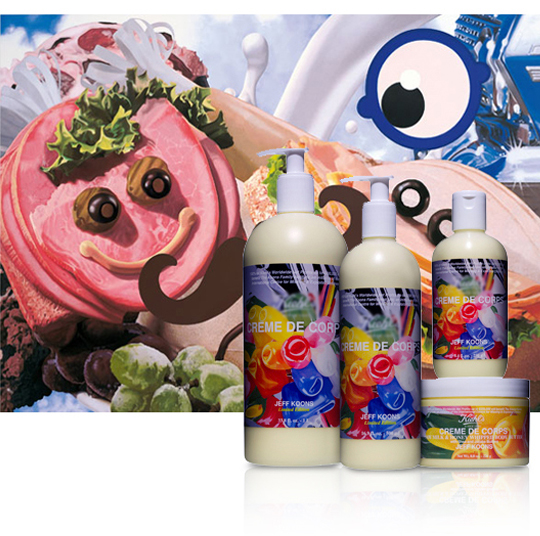
So, art schools: here�s a start for an interesting discussion on what Dutch Design really can be all about. And who will be the first to flick the switch and jump into the trade that�s as design-extensive as it is a guarantee on an interesting job? In the meanwhile you can enjoy some work made by �commercial explorer� Jeff Koons (shown above) and his design for body milk, by which he turned his art into �the daily�, instead of �the daily� into art. Oh, and the first run of packaging-trained students can send their portfolio to us � but that goes without saying.


