September 26th, 2017 | 04:10 pm
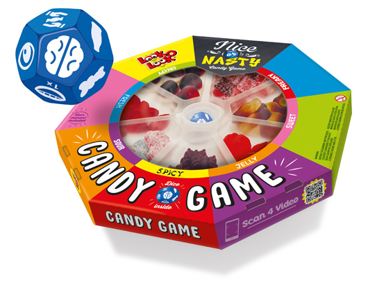
 Board games are fun and that’s why Look-O-Look created a board game that brings people back together to play a game: Nice Or Nasty, The Candy Game. Roll the dice and find out who has the best poker face while daring to eat a sweet, fresh, sour or perhaps spicy candy.
In collaboration with Look-O-Look we developed an attractive packaging design for this new concept with the look of a real board game. Wondering how Nice Or Nasty is played? Click here for the video.
Nice Or Nasty. Do you take the challenge?!
==
Bordspellen zijn leuk en van alle tijden en daarom heeft Look-O-Look met Nice Or Nasty, The Candy Game een bordspel gerealiseerd dat je weer �cht samen om de tafel brengt. Speel het spel met vrienden en familie. De speciaal voor dit spel ontwikkelde dobbelsteen laat je ontdekken wie er met de beste pokerface een zoet, fris, zuur of misschien juist wel pittig snoepje durft te eten.
Met het door ons in samenwerking met Look-O-Look ontwikkelde aantrekkelijke packaging design heeft dit nieuwe concept de uitstraling van een echt bordspel meegekregen. Ook benieuwd hoe Nice Or Nasty gespeeld wordt? Klik hier voor de video.
Nice Or Nasty, durf jij het aan?!
TAGS: candy, Dutch, Look-O-Look, Netherlands, nice or nasty, packaging design, Stepfive
POSTED IN food | no comments »

September 08th, 2017 | 11:26 am
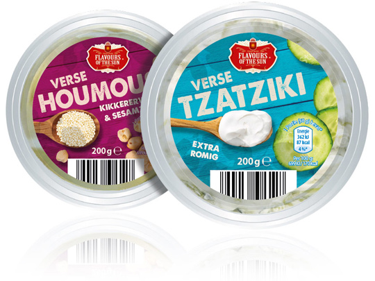
 Stepfive was asked by Aldi Netherlands to redesign their private label Flavours of the Sun. A few years ago Stepfive already developed the name, branding and packaging design and now it was about time for something new. The packaging design is enriched with intense and bright colors that refer to the countries of the South. The wooden texture in the background and the tasteful photography of ingredients makes this restyle complete.
==
Aldi Nederland heeft Stepfive gevraagd een redesign aan het private label Flavours of the Sun te geven. Nadat Stepfive voor dit merk enkele jaren geleden al de naamstelling, branding en het packaging design had ontwikkeld, was het merk toe aan een opfrisbeurt. Het verpakkingsdesign is verrijkt met intense en heldere kleuren die refereren aan de zuidelijke landen. De houtstructuur op de achtergrond en de smaakvolle fotografie van ingredi�nten maken deze restyle helemaal af.
TAGS: Aldi, Dutch, Flavours of the Sun, Netherlands, packaging design, rebranding, redesign, Stepfive
POSTED IN food | no comments »
 Board games are fun and that’s why Look-O-Look created a board game that brings people back together to play a game: Nice Or Nasty, The Candy Game. Roll the dice and find out who has the best poker face while daring to eat a sweet, fresh, sour or perhaps spicy candy.
 Stepfive was asked by Aldi Netherlands to redesign their private label Flavours of the Sun. A few years ago Stepfive already developed the name, branding and packaging design and now it was about time for something new. The packaging design is enriched with intense and bright colors that refer to the countries of the South. The wooden texture in the background and the tasteful photography of ingredients makes this restyle complete.


