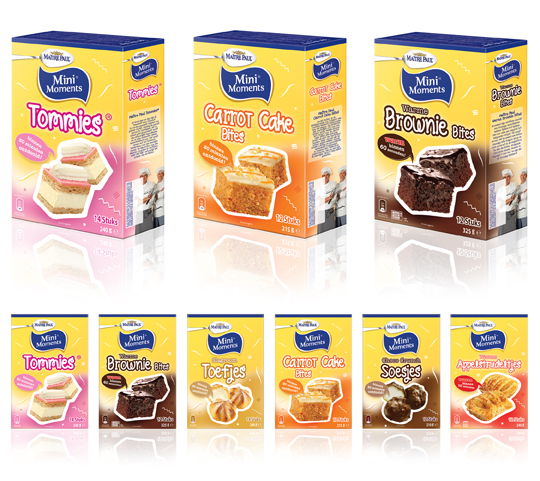
 Stepfive created new packaging design for Ma�tre Paul�s MiniMoments range, a range of small pastries that are the perfect treat for ‘those special little moments’. The MiniMoments are nice to give and fun to get! The goal was to create a visually appealing and recognizable range.


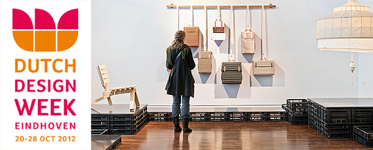
 This years Dutch Design Week will take place from the 20th until the 28th of October. This eleventh edition offers a unique glimpse into the future of design thanks to the endless creativity of hundreds of renowned designers and young talents from The Netherlands.
Over 1,500 designers display their work ranging from graphic design, industrial design, packaging design, spatial design, textiles, fashion, architecture, sustainable responsible business design and design management & trends. There are 85 different locations housing more than 300 events. Besides exhibitions, there are numerous lectures, workshops, fashion shows and seminars.
This year 200,000 visitors are expected to visit the Dutch Design Week.
Dutch Designweek 2012, Eindhoven – The Netherlands

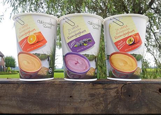
 In addition to this restyling, a new organic cream yoghurt (with fruits) packaging design was created for Dutch company Weerribben Zuivel. Fresh and natural visuals on the packaging are showing us the origin of this organic cream yoghurt: National Park �De Weerribben� in The Netherlands. These visuals and the coloured shopping list on top derives from the complete restyling by Stepfive of all the other Weerribben products and herewith makes it into a coherent and appetizing product range. Also to distinguish the cream yoghurts from the other yoghurts, we’ve added visuals of the fruits used in the yoghurt.

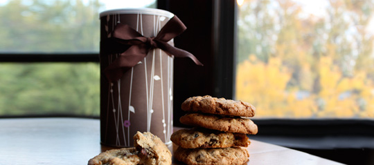
 Ever thought about just how persuasive packaging can be? Supermarkets use carefully designed packaging to influence customers’ perceptions of their products. But does it work? It was tested with chocolate chip cookies on two groups of people, one group tasted and rated the cookies without seeing any of the packaging, while the other group did the same thing while the packets were shown beforehand. Read about the results here.
Packaging is one way of making a product get your attention. But there’s more. Every element of the in-store environment is carefully deliberated over; from the general layout to the position of products on the shelf and even the smell and sound.
Read more about psychological tactic in stores here.


