February 26th, 2018 | 04:51 pm
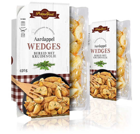 For the brand PolderGoud of potato producer Schaap Holland we’ve developed the sleeves of the potato wedges. It resulted in clear sleeves with a leading role for the potato wedges itself. They are located in a stylish black scale, photographed from above, which is on a whitewash wooden floor. The typography in the color of the tablecloth under the scale gives the whole a familiar and authentic feeling.
==
Voor het merk PolderGoud van aardappelproducent Schaap Holland hebben wij de sleeves van de aardappel wedges mogen ontwikkelen. Het heeft geresulteerd in heldere sleeves met een hoofdrol voor de aardappel wedges zelf. Ze liggen in een stijlvol zwarte schaal, van bovenaf gefotografeerd, die op een whitewash houten vloer is gepositioneerd. De typografie in de kleur van het kleedje onder de schaal geeft het geheel een vertrouwd en ambachtelijk gevoel.
TAGS: Dutch, Netherlands, packaging design, Poldergoud, Schaap Holland, sleeve, Stepfive
POSTED IN food | no comments »

February 09th, 2018 | 03:37 pm
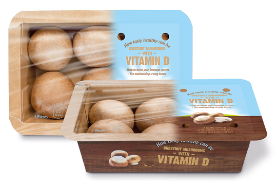 Banken Champignons serves with the vitamin D mushrooms the still growing demand for healthy and natural food. The innovative (chestnut) mushrooms are available in England, Germany and The Netherlands since last year. We were asked to develop the branding and packaging design. This resulted in a tray of kraft paper carton with an organic touch, due to the wood structure printing on it. The topseal communicates clearly the benefits of this unique product with a bright visual of air, sun and grass which emphasizes the healthyness of the product once again.
==
Banken Champignons speelt met haar vitamine D champignons in op de nog altijd groeiende vraag naar gezonde en natuurlijke voeding. De innovatieve (kastanje)champignons zijn sinds vorig jaar op de Nederlandse, Duitse en Engelse markt verkrijgbaar en wij mochten voor de branding en het design zorgen. Het heeft geresulteerd in een bakje van kraftkarton met een hoog biologische feel door de bedrukking van houtstructuur. De topseal communiceert nogmaals helder en duidelijk de benefits van het unieke product in een visual van lucht, zon en gras wat het gezonde van het product nog eens nadrukkelijk onderstreept.
TAGS: Banken Champignons, brand identity, Dutch, packaging design, Stepfive, Vitamin D
POSTED IN food | no comments »

February 02nd, 2018 | 04:30 pm
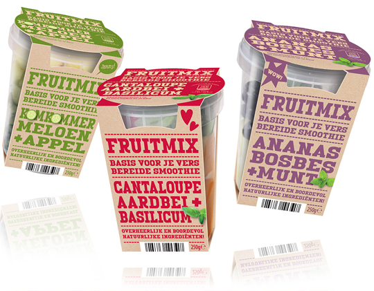 The fresher, the better and that certainly goes for the new fruit mix for smoothies of Aldi Netherlands. The sleeves that we developed surprise with their modern, firm typography that is set in a single signal color for each smoothie variety and put on a kraft paper surface. Because the design of this packaging design basically consists of typography, it strongly communicates the benefits of the product and stands out on shelf.
==
Hoe verser, hoe beter en dat geldt zeker ook voor de nieuwe Fruitmix voor smoothies van Aldi Nederland. De sleeves die wij daarvoor ontwikkeld hebben verrassen door hun modern, robuuste typografie die voor elke smoothie soort slechts in ��n enkele signaalkleur is gezet op een kraftpapieren ondergrond. Doordat het design van dit verpakkingsontwerp vrijwel alleen uit typografie bestaat, communiceert het sterk de benefits van het product en valt het goed op in het schap.
POSTED IN food | no comments »
 For the brand PolderGoud of potato producer Schaap Holland we’ve developed the sleeves of the potato wedges. It resulted in clear sleeves with a leading role for the potato wedges itself. They are located in a stylish black scale, photographed from above, which is on a whitewash wooden floor. The typography in the color of the tablecloth under the scale gives the whole a familiar and authentic feeling.
 Banken Champignons serves with the vitamin D mushrooms the still growing demand for healthy and natural food. The innovative (chestnut) mushrooms are available in England, Germany and The Netherlands since last year. We were asked to develop the branding and packaging design. This resulted in a tray of kraft paper carton with an organic touch, due to the wood structure printing on it. The topseal communicates clearly the benefits of this unique product with a bright visual of air, sun and grass which emphasizes the healthyness of the product once again.
 The fresher, the better and that certainly goes for the new fruit mix for smoothies of Aldi Netherlands. The sleeves that we developed surprise with their modern, firm typography that is set in a single signal color for each smoothie variety and put on a kraft paper surface. Because the design of this packaging design basically consists of typography, it strongly communicates the benefits of the product and stands out on shelf.


