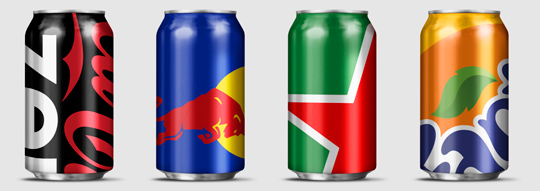
 Wondering how far you can push your packaging design to the limit? Designer Ewan Yap presents his ”Big Brand Theory” on Behance with some major and iconic brands (think Heineken, Coca-Cola, Pepsi, Red Bull etc.). His beautiful work is an experiment in brand aesthetics, and also informs us on the cropability of logos in terms of image cropability.
Check out the cropability of a brand (or the guts to leave things out).


 Until recently, direct bottle printing was really only an option for glass bottles. But that’s changing. Today, there are a number of options for direct printing bottles, both glass and plastic. Yet another step forward in sustainable packaging design techniques.
Read more on the next wave of bottle and container decorating here.

With a superb show, Heineken showed their latest invention at this year’s Milan Design Week: an interactive bottle to re-invent your night out!
Cool.

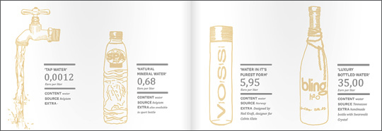 An inspiring and interesting brand new book by Dutch publisher BIS Publishers out this month about ‘the essence of retail branding and design’.
”Retail mirrors society and as society is constantly changing, retail has to be able to anticipate these changes in order to maintain its right of existence. In short; act, react or suffer! This book covers all the facets of retail branding, holistic formula development and the essential one-to-one relationship with your customers.” -> Buy at BIS Publishers or view large and read at ISSUU

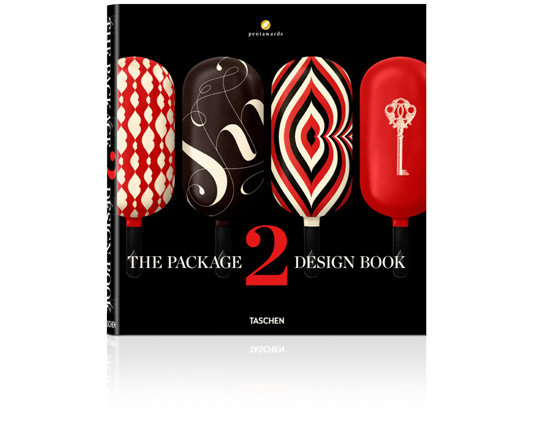 An international roundup of contemporary packaging design by Taschen: On sale soon!
Packaging is a highly underrated art form. As the first thing a consumer sees when looking at a product, the packaging can make or break a sale. Every year, the Pentawards celebrate the art of the package by presenting awards to designs from around the world. Featuring a selection of over 400 works from 30 countries, this book brings together all the Pentawards winners from 2011 and 2012. This well of inspiration is not just aimed at design and marketing professionals but anyone with an interest in the creative process of packaging.
The editor: Pentawards is the first and only worldwide competition dedicated to packaging design in all its forms, open to anyone associated with its creation and/or marketing. Aside from prize-giving, Pentawards’ mission is the worldwide promotion of packaging design among companies, media, economic and political authorities, and the general public. Further information: www.pentawards.org

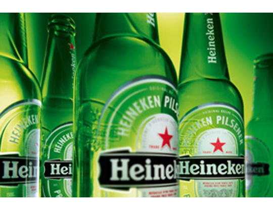 The characteristic brown beer bottle will turn just as green as the bottles that Heineken sells worldwide. The Brown bottle is a relic of Dutch appointments made decades ago to redeem deposit-bottles. Brown glass is recycled by most Dutch brewers, so it doesn’t matter which Brewer is taking in a bottle. Green glass is much less established. First, the green bottle was intended as an export bottle, but over the years it has become the color of the Heineken brand. The exchange operation began twenty years ago. In 1992 the Red cap disappeared, six years afterwards the yellow crates turned green and since 2000 all Lightboxes are green as well.

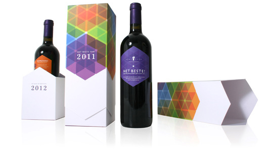 It’s that time of the year again. And as we’re used to, we like to thank our clients and other relations with a special gift for the successful cooperation this past year.
This years theme is ‘All the Best!’ (‘Het Beste’ in Dutch). Not only because the wine, a Domiziano Negroamaro del Salento, is best judged by a professional specialist journal, but also because we launched our renewed website this week. You can find all the best of our latest and past projects with our clients over there.
Stepfive Communication & Design wishes you All The Best for 2012!

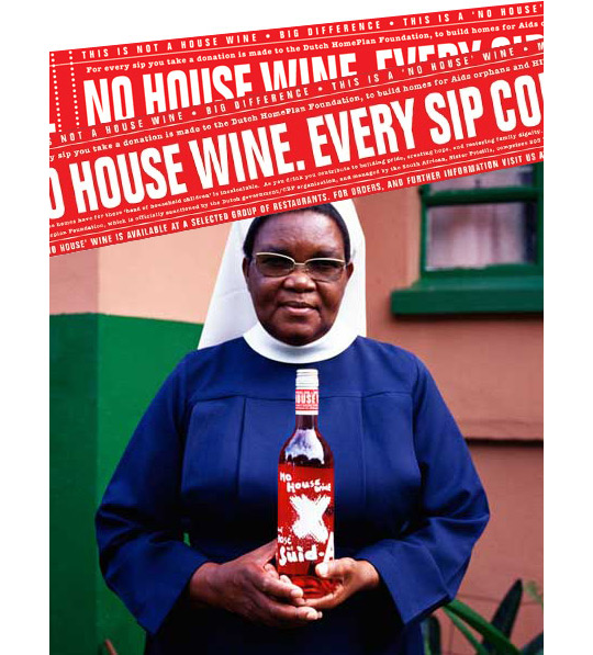 Excellent Packaging design and social responsibility can go hand in hand. A good exemple is ‘No House Wine’, a new wine-label that uses it’s profits to build houses for so called kid-parents (older brothers and sisters who take care of their younger ones) of HIV-contaminated families. It prevents kids from getting homeless after their parents died of AIDS.
The international awarded design (New York Festivals (silver), Art Directors Club Nederland (zilveren lamp), Epica (silver) was designed by Edwin Vollebergh. It delicately cites the subject (houses and moving): an apparently handwritten signing on the front and a label made of packaging-tape on the back.
More on ‘No House’ Wine here.

