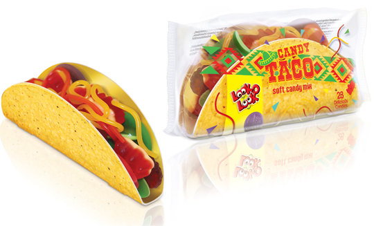
 The Candy Taco is a nice and cheerful product with a great recognisability that you can easily share with others, but is also very nice to give. The transparent foil decorated with a Mexican touch provides the right taco feel, along with the matching typography and sombrero. Due to the transparency there is an excellent view of the sweets in the taco. The cardboard taco shell itself is printed on the outside with a realistic print, making the overall packaging design of this Look-O-Look product even more appetizing.
==
De Candy Taco is een lekker vrolijk product met een grote herkenbaarheid dat je makkelijk kunt delen met anderen, maar ook heel leuk is om te geven. De met een Mexicaanse touch gedecoreerde transparante folie zorgt voor het juiste taco gevoel, samen met de bijpassende typografie en sombrero. Door de transparantie is er uitstekend zicht op de snoepjes in de taco. De kartonnen tacoschelp zelf is aan de buitenzijde met een realistische print bedrukt, waardoor het totale packaging design van dit Look-O-Look product nog eens extra appetijtelijk oogt.


Last year there were still a few design agencies and food photographers present. Unfortunately, this 4th edition of the Packaging Innovations Event in Zaandam has become more and more a representation of the printing industry. Of course it’s always nice to meet colleagues in the profession to speak with, but you can barely still call it ‘the most innovative and inspirational packaging event’. Next year, a new opportunity?
See more at: www.easyfairs.com

 On November 26th & 27th Packaging Innovations will bring together the best professionals of branded packaging and retail design. Specialists show designs, product presentations, new materials and solutions for packaging problems.
See more at: www.easyfairs.com

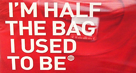 At Dutch website Groene Offerte you’ll find loads of interesting packaging design related articles, opinions and other stuff (all in Dutch). Especially the serie ‘Food for Thought’ gives entertaining and remarkable examples of packaging design in all its aspects, good or bad.
Groene Offerte is established for the complete design industry. The site is set up to grow: more and more contacts, knowledge and new insights. In this way Groene Offerte wants to help and encourage the design industry with their key role of this industry in the sustainable development of society and economy.
Food for Thought at Groene Offerte (all in Dutch).

With a superb show, Heineken showed their latest invention at this year’s Milan Design Week: an interactive bottle to re-invent your night out!
Cool.

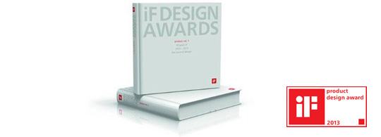 The iF product design award was introduced in 1954. Each year the iF award attracts more than 2000 entries from 37 countries, which are then judged by experts in the respective fields. This Product and Material yearbook features the best in international product design, focusing on newly developed materials and the innovative use of existing materials.

 A niche topic, a clear defined target group, a sharp program content, up to 80 stand units, a low entry fee et voilá, the ingredients that’ll make ‘Foodpacking Event 2013’ into a special event. The exhibition will take place on October 9 and 10 (Wednesday and Thursday) and will be held in ‘High Five’ in the ‘Jaarbeurscomplex’ in Utrecht, The Netherlands.
This event has been given the subtitle: High knowledge event on packaging in the food industry.
Read more here (Dutch).

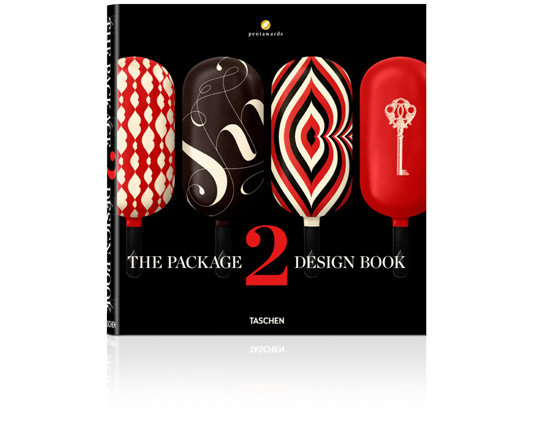 An international roundup of contemporary packaging design by Taschen: On sale soon!
Packaging is a highly underrated art form. As the first thing a consumer sees when looking at a product, the packaging can make or break a sale. Every year, the Pentawards celebrate the art of the package by presenting awards to designs from around the world. Featuring a selection of over 400 works from 30 countries, this book brings together all the Pentawards winners from 2011 and 2012. This well of inspiration is not just aimed at design and marketing professionals but anyone with an interest in the creative process of packaging.
The editor: Pentawards is the first and only worldwide competition dedicated to packaging design in all its forms, open to anyone associated with its creation and/or marketing. Aside from prize-giving, Pentawards’ mission is the worldwide promotion of packaging design among companies, media, economic and political authorities, and the general public. Further information: www.pentawards.org

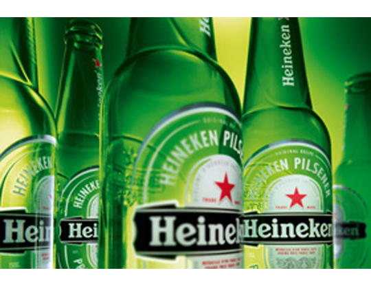 The characteristic brown beer bottle will turn just as green as the bottles that Heineken sells worldwide. The Brown bottle is a relic of Dutch appointments made decades ago to redeem deposit-bottles. Brown glass is recycled by most Dutch brewers, so it doesn’t matter which Brewer is taking in a bottle. Green glass is much less established. First, the green bottle was intended as an export bottle, but over the years it has become the color of the Heineken brand. The exchange operation began twenty years ago. In 1992 the Red cap disappeared, six years afterwards the yellow crates turned green and since 2000 all Lightboxes are green as well.

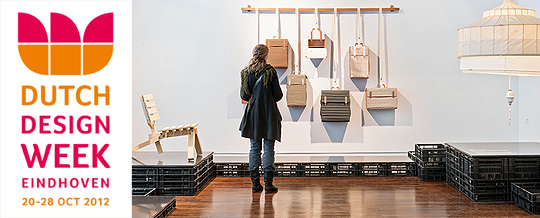 This years Dutch Design Week will take place from the 20th until the 28th of October. This eleventh edition offers a unique glimpse into the future of design thanks to the endless creativity of hundreds of renowned designers and young talents from The Netherlands.
Over 1,500 designers display their work ranging from graphic design, industrial design, packaging design, spatial design, textiles, fashion, architecture, sustainable responsible business design and design management & trends. There are 85 different locations housing more than 300 events. Besides exhibitions, there are numerous lectures, workshops, fashion shows and seminars.
This year 200,000 visitors are expected to visit the Dutch Design Week.
Dutch Designweek 2012, Eindhoven – The Netherlands

