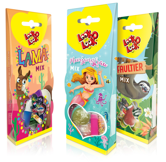
 For Look-O-Look we have, in addition to the successful Unicorn theme packaging, developed three new cheerful candy mix packaging designs for the German market. This packaging design is once again richly illustrated in three different trendy themes; a Lama Mix, a Mermaid Mix and a Sloth Mix. These candy boxes are superb for gifting and sharing as well. The window at the bottom of the packaging that can both hang and stand gives a good view on the mix of candies inside the package.
==
Voor Look-O-Look hebben wij in navolging van het succesvolle Eenhoorn themadoosje, drie nieuwe vrolijke snoepmix verpakkingen ontwikkeld voor de Duitse markt. Dit packaging design is opnieuw rijk geïllustreerd in drie verschillende trendy thema’s; een Lama Mix, een Zeemeermin Mix en een Luiaard Mix. De speelse verpakkingen zijn ideaal voor gifting en ook om samen te delen. De verpakkingen die zowel kunnen hangen als staan, geven door middel van de vensters onderin goed zicht op de mix van snoep binnenin de verpakking.


 Again a wonderfull asset for our bookshelf, “packed” with inspiration: THE ART OF PACKAGE DESIGN. A recent assembly of international designers is creating highly outstanding and savvy designs to complement the nature and function of a product. Editor Wendy Xu included the Atelier LaDurance Japanese Denim packaging in the publication that is about innovative packaging designs that functions beyond ‘simply product wrappers’. A creative treasure published by Gingko Press: www.gingkopress.com

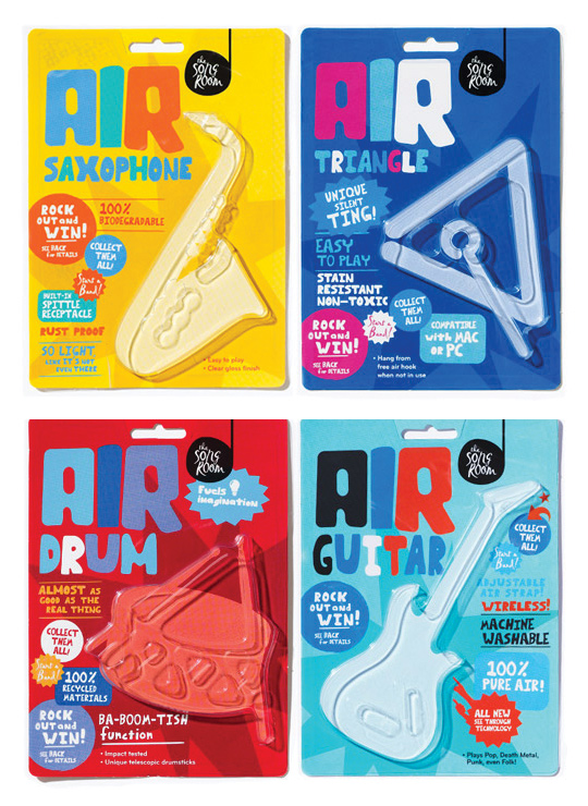 A fine example of what pakaging can do besides just containing and/or selling a product, given by Designworks Melbourne. These air-instruments are part of a ‘Play Air Campagne’, a campaign which helped raise money for an organisation called The Song Room. The Song Room is a charitable organisation who help ensure that underprivileged schools can allow their students to partake in creativity. Deservedly nominated for a Cannes Lions award for Promo & Activation.

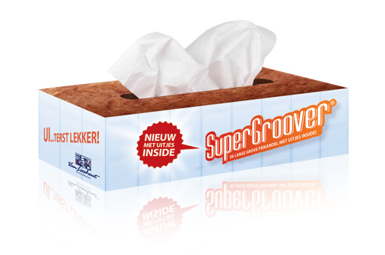 Stepfive developed packaging design (a tissue box) as part of an introduction campaign for a new take on a typical Dutch snack, the Frikandel. This new breed contains onion, so we thought it was appropriate to reach out to anyone eating it by providing free tissues for all those teary eyes. ‘So good, you could cry’.

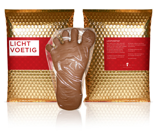 Light-footed (in Dutch: lichtvoetig) ain’t a title that fits Stepfive Communication & Design too well. Contrary, we just love to do complex and new issues concerning packaging design and other graphic jobs for our clients! And we do love a chocolate bite too. That’s why we gave our clients this delicious chocolate foot last december as a new years present: to eat your heart out with Stepfive.

 Every year since it’s founding in 2006 the European Design Awards make selections of the best European graphic design, illustrations and interactive designs. The award is presented by a collaboration of fourteen European designmagazines, among which the Dutch magazine ‘Vormberichten’. These awards are great for promotional purposes and exposure for the winners on an international scale. More information on the EDA can be found here.


