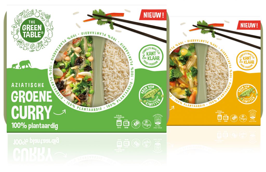
Commissioned by food innovator Peter-Paul Biermans, we developed the brand identity of The Green Table®.
The products of The Green Table® are 100% vegetable and have an extremely long shelf life (more than a year) even without refrigeration. A real innovation!
The question to us is based on the distinctive ability to develop a unique proposition. Consisting of the brand name, brand identity, packaging design and corporate identity. A project we like to get our teeth into.
The dishes are all packed with crunchy vegetables and legumes such as carrots, red peppers, broccoli, lentils, bamboo shoots and sugar snap peas. Exotic fruit such as lychees and pineapple give a fresh touch to the dish. The rice and the authentic taste of the Indian curry sauces give a delicious taste sensation.
The dishes are: clean label (no E-substances). In addition, the meals contain no gluten, no soy and no dairy. The meals have as few additives as possible, salt, sugar or acids for shelf life.
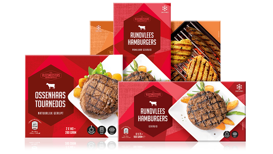
Aldi has asked us to develop a new brand identity and packaging design for their frozen meat products. Contemporary, distinctive, seductive and a lot of shelf impact were some of the starting points. In addition, there was a need for a clear focus on the product and block formation with color coding per product category. A total of 20 products have been converted to this new line. The tight division of surfaces originated from the idea that every meat product is first cut before it is eaten. In short, various beautiful meat products for that one moment of the week when you, as a flexitarian, feel like a piece of quality meat. Conveniently packaged per portion. Now available at Aldi.
—
Aldi heeft ons gevraagd om een nieuwe merkidentiteit en verpakkingslijn te ontwikkelen voor hun vleesproducten in het diepvriesschap. Eigentijds, onderscheidend, verleidelijk en veel schapimpact waren een aantal vertrekpunten. Daarnaast was er behoefte aan een duidelijke focus op het product en blokvorming met kleurcodering per productcategorie. In totaal zijn er 20 producten omgezet naar deze nieuwe lijn. De strakke vlakverdeling is ontstaan uit de gedachte dat elk vleesproduct eerst gesneden wordt voordat het gegeten wordt. Kortom diverse mooie vleesproducten voor dat ene moment van de week dat je als flexitariër zin hebt in een stukje kwaliteitsvlees. Handig per portie verpakt. Nu verkrijgbaar bij Aldi.
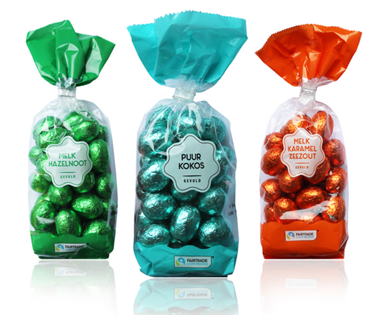
Chocolate eggs really belong to Easter. Just like painting eggs, a tasty Easter breakfast and looking for eggs of course. This year again, we’ve developed the total Easter chocolate line for Aldi, such as the filled chocolate eggs for which the product’s visibility was the starting point. One of these is this modest design with only a white rosette as a design element, on which the taste indication is stated. The product is the hero in this packaging design, because the film is also completely transparent. The brightly colored foils around the eggs make it complete. Happy Easter!
==
Chocolade eieren horen echt bij Pasen. Net zoals eieren beschilderen, een lekker Paasontbijt en eieren zoeken natuurlijk. Ook dit jaar hebben wij voor Aldi weer de totale Paas chocoladelijn ontwikkeld, zoals bijvoorbeeld de gevulde chocolade eitjes waarbij zichtbaarheid van het product het vertrekpunt was. Eén daarvan is dit ingetogen design met enkel een witte rozet als design element, waarop de smaakaanduiding vermeld staat. Het product is in dit verpakkingsontwerp de hero, doordat de folie verder volledig transparant is. De fel gekleurde folies om de eitjes maken het helemaal af. Fijne Pasen!
The Cherry Bonbons and Chocolate Sea Shells Praline packaging design from Aldi NL have been redesigned. For the private label Bonroyaal a modern look has been created while preserving classical elements such as the golden bow. The new Bonroyaal line always has an appealing basic color, which in combination with white and golden line artwork looks festive. It therefore makes this packaging also extremely suitable as a gift.
==
De Kersenbonbons en Zeevruchten van Aldi NL zijn in het nieuw gestoken. Voor het private label Bonroyaal is een moderne uitstraling gecreëerd met behoud van klassieke elementen zoals de gouden strik. De nieuwe Bonroyaal lijn heeft altijd een aansprekende basiskleur, die in combinatie met wit en het gouden lijnenwerk feestelijk oogt. Het maakt deze verpakking dan ook uitermate geschikt om cadeau te geven.
For Aldi Nederland we have developed the packaging design for fragrance sticks under the private label Glowitt. The tasteful packaging is richly illustrated with ingredients from the respective fragrance and each has a clear color segmentation. The packaging form contains two windows which offers a view on the fragrance sticks themselves and the bottle in which they are placed.
==
Voor Aldi Nederland hebben wij onder private label Glowitt een drietal verpakkingen ontwikkeld voor geurstokjes. De smaakvolle verpakkingen zijn rijk geïllustreerd met ingrediënten van de betreffende geur en hebben elk een duidelijke kleursegmentering. De verpakkingsvorm biedt door twee afzonderlijke vensters zicht op zowel de geurstokjes zelf als op het flesje waarin ze worden geplaatst.
For Aldi NL’s new chocolate line under the private label Sjakie’s, we have developed positioning, brand design and various packaging. The brightly colored patterns on the packaging have a clear connotation to animals, but the surprising use of colors gives it an alienating and eye-catching effect. A striking modern packaging design that will not remain unnoticed on the shelf. A true sweet temptation!
==
Voor de nieuwe chocolade lijn van Aldi NL onder het private label Sjakie’s hebben wij de positionering, het brand design en verschillende verpakkingen ontwikkeld. De fel gekleurde patronen op de verpakkingen hebben een duidelijke connotatie naar de dierenwereld, maar door het verrassende kleurgebruik krijgt het een vervreemdend en in het oog springend effect. Een opvallend modern packaging design dat niet onopgemerkt in het schap zal blijven liggen. Een echte zoete verleiding!
We’ve developed the packaging design for the Pulled Mushroom of Champi Cuisine (Banken Champignons). It’s a distinctive packaging, partly due to the organic shape of the window and the female look & feel. This packaging will definitely stand out in the cooling shelves. The illustrative elements gives this packaging design a natural and traditional touch. The Pulled Mushroom is conveniently packed, ready-made, easy to dose and to prepare in a short time. At the table and enjoy…
==
Wij hebben het packaging design voor de Pulled Mushroom van Champi Cuisine (Banken Champignons) mogen ontwikkelen. Het is een onderscheidende verpakking, onder andere door de organische vorm van het venster en de female look & feel. Deze verpakking zeker zal opvallen in het koelversschap. De illustratieve elementen geven de verpakking een natuurlijke en ambachtelijke touch. De Pulled Mushroom is handzaam verpakt, kant-en-klaar, eenvoudig te doseren en in een korte tijd te bereiden. Aan tafel en smullen maar…
The Candy Taco is a nice and cheerful product with a great recognisability that you can easily share with others, but is also very nice to give. The transparent foil decorated with a Mexican touch provides the right taco feel, along with the matching typography and sombrero. Due to the transparency there is an excellent view of the sweets in the taco. The cardboard taco shell itself is printed on the outside with a realistic print, making the overall packaging design of this Look-O-Look product even more appetizing.
==
De Candy Taco is een lekker vrolijk product met een grote herkenbaarheid dat je makkelijk kunt delen met anderen, maar ook heel leuk is om te geven. De met een Mexicaanse touch gedecoreerde transparante folie zorgt voor het juiste taco gevoel, samen met de bijpassende typografie en sombrero. Door de transparantie is er uitstekend zicht op de snoepjes in de taco. De kartonnen tacoschelp zelf is aan de buitenzijde met een realistische print bedrukt, waardoor het totale packaging design van dit Look-O-Look product nog eens extra appetijtelijk oogt.
These two brand new cake boxes from Member’s Mark have been specially developed in series for the Mexican consumer market. The photography from above gives a good impression of the cake in the box, while the hand-made illustrations indicate the origin of the cakes. The script typography, placed in perspective, reinforces the authentic look of this design. Tasty!
==
Fiësta was niet eerder zo lekker!
Deze twee fonkelnieuwe taartdozen van Member’s Mark zijn speciaal in serie ontwikkeld voor de Mexicaanse consumenten markt. De fotografie van bovenaf geeft een goede indruk van de taart in de doos, terwijl de hand gemaakte illustraties de herkomst van de taarten indiceren. De script typografie, in perspectief geplaatst, versterkt de authentieke look van dit ontwerp. Tasty!
After the successful introductions of the Candy Taco, Candy Burger, Candy Cake and Candy Sushi, we have developed the packaging design for another beautiful new Look-O-Look product: the Candy Donut. The result is a colorful design with a large viewing window, making the candy donut itself clearly visible. Ideal for gifting and great to share.
==
Na de succesvolle introducties van de Candy Taco, Candy Burger, Candy Cake en Candy Sushi, hebben wij het packaging design voor weer een mooi nieuw Look-O-Look product ontwikkeld: de Candy Donut. Het resultaat is een kleurrijk ontwerp met een groot zichtvenster, waardoor de candy donut zelf goed zichtbaar is. Ideaal voor gifting en heerlijk om te delen.

 Chocolate eggs really belong to Easter. Just like painting eggs, a tasty Easter breakfast and looking for eggs of course. This year again, we’ve developed the total Easter chocolate line for Aldi, such as the filled chocolate eggs for which the product’s visibility was the starting point. One of these is this modest design with only a white rosette as a design element, on which the taste indication is stated. The product is the hero in this packaging design, because the film is also completely transparent. The brightly colored foils around the eggs make it complete. Happy Easter!
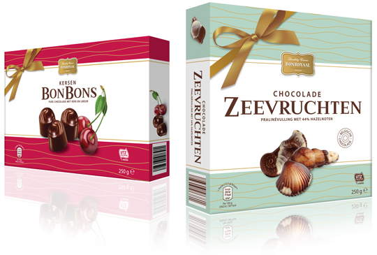 The Cherry Bonbons and Chocolate Sea Shells Praline packaging design from Aldi NL have been redesigned. For the private label Bonroyaal a modern look has been created while preserving classical elements such as the golden bow. The new Bonroyaal line always has an appealing basic color, which in combination with white and golden line artwork looks festive. It therefore makes this packaging also extremely suitable as a gift.
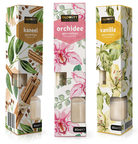 For Aldi Nederland we have developed the packaging design for fragrance sticks under the private label Glowitt. The tasteful packaging is richly illustrated with ingredients from the respective fragrance and each has a clear color segmentation. The packaging form contains two windows which offers a view on the fragrance sticks themselves and the bottle in which they are placed.
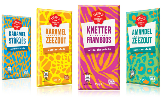 For Aldi NL’s new chocolate line under the private label Sjakie’s, we have developed positioning, brand design and various packaging. The brightly colored patterns on the packaging have a clear connotation to animals, but the surprising use of colors gives it an alienating and eye-catching effect. A striking modern packaging design that will not remain unnoticed on the shelf. A true sweet temptation!
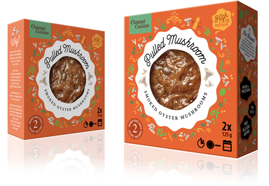 We’ve developed the packaging design for the Pulled Mushroom of Champi Cuisine (Banken Champignons). It’s a distinctive packaging, partly due to the organic shape of the window and the female look & feel. This packaging will definitely stand out in the cooling shelves. The illustrative elements gives this packaging design a natural and traditional touch. The Pulled Mushroom is conveniently packed, ready-made, easy to dose and to prepare in a short time. At the table and enjoy…
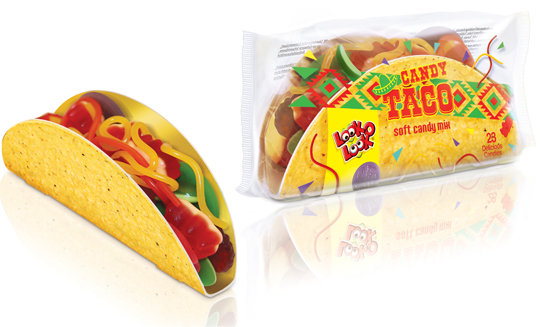 The Candy Taco is a nice and cheerful product with a great recognisability that you can easily share with others, but is also very nice to give. The transparent foil decorated with a Mexican touch provides the right taco feel, along with the matching typography and sombrero. Due to the transparency there is an excellent view of the sweets in the taco. The cardboard taco shell itself is printed on the outside with a realistic print, making the overall packaging design of this Look-O-Look product even more appetizing.
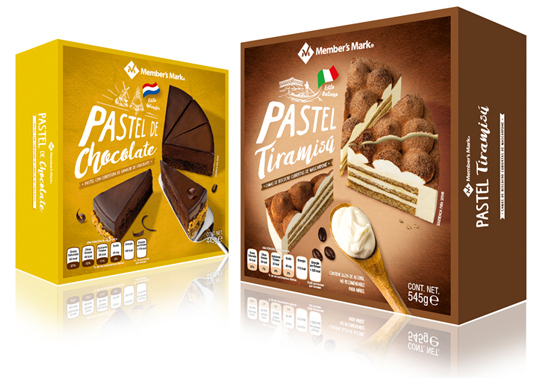 These two brand new cake boxes from Member’s Mark have been specially developed in series for the Mexican consumer market. The photography from above gives a good impression of the cake in the box, while the hand-made illustrations indicate the origin of the cakes. The script typography, placed in perspective, reinforces the authentic look of this design. Tasty!
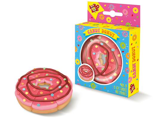 After the successful introductions of the Candy Taco, Candy Burger, Candy Cake and Candy Sushi, we have developed the packaging design for another beautiful new Look-O-Look product: the Candy Donut. The result is a colorful design with a large viewing window, making the candy donut itself clearly visible. Ideal for gifting and great to share.