May 09th, 2014 | 02:25 pm
 Retailers and brands use packaging design of their products far too little as a marketing tool. ”The story of retail is a game of seduction in shelves. Consumers make their choice, brands and retailers are there to respond more” says Birgit Kamp of Tetra Pak Benelux.
Read more here (in Dutch).
TAGS: Birgit Kamp, Dutch, marketing, Netherlands, packaging design, retail, shelf impact, Stepfive, Tetra Pak
POSTED IN food | no comments »
October 14th, 2011 | 08:50 am
 Again a wonderfull asset for our bookshelf, “packed” with inspiration: THE ART OF PACKAGE DESIGN. A recent assembly of international designers is creating highly outstanding and savvy designs to complement the nature and function of a product. Editor Wendy Xu included the Atelier LaDurance Japanese Denim packaging in the publication that is about innovative packaging designs that functions beyond ‘simply product wrappers’. A creative treasure published by Gingko Press: www.gingkopress.com
TAGS: book, brand identity, consumers, design, Dutch, food, GINGKO PRESS, innovation, inspiration, Netherlands, packaging design, promotion, rebranding, shelf impact, Stepfive
POSTED IN bookshelf, food, non food, Uncategorized | no comments »
May 04th, 2011 | 11:30 am
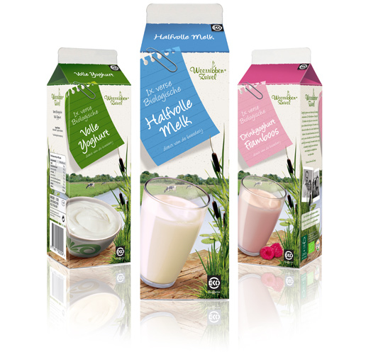
 Following to this restyling, a similar fresh and natural packaging design was created by Stepfive of milk and drinks for Dutch company Weerribben Zuivel. The visuals on the packaging are showing us the origin of the milk and drinks: National Park ‘De Weerribben’ in The Netherlands with its characteristic feather reed grass. The coloured shopping list is a powerful asset to match all twelve products into a coherent range.
TAGS: brand identity, curd, drinks, Dutch, food, milk, Netherlands, packaging design, shelf impact, Stepfive, Weerribben
POSTED IN food | no comments »
January 26th, 2011 | 11:57 am
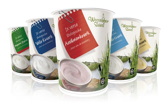
 Delicious and fresh curds on your shopping list every day! A packaging design that makes the difference and takes care of a distinct shop shelf impact with a bright and natural appearance.
The visual at the package shows us the origin of the milk used for the curds: National Park ‘De Weerribben’ in The Netherlands with its characteristic feather reed grass. The coloured shopping list is a powerful way to give all five sort of curds its own unique look.
TAGS: brand identity, curd, Dutch, milk, Netherlands, packaging design, rebranding, shelf impact, Stepfive, Weerribben
POSTED IN food | 2 comments »
 Retailers and brands use packaging design of their products far too little as a marketing tool. ”The story of retail is a game of seduction in shelves. Consumers make their choice, brands and retailers are there to respond more” says Birgit Kamp of Tetra Pak Benelux.

