November 06th, 2015 | 04:25 pm
 ”Weerribben Zuivel BV has won the National Business Success Award 2015 in the Dutch dairy industry. According to the nomination committee, the company became one of the most significant dairy producers in the Netherlands, with a very strong position in a relatively short time.”
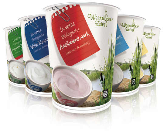
Stepfive created the packaging design for them. See some examples here.
Read more about this bio-award here.
==
”Weerribben Zuivel BV is door de Nationale Business Succes Award uitgeroepen tot branchewinnaar 2015 in de melkvee/ zuivelbranche. Het bedrijf heeft zich volgens de Nominatiecommissie in betrekkelijk korte tijd ontwikkeld tot één van de meest markante zuivelproducenten van Nederland, met een zeer sterke positionering.”
Stepfive heeft het packaging design voor hen ontwikkeld. Voorbeelden hiervan vind u hier.
Meer over deze bio-award leest u hier.
TAGS: Award, Dutch, Netherlands, packaging design, Weerribben
POSTED IN food | no comments »
September 13th, 2012 | 02:25 pm
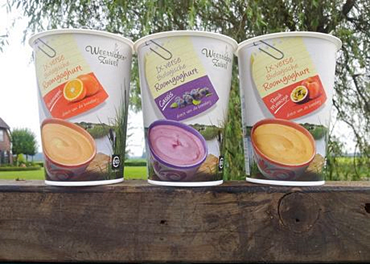
 In addition to this restyling, a new organic cream yoghurt (with fruits) packaging design was created for Dutch company Weerribben Zuivel. Fresh and natural visuals on the packaging are showing us the origin of this organic cream yoghurt: National Park ‘De Weerribben’ in The Netherlands. These visuals and the coloured shopping list on top derives from the complete restyling by Stepfive of all the other Weerribben products and herewith makes it into a coherent and appetizing product range. Also to distinguish the cream yoghurts from the other yoghurts, we’ve added visuals of the fruits used in the yoghurt.
TAGS: Dutch, food, Netherlands, packaging design, Stepfive, Weerribben
POSTED IN food | no comments »
May 29th, 2012 | 01:52 pm
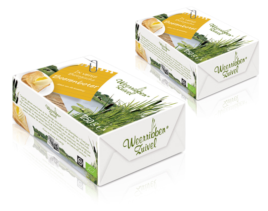
 In addition to this restyling, a new organic butter packaging design was created for Dutch company Weerribben Zuivel. Fresh and natural visuals on the packaging are showing us the origin of this organic butter: National Park ‘De Weerribben’ in The Netherlands. These visuals and the coloured shopping list on top derives from the complete restyling by Stepfive of all the other Weerribben products and herewith makes it into a coherent and appetizing product range.
TAGS: butter, Dutch, food, Netherlands, packaging design, Stepfive, Weerribben
POSTED IN food | no comments »
May 04th, 2011 | 11:30 am
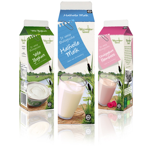
 Following to this restyling, a similar fresh and natural packaging design was created by Stepfive of milk and drinks for Dutch company Weerribben Zuivel. The visuals on the packaging are showing us the origin of the milk and drinks: National Park ‘De Weerribben’ in The Netherlands with its characteristic feather reed grass. The coloured shopping list is a powerful asset to match all twelve products into a coherent range.
TAGS: brand identity, curd, drinks, Dutch, food, milk, Netherlands, packaging design, shelf impact, Stepfive, Weerribben
POSTED IN food | no comments »
January 26th, 2011 | 11:57 am
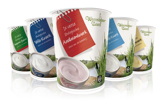
 Delicious and fresh curds on your shopping list every day! A packaging design that makes the difference and takes care of a distinct shop shelf impact with a bright and natural appearance.
The visual at the package shows us the origin of the milk used for the curds: National Park ‘De Weerribben’ in The Netherlands with its characteristic feather reed grass. The coloured shopping list is a powerful way to give all five sort of curds its own unique look.
TAGS: brand identity, curd, Dutch, milk, Netherlands, packaging design, rebranding, shelf impact, Stepfive, Weerribben
POSTED IN food | 2 comments »
 ”Weerribben Zuivel BV has won the National Business Success Award 2015 in the Dutch dairy industry. According to the nomination committee, the company became one of the most significant dairy producers in the Netherlands, with a very strong position in a relatively short time.”
