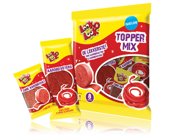
 ”The most delicious candies in one bag”. A new design in a tough and streetwise style that also fits to the regular Look-O-Look brand identity. The products: sour strawberry stripes and laces. This packaging design with a clear product communication is appealing for kids and tweens as it shows quite clearly ‘what’s in it for them’. Literally that is.

January 26th, 2011 | 03:27 pm

3 comments on “A new look for Look-O-Look’s Toppermix”
comment


[…] More on Look-O-Look’s winning Toppermix design by Stepfive here. […]
[…] a successful redesign of Look-O-Look�s Flowpacks and Toppermix, the redesign and packaging for the international familybags of Look-O-Look is done by Stepfive […]
[…] a successful redesign of Look-O-Look’s Family Bags, Flowpacks and Toppermix, the redesign and packaging for the international Mix Bags of Look-O-Look is done by Stepfive […]