January 13th, 2012 | 04:20 pm
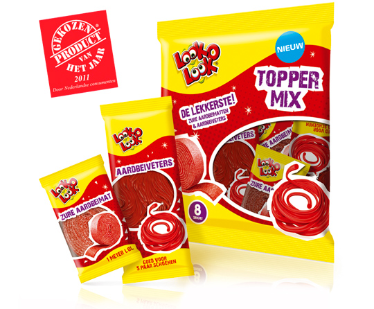 A kick-start of 2012 with this news. Look-O-Look’s Toppermix was voted Product of the Year 2011! A representative panel of 6,000 Dutch consumers criticized it best among all others. A reason to be cheerful and so are we at Stepfive headquarters!
More on Look-O-Look’s winning Toppermix (design by Stepfive) here.
TAGS: Award, brand identity, candy, Dutch, Look-O-Look, Netherlands, packaging design, Product of the Year, Stepfive, toppermix
POSTED IN food | no comments »
February 22nd, 2011 | 11:28 am
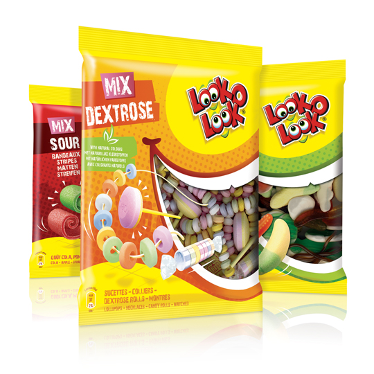
 After a successful redesign of Look-O-Look’s Toppermix, the redesign and packaging for the familybags of Look-O-Look is done by Stepfive Communication & Design too.
The Dutch candy producer with ”The most delicious candies in one bag” wanted a fun and diverting familybag, appealing for all family members, young and old. Each different bag has its own colour coding, but all bags have the same window (a laughing mouth shape) and illustrated candies, drawn in comic style.
TAGS: brand identity, candy, Dutch, familybag, Look-O-Look, Netherlands, packaging design, rebranding, Stepfive, toppermix
POSTED IN food | no comments »
January 26th, 2011 | 03:27 pm
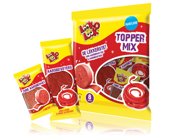
 ”The most delicious candies in one bag”. A new design in a tough and streetwise style that also fits to the regular Look-O-Look brand identity. The products: sour strawberry stripes and laces. This packaging design with a clear product communication is appealing for kids and tweens as it shows quite clearly ‘what’s in it for them’. Literally that is.
TAGS: brand identity, candy, Dutch, Look-O-Look, Netherlands, packaging design, rebranding, Stepfive, toppermix
POSTED IN food | 3 comments »
 A kick-start of 2012 with this news. Look-O-Look’s Toppermix was voted Product of the Year 2011! A representative panel of 6,000 Dutch consumers criticized it best among all others. A reason to be cheerful and so are we at Stepfive headquarters!
