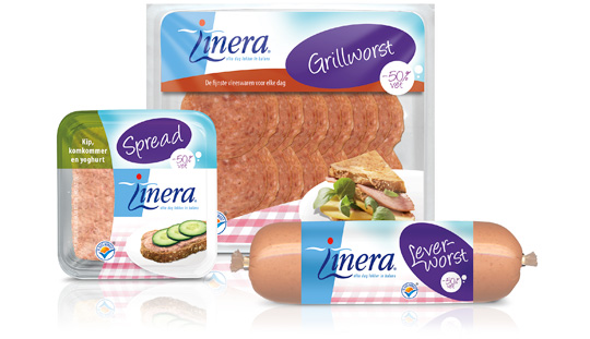
 Linera is long known for it’s diet-related products. But The Times They Are A-Changin’ and so does our perception of healthy living, which is more based on a healthy diet as being a lifestyle then occasionally being on a strict diet. So Linera asked Stepfive to redesign the packaging design of their current line of products in order to fit this modern take on healthy living. Therefore, Linera set some basic rules: the Linera branding must not be altered. Nor should the focus on the target group, which consists mainly of female consumers. Furthermore, the design must be colourful and have an active feel to it.
We think we managed to do just that. We’ve gained Linera’s presence by adding a big purple oval in which the product-type is communicated. The result is this highly recognisable line of modern Linera-products that can stand the times for at least a number of years.


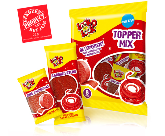 A kick-start of 2012 with this news. Look-O-Look’s Toppermix was voted Product of the Year 2011! A representative panel of 6,000 Dutch consumers criticized it best among all others. A reason to be cheerful and so are we at Stepfive headquarters!
More on Look-O-Look’s winning Toppermix (design by Stepfive) here.

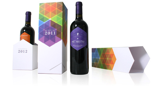 It’s that time of the year again. And as we’re used to, we like to thank our clients and other relations with a special gift for the successful cooperation this past year.
This years theme is ‘All the Best!’ (‘Het Beste’ in Dutch). Not only because the wine, a Domiziano Negroamaro del Salento, is best judged by a professional specialist journal, but also because we launched our renewed website this week. You can find all the best of our latest and past projects with our clients over there.
Stepfive Communication & Design wishes you All The Best for 2012!

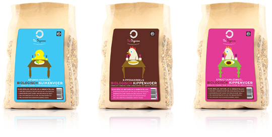 An entirely new brand called ‘Via Organica’ launched a complete new range of organic pet food. Focus of Via Organica is primarily on the Dutch retail channel and secondly the Bio-supermarkets. Stepfive created a new packaging design with a fresh and modern illustrative look. There are several strong color variations for each different categorie and every one of them has its own typical illustration. For now Via Organica only involves organic chicken food, the next step will be food for all kind of pets.

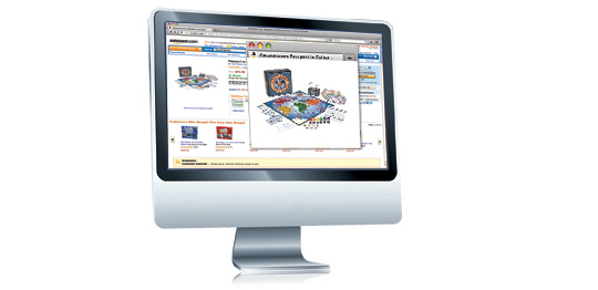 Packaging design always had to look slick on the shelves, be functional, protective and attractive, not too heavy and most important: at a prominent place in stores, dying to be bought. But what remains from all of this when we’re shopping online? Do we choose only the products nowadays, or is there still an important role left for packaging design?
Shikatani Lacroix’ Design Lounge did an interesting study on this theme.
Want to know the answers? Go here.

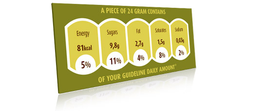 Food companies have five years to implement the mandatory nutrition labelling rules of the European Union’s Food Information to Consumers Regulation published today, said international policy experts EAS (Strategic advice on nutritional products).
Xavier Lavigne, Food Law Manager at EAS, said that the clock starts ticking towards the five-year deadline for nutrition labelling requirements from 20 days after publication, therefore from 13 December 2011.
”The regulation introduces a minimum font size of 1.2mm for all mandatory label information, and 0.9mm for products whose packaging has a largest surface of less than 80cm2.”
More information on the EAS website.

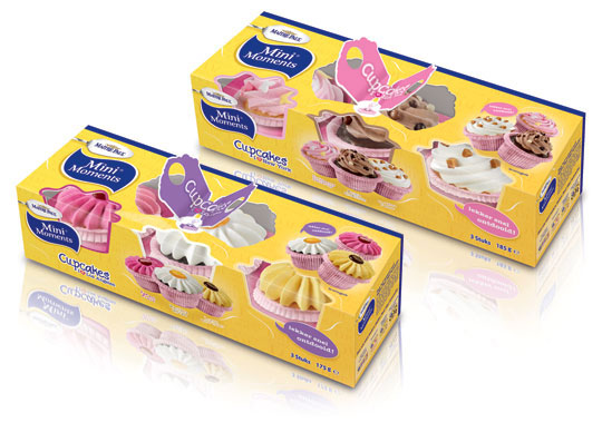 Stepfive created this packaging design for Maître Paul’s Cupcakes. The goal was to create a visually appealing and festive package which could be presented like, as it were, a real gift. Maître Paul’s Cupcakes are the perfect treat for those special little moments. They are nice to give and fun to get! There are three cupcakes per package and you can choose from two different cupcake styles: New York Cupcakes and Los Angeles Cupcakes.

 Ryan Partnership Chicago, a leading expert in marketing campaigns for emerging and established consumer brands, did a huge research project on health and eco-consumers. One conclusion: consumers prefer a single green score on packs.
”We know that consumer commitment to earth-friendly products is increasing,” says Christine Nardi Diette, president of Ryan Partnership Chicago. ”But all of the green messaging is creating more confusion than confidence. Consumers are challenging manufacturers and retailers to be clear about their commitment to sustainability.”
More? Check: www.onegreenscore.com

 Again a wonderfull asset for our bookshelf, “packed” with inspiration: THE ART OF PACKAGE DESIGN. A recent assembly of international designers is creating highly outstanding and savvy designs to complement the nature and function of a product. Editor Wendy Xu included the Atelier LaDurance Japanese Denim packaging in the publication that is about innovative packaging designs that functions beyond ‘simply product wrappers’. A creative treasure published by Gingko Press: www.gingkopress.com

 Stepfive created several design concepts for the toys including the ones you can see here. White, combined with a strong primary colour or colours gives a stronger result than white with weakened pastels, because that makes it look old fashioned and dirty. In contrary, white gives the designs a fresh and modern look with yet a responsable touch at the same time. Therefore we choose to work mainly with white combined with fresh and bright colours. The design above are shown as 3D view, as separate packaging and as separate packaging on a plastic display stand.


