December 21st, 2012 | 04:55 pm
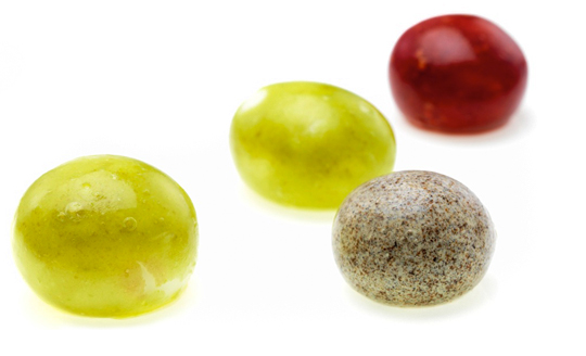 Few people eat an orange peel, but it is edible. We do eat the peels of other fruits, like peaches and apples. The peel is a kind of durable, biodegradable packaging. The fact that these fruits come in their own built-in packaging is convenient. It means they do not have to be sold in boxes or bags.
That idea is the inspiration behind a company that David Edwards has founded. He wants to change the way we package and eat food. His vision is that one day you will go to the supermarket and, instead of buying cartons of juice and cans of soup, you will fill your cart up with balls of food and drink.
Read the rest of this entry »
TAGS: Dutch, edible, food, fruit, packaging design, Stepfive
POSTED IN food | no comments »
December 14th, 2012 | 04:32 pm
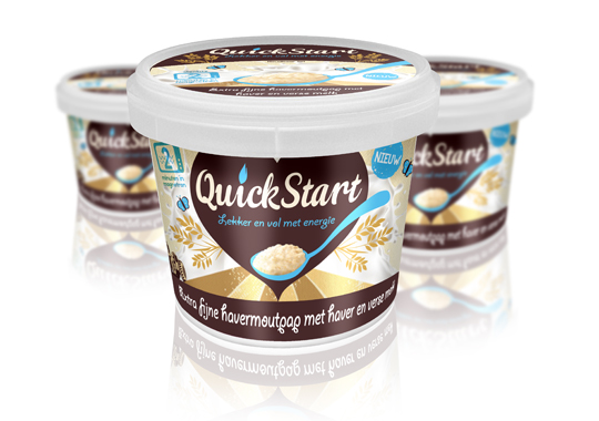 For the launch of a ready-to-eat Oat Porridge concept to the Dutch market, we devised the name ‘QuickStart’ and the pay-off. The name describes a quick preparation and the moment of consumption. It’s based on Kickstart, so there’s a strong reference to terms like ‘energy boost’ and, besides that, it’s multilingual as well. This fashionable name will easily fit between similar products on the shelves.
TAGS: Dutch, oatmeal, packaging design, quickstart, retail, Stepfive
POSTED IN food | no comments »
December 07th, 2012 | 04:37 pm
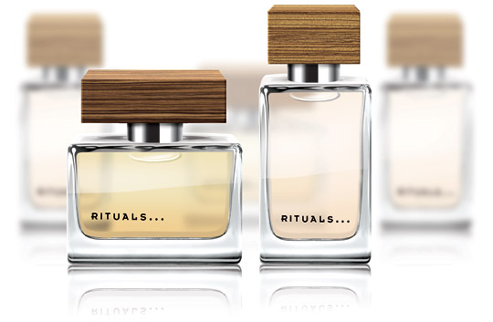 Starting points in this packaging design for a Dutch women’s fragrance were elegance and prestige, combined with a natural look & feel. This led to a series of bottles in different shapes, with different caps in a wooden look.
TAGS: Dutch, eau de toilette, fragrance, packaging design, Stepfive
POSTED IN non food | no comments »
November 30th, 2012 | 01:22 pm
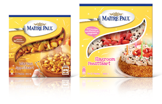 Stepfive created this packaging design for Maître Paul’s Warme Appeltaart (Warm Apple Pie) and Slagroom Feesttaart (Party Cream Cake). The design for the apple pie box is a combination of the recognizable Maître Paul yellow color and a warm productvisual with an oven in the background. The cream cake box is also a combination of Maître Paul’s yellow color, with colorful and festive productvisuals of the cream cake added. The boxes are decorated with fun white graphics.
TAGS: Dutch, Maître Paul, Netherlands, packaging design, pie, retail, Stepfive
POSTED IN food | no comments »
November 14th, 2012 | 01:26 pm
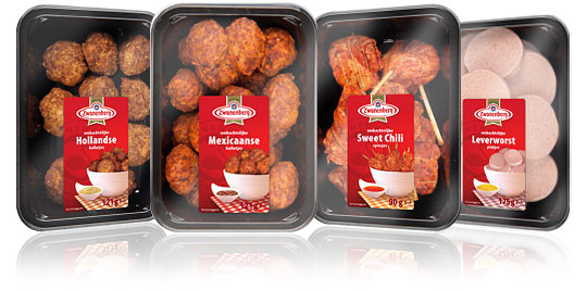 For the Dutch company Zwanenberg Food Group, Stepfive created this serie of packaging labels for a range of tasteful snacks. The bright red color used in all labels really draws your attention and makes the packages stand out on store shelves.
TAGS: Dutch, food, Netherlands, packaging design, retail, snacks, Stepfive, Zwanenberg Food Group
POSTED IN food | no comments »
October 30th, 2012 | 11:24 am
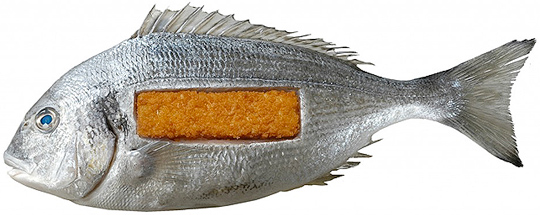 In De Etende Mens (Food Culture: Eating by Design) Premsela explores how design can enable us to make the changes to our food chain that are necessary to ensure a healthy future. Mediamatic’s High Density Aquaponics Edifice and the Diesel Kantine (a collaboration with João Negro) are featured in the exhibition.
The exhibition De Etende Mens showcases work by designers who concern themselves with the relationship between design, food, and (the origins of) what we eat. Curated by Marije Vogelzang, the works on display map people’s complex relationship with food and make visitors aware of how our food is produced.
Throughout the year, Premsela offers educational activities in connection with the Designhuis exhibitions for students in Dutch secondary and higher education. De Etende Mens is on view until January 6, 2013 at the Designhuis in Eindhoven. The exhibition is open from Tuesday till Sunday, from 11.00-18.00. Entrance fee is 5,-. Go to the Designhuis website for more information.
TAGS: Designhuis, Dutch, exhibition, food, packaging design, Premsela, Stepfive
POSTED IN bno, food, non food | no comments »

October 25th, 2012 | 02:18 pm
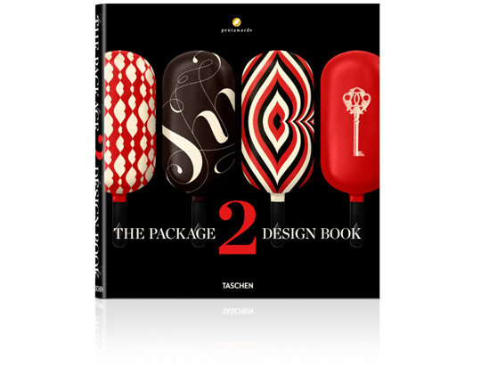 An international roundup of contemporary packaging design by Taschen: On sale soon!
Packaging is a highly underrated art form. As the first thing a consumer sees when looking at a product, the packaging can make or break a sale. Every year, the Pentawards celebrate the art of the package by presenting awards to designs from around the world. Featuring a selection of over 400 works from 30 countries, this book brings together all the Pentawards winners from 2011 and 2012. This well of inspiration is not just aimed at design and marketing professionals but anyone with an interest in the creative process of packaging.
The editor: Pentawards is the first and only worldwide competition dedicated to packaging design in all its forms, open to anyone associated with its creation and/or marketing. Aside from prize-giving, Pentawards’ mission is the worldwide promotion of packaging design among companies, media, economic and political authorities, and the general public. Further information: www.pentawards.org
TAGS: beverage, book, brand identity, concept, design, Dutch, food, graphic design, innovation, inspiration, packaging design, Stepfive, Taschen
POSTED IN bookshelf | no comments »

October 11th, 2012 | 08:31 am
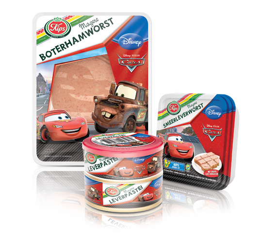 The packaging design for Disney Cars baloney and liver paté was created by Stepfive, commissioned by Zwanenberg Food Group. This delicious sandwich filling for children appeals not only to the youngest ones. Due to it’s strong presence, it also looks very desirable on the shelf. Disney Cars makes lunch and breakfast even more fun!
TAGS: cars, disney, Dutch, Kips, packaging design, retail, Stepfive, Zwanenberg Food Group
POSTED IN food | no comments »
October 08th, 2012 | 04:24 pm
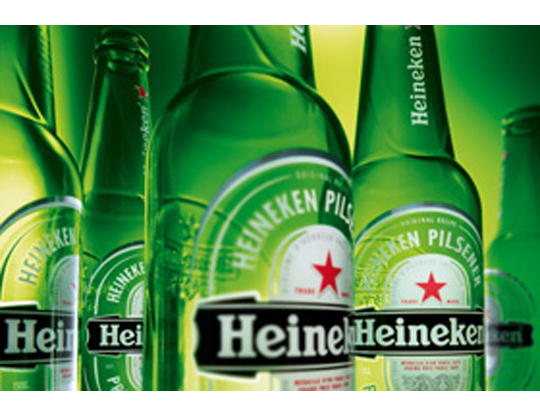 The characteristic brown beer bottle will turn just as green as the bottles that Heineken sells worldwide. The Brown bottle is a relic of Dutch appointments made decades ago to redeem deposit-bottles. Brown glass is recycled by most Dutch brewers, so it doesn’t matter which Brewer is taking in a bottle. Green glass is much less established. First, the green bottle was intended as an export bottle, but over the years it has become the color of the Heineken brand. The exchange operation began twenty years ago. In 1992 the Red cap disappeared, six years afterwards the yellow crates turned green and since 2000 all Lightboxes are green as well.
TAGS: beverage, brand identity, design, Dutch, food, graphic design, innovation, inspiration, Netherlands, packaging design
POSTED IN food | no comments »
October 05th, 2012 | 12:23 pm
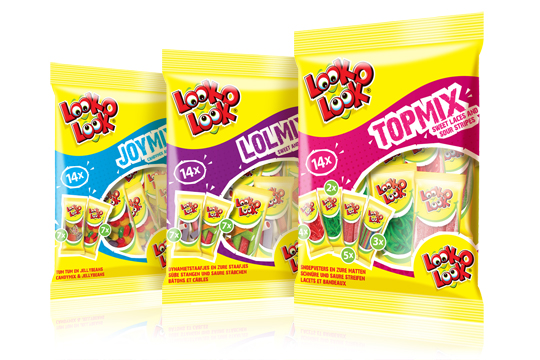
 After a successful redesign of Look-O-Look’s Family Bags, Flowpacks and Toppermix, the redesign and packaging for the international Mix Bags of Look-O-Look is done by Stepfive Communication & Design too. The Dutch candy producer with “The most delicious candies in one bag” wanted a fun and diverting bag with small flowpacks in it, appealing to all family members, young and old. These Mix Bags differ from the other Look-O-Look bags by having small and handy portion packs in each mix bag. Each different bag has its own colour coding, visuals of aforementioned small portion packs/flowpacks (drawn in realistic style) and a large window for optimal visibility of the delicious candies.
TAGS: candy, Dutch, Look-O-Look, Netherlands, packaging design, retail, Stepfive
POSTED IN food | 1 comment »
 Few people eat an orange peel, but it is edible. We do eat the peels of other fruits, like peaches and apples. The peel is a kind of durable, biodegradable packaging. The fact that these fruits come in their own built-in packaging is convenient. It means they do not have to be sold in boxes or bags.


 The characteristic brown beer bottle will turn just as green as the bottles that Heineken sells worldwide. The Brown bottle is a relic of Dutch appointments made decades ago to redeem deposit-bottles. Brown glass is recycled by most Dutch brewers, so it doesn’t matter which Brewer is taking in a bottle. Green glass is much less established. First, the green bottle was intended as an export bottle, but over the years it has become the color of the Heineken brand. The exchange operation began twenty years ago. In 1992 the Red cap disappeared, six years afterwards the yellow crates turned green and since 2000 all Lightboxes are green as well.