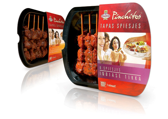
 Health and convenience also becomes more and more important within the Dutch food industry. That’s why Zwanenberg Food Group choose for ‘the other way to snack’ with Pinchitos Tapas Spears: no chips, but a healthy and light meat snack, that only takes one minute in the microwave to prepare. Together with Boom Packaging, Stepfive created a fresh and open packaging design along with the Pinchitos brand identity for this healthy snack in five different flavors.


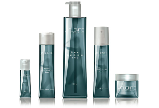 Fuente is dedicated to developing exclusive, naturally-based hair care, colour, transformation and styling products. Stepfive designed a new packaging line in a natural atmospheric style for their bottles, jars and tubes, after a thoroughly brand positioning analysis. Commissioned by Oosterbeek Verpakkingen from The Netherlands.

 crEAte is the-must-have book for every designer connected to the world of food and beverage. Six chapters:’Food Activista’, ‘Wholehearted’, Smart Food’, ‘Packaging’, ‘Food Spaces’ and ‘Typologies’ deal with different aspects of design within gastronomy. An inspiring book published by Gestalten, Berlin 2008

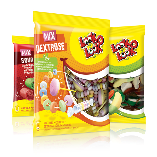 After a successful redesign of Look-O-Look’s Toppermix, the redesign and packaging for the familybags of Look-O-Look is done by Stepfive Communication & Design too.
The Dutch candy producer with ”The most delicious candies in one bag” wanted a fun and diverting familybag, appealing for all family members, young and old. Each different bag has its own colour coding, but all bags have the same window (a laughing mouth shape) and illustrated candies, drawn in comic style.

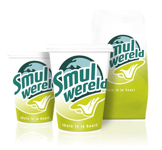 FFC (Franchise Friendly Concepts) is the largest independent Dutch food franchise organization with several success formulas. One of them: Smulwereld. The new logo created for their rebranding is modern with a healthy look and symbolizes the propositions. Along with this rebranding a complete range of disposables was designed. This rebranding was implemented in all 100 Smulwereld companies in The Netherlands, together with signings and interior adjustments.

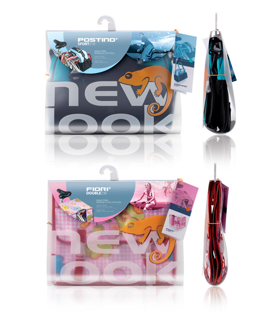 Recognition and a powerful brand experience of New Look were the main starting points for both the single and double bike bag packaging design. The final design conveys the value of the product and the image of the brand which is stylish, colourful and modern, in yet a distinctive manner. Beside this sparkling new Dutch packaging design a whole line of supporting materials such as labels, cards and action banners have been developed for New Look bike bags in The Netherlands.

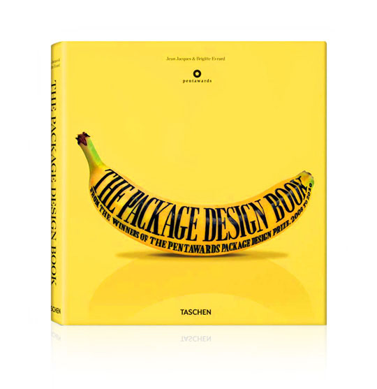 Looking for a great read that just hit the shelves? Check out ‘The Package Design Book’ written by Julius Wiedemann. This recently published book showcases Pentaward winners from the worldwide packaging design contest. Featuring a vibrantly yellow cover, the book itself is an example of eye-catching design not to mention having over 400 product pages. Each page has high quality images of food, beverage, and beauty products along with a short summary about the packaging design. The Package Design Book can be purchased at TASCHEN.

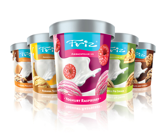 The new ice cream ‘Friz’ is developed for FFC (Franchise Friendly Concepts), the largest independent Dutch food franchise organization with several success formulas. The complete brand identity and packaging design is based on the fresh and round Friz logo, attractive to young and old. This organic ice cream with a fresh and funky look comes in five flavours and was successfully introduced within all the FFC formulas.

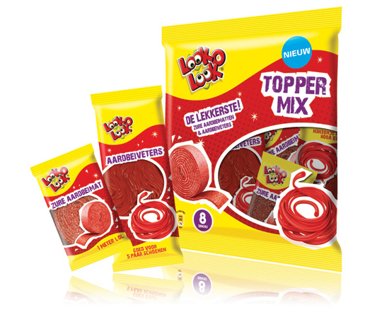 ”The most delicious candies in one bag”. A new design in a tough and streetwise style that also fits to the regular Look-O-Look brand identity. The products: sour strawberry stripes and laces. This packaging design with a clear product communication is appealing for kids and tweens as it shows quite clearly ‘what’s in it for them’. Literally that is.

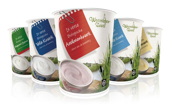 Delicious and fresh curds on your shopping list every day! A packaging design that makes the difference and takes care of a distinct shop shelf impact with a bright and natural appearance.
The visual at the package shows us the origin of the milk used for the curds: National Park ‘De Weerribben’ in The Netherlands with its characteristic feather reed grass. The coloured shopping list is a powerful way to give all five sort of curds its own unique look.


