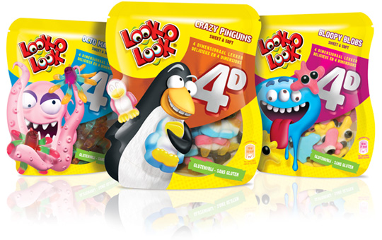
 A striking, distinctive packaging design developed for 4D candy (Penguins, Blobs and Octopuses). A high fun factor and playfulness were leading for Look-O-Look. The packaging design is seamlessly integrated in a playful dieline that works for the design. Because of this unique form of packaging design and special printing techniques, the use of metallic colors, the illustrations of the cartoons and the productvisuals this design creates a striking and colourful packaging with a large fun factor and high stopping power.


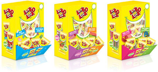 Look-O-Look, the Dutch candy producer with ‘The most delicious candies in one bag’ asked Stepfive Communication & Design to create candy boxes for the Out of Home segment. Each box is filled with 75 mini flowpacks in different flavours. Concept and packaging design of the boxes and mini flowpacks are integrated within the current line of Look-O-Look’s mixbags and familybags, which are done by Stepfive too.

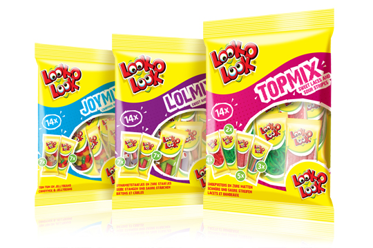 After a successful redesign of Look-O-Look’s Family Bags, Flowpacks and Toppermix, the redesign and packaging for the international Mix Bags of Look-O-Look is done by Stepfive Communication & Design too. The Dutch candy producer with “The most delicious candies in one bag” wanted a fun and diverting bag with small flowpacks in it, appealing to all family members, young and old. These Mix Bags differ from the other Look-O-Look bags by having small and handy portion packs in each mix bag. Each different bag has its own colour coding, visuals of aforementioned small portion packs/flowpacks (drawn in realistic style) and a large window for optimal visibility of the delicious candies.

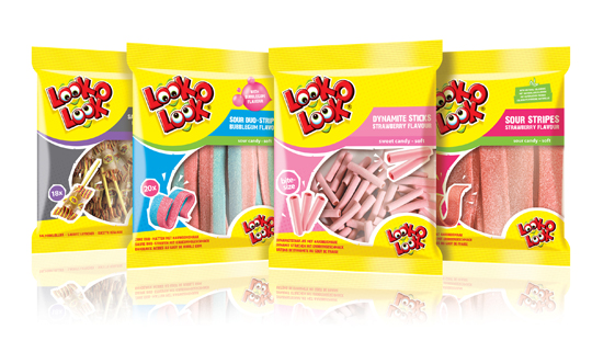 After a successful redesign of Look-O-Look’s Flowpacks and Toppermix, the redesign and packaging for the international familybags of Look-O-Look is done by Stepfive Communication & Design too.
The Dutch candy producer with ”The most delicious candies in one bag” wanted a fun and diverting familybag, appealing for all family members, young and old. Each different bag has its own colour coding, illustrated candies on the front (drawn in realistic style) and a large window for optimal visibility of the delicious candies.

 For Look-O-Look, Stepfive developed a new and contemporary line of packages (for 29 different candies) which will replace the current ‘kopkaartjes’ (transparent candy bags). These new flowpacks are designed in a handy size and are easy to open, which creates optimal ease in use. The new flowpacks have a fun, fresh and strong packaging design which corresponds perfectly with the target group. The flowpack design also contains a clear product-communication and an optimal visibility for a maximal impulse, which really distinguishes this packaging in stores from it’s competitors.

In a world of tremendous fast growing digitalization, packaging design can’t stay far behind. Want to ‘feel’ a package and see it’s benefits without having the actual package in hands? Apps and other digital media provides us, in combination with regular printed media, an innovative and even better way of advertising.
Stepfive Communication & Design designed and developed a mobile and desktop website for Dutch candy producer Look-O-Look, to be reached by a QR-code at advertisements. Consumers and sales managers can digitally feel and navigate around the new package design at this site. In combination with printed and social media it gives Look-O-Look a wide spread and an effective campaign to show their brand and products.

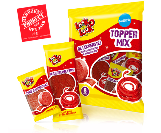 A kick-start of 2012 with this news. Look-O-Look’s Toppermix was voted Product of the Year 2011! A representative panel of 6,000 Dutch consumers criticized it best among all others. A reason to be cheerful and so are we at Stepfive headquarters!
More on Look-O-Look’s winning Toppermix (design by Stepfive) here.

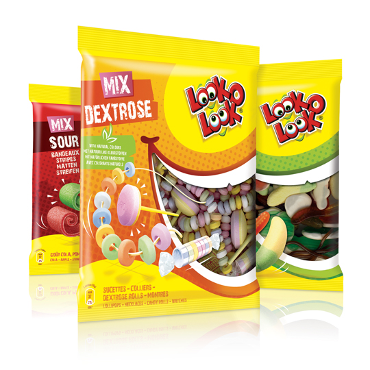 After a successful redesign of Look-O-Look’s Toppermix, the redesign and packaging for the familybags of Look-O-Look is done by Stepfive Communication & Design too.
The Dutch candy producer with ”The most delicious candies in one bag” wanted a fun and diverting familybag, appealing for all family members, young and old. Each different bag has its own colour coding, but all bags have the same window (a laughing mouth shape) and illustrated candies, drawn in comic style.

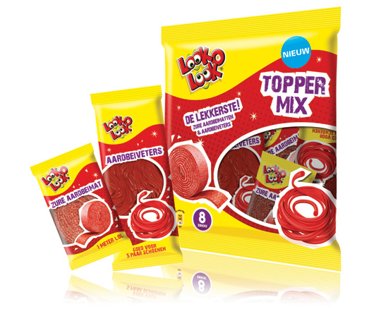 ”The most delicious candies in one bag”. A new design in a tough and streetwise style that also fits to the regular Look-O-Look brand identity. The products: sour strawberry stripes and laces. This packaging design with a clear product communication is appealing for kids and tweens as it shows quite clearly ‘what’s in it for them’. Literally that is.


