February 08th, 2013 | 03:45 pm
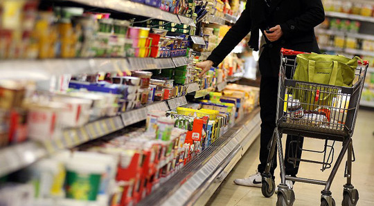
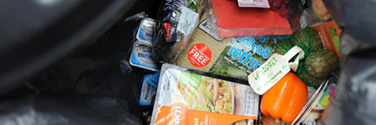 ”The primary role of packaging is protection, whether that be primary packaging to reduce oxidation, moisture change or insect/microbial access or transportation packaging to reduce crushing or other damage in distribution. It is more than coincidental that packaging usage per person is higher in the developed world and food availability is much greater. The benefits of (diverse) packaging are obvious to us but less so in many developing countries. Both use and quality of packaging is important to reduce food loss and impact sales.”
Read more on packaging design and food loss at Packaging Digest.
TAGS: consumers, Dutch, eco, environment, food loss, green, packaging design, recycling, social responsibility, Stepfive
POSTED IN csr, food, legislation, non food | no comments »
January 31st, 2013 | 05:00 pm
 A niche topic, a clear defined target group, a sharp program content, up to 80 stand units, a low entry fee et voilá, the ingredients that’ll make ‘Foodpacking Event 2013’ into a special event. The exhibition will take place on October 9 and 10 (Wednesday and Thursday) and will be held in ‘High Five’ in the ‘Jaarbeurscomplex’ in Utrecht, The Netherlands.
This event has been given the subtitle: High knowledge event on packaging in the food industry.
Read more here (Dutch).
TAGS: Dutch, exhibition, food, food industry, innovation, Jaarbeurscomplex, Netherlands, packaging design, Stepfive
POSTED IN food, legislation, non food | no comments »
January 25th, 2013 | 12:27 pm
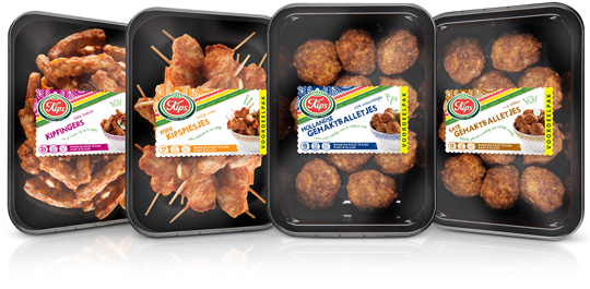
 Chickenfingers, mini chicken skewers, Dutch meatballs and meatballs satéh. Four new products by Kips (a brand of Zwanenberg Food Group) of which Stepfive created packaging labels for. The labels have unique colours for each product and are placed right in the middle so there’s still a good spot on the delicious snacks.
TAGS: Dutch, food, Kips, Netherlands, packaging design, retail, Stepfive, Zwanenberg Food Group
POSTED IN food | no comments »
January 21st, 2013 | 12:17 pm
 According to Unilever’s top manager in Europe Jan Zijderveld, ”Poverty is returning to Europe”. Unilever, best known for popular brands like Knorr instant soups, Ben & Jerry’s ice cream, Lipton teas and many more, will cut package sizes due to the Euro crisis and still earn decent money. ”We know how to do it, but in the European boom years prior to the crisis we forgot.”
Read more in The International Spiegel.
TAGS: crisis, Dutch, euro, Jan Zijderveld, packaging design, Stepfive, Unilever
POSTED IN csr, non food | no comments »
January 04th, 2013 | 04:40 pm
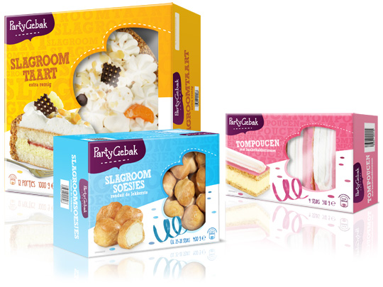
 Throwing a party? Make it extra festive with Aldi’s ‘PartyGebak’ (Party Pastries). Stepfive created the new packaging design for the complete range of PartyGebak products in The Netherlands and also created the new branding.
A visually appealing, festive and joyous packaging design that lightens up every party and any other moment of fun.
TAGS: Aldi, brand creation, brand identity, Dutch, food, Netherlands, packaging design, retail, Stepfive
POSTED IN food | no comments »
December 21st, 2012 | 04:55 pm
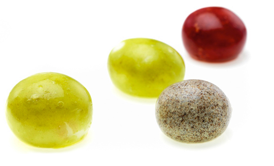
 Few people eat an orange peel, but it is edible. We do eat the peels of other fruits, like peaches and apples. The peel is a kind of durable, biodegradable packaging. The fact that these fruits come in their own built-in packaging is convenient. It means they do not have to be sold in boxes or bags.
That idea is the inspiration behind a company that David Edwards has founded. He wants to change the way we package and eat food. His vision is that one day you will go to the supermarket and, instead of buying cartons of juice and cans of soup, you will fill your cart up with balls of food and drink.
Read the rest of this entry »
TAGS: Dutch, edible, food, fruit, packaging design, Stepfive
POSTED IN food | no comments »
December 14th, 2012 | 04:32 pm
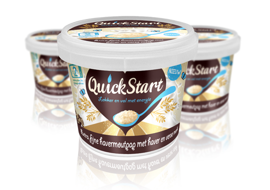
 For the launch of a ready-to-eat Oat Porridge concept to the Dutch market, we devised the name ‘QuickStart’ and the pay-off. The name describes a quick preparation and the moment of consumption. It’s based on Kickstart, so there’s a strong reference to terms like ‘energy boost’ and, besides that, it’s multilingual as well. This fashionable name will easily fit between similar products on the shelves.
TAGS: Dutch, oatmeal, packaging design, quickstart, retail, Stepfive
POSTED IN food | no comments »
December 07th, 2012 | 04:37 pm
 Starting points in this packaging design for a Dutch women’s fragrance were elegance and prestige, combined with a natural look & feel. This led to a series of bottles in different shapes, with different caps in a wooden look.
TAGS: Dutch, eau de toilette, fragrance, packaging design, Stepfive
POSTED IN non food | no comments »
November 30th, 2012 | 01:22 pm
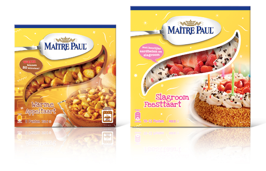
 Stepfive created this packaging design for Maître Paul’s Warme Appeltaart (Warm Apple Pie) and Slagroom Feesttaart (Party Cream Cake). The design for the apple pie box is a combination of the recognizable Maître Paul yellow color and a warm productvisual with an oven in the background. The cream cake box is also a combination of Maître Paul’s yellow color, with colorful and festive productvisuals of the cream cake added. The boxes are decorated with fun white graphics.
TAGS: Dutch, Maître Paul, Netherlands, packaging design, pie, retail, Stepfive
POSTED IN food | no comments »
November 14th, 2012 | 01:26 pm
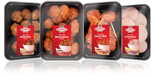
 For the Dutch company Zwanenberg Food Group, Stepfive created this serie of packaging labels for a range of tasteful snacks. The bright red color used in all labels really draws your attention and makes the packages stand out on store shelves.
TAGS: Dutch, food, Netherlands, packaging design, retail, snacks, Stepfive, Zwanenberg Food Group
POSTED IN food | no comments »
 ”The primary role of packaging is protection, whether that be primary packaging to reduce oxidation, moisture change or insect/microbial access or transportation packaging to reduce crushing or other damage in distribution. It is more than coincidental that packaging usage per person is higher in the developed world and food availability is much greater. The benefits of (diverse) packaging are obvious to us but less so in many developing countries. Both use and quality of packaging is important to reduce food loss and impact sales.”

