 Again a wonderfull asset for our bookshelf, “packed” with inspiration: THE ART OF PACKAGE DESIGN. A recent assembly of international designers is creating highly outstanding and savvy designs to complement the nature and function of a product. Editor Wendy Xu included the Atelier LaDurance Japanese Denim packaging in the publication that is about innovative packaging designs that functions beyond ‘simply product wrappers’. A creative treasure published by Gingko Press: www.gingkopress.com


 Stepfive created several design concepts for the toys including the ones you can see here. White, combined with a strong primary colour or colours gives a stronger result than white with weakened pastels, because that makes it look old fashioned and dirty. In contrary, white gives the designs a fresh and modern look with yet a responsable touch at the same time. Therefore we choose to work mainly with white combined with fresh and bright colours. The design above are shown as 3D view, as separate packaging and as separate packaging on a plastic display stand.

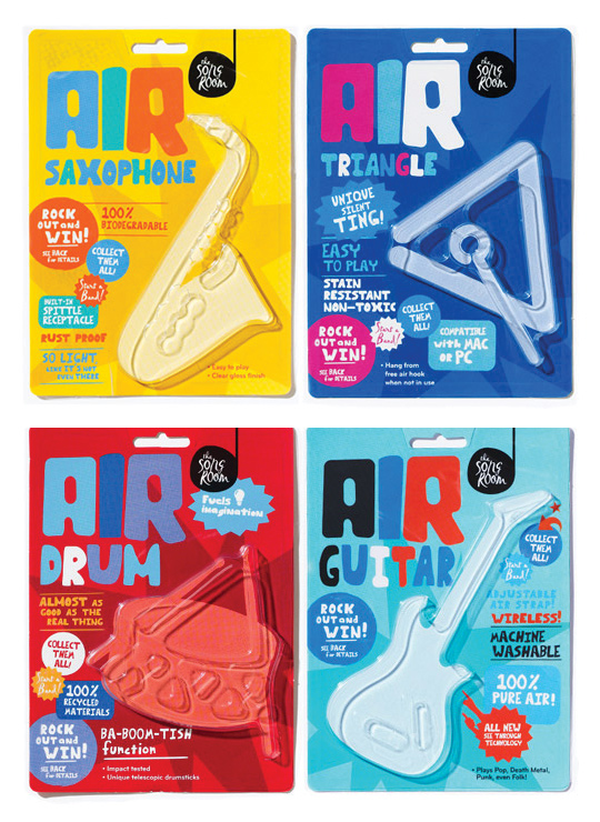 A fine example of what pakaging can do besides just containing and/or selling a product, given by Designworks Melbourne. These air-instruments are part of a ‘Play Air Campagne’, a campaign which helped raise money for an organisation called The Song Room. The Song Room is a charitable organisation who help ensure that underprivileged schools can allow their students to partake in creativity. Deservedly nominated for a Cannes Lions award for Promo & Activation.

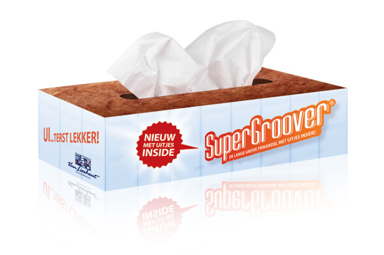 Stepfive developed packaging design (a tissue box) as part of an introduction campaign for a new take on a typical Dutch snack, the Frikandel. This new breed contains onion, so we thought it was appropriate to reach out to anyone eating it by providing free tissues for all those teary eyes. ‘So good, you could cry’.

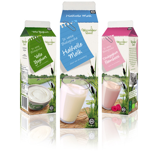 Following to this restyling, a similar fresh and natural packaging design was created by Stepfive of milk and drinks for Dutch company Weerribben Zuivel. The visuals on the packaging are showing us the origin of the milk and drinks: National Park ‘De Weerribben’ in The Netherlands with its characteristic feather reed grass. The coloured shopping list is a powerful asset to match all twelve products into a coherent range.

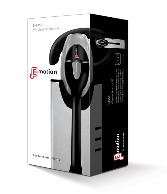 Stepfive created the packaging for this modern headset from Emotion. You will experience beautiful sounds and audio with this high-tech headset. The graphical appeal of the slick design- and metallook and high quality of the headset has been a source of inspiration for creating this clean yet strong packaging.

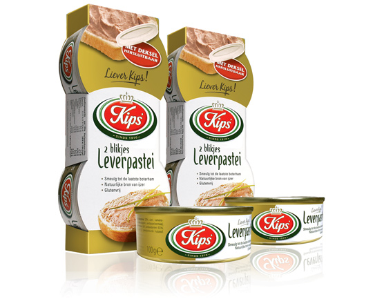 For the Dutch company Kips’, who actually celebrate their 100th anniversary this year, Stepfive created a golden packaging design for their tins with excellent liver pâté. This exclusive and tasteful look with much attention to branding and product experience is successfully introduced at the Dutch consumer market. Kips’ is part of Zwanenberg Food Group.

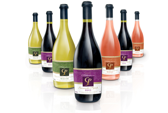 With first class facilities, a wide range of indoor and outdoor activities and restaurants and bars, an own range of wines couldn’t be missed. That’s why Stepfive was asked to develop the total brand identity for the new wine selection of Center Parcs Europe: Selection CP. Stepfive designed a series of tasteful labels with a high quality appearance for the rosé and the red and white wines. After the introduction the sales increased with 20%. Mission accomplished!

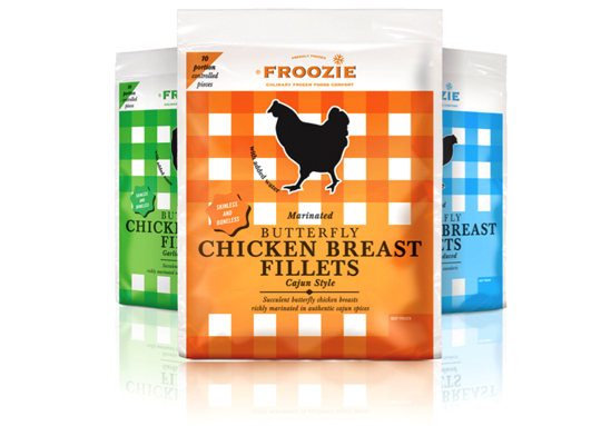 Dalco Food specialises in developing and producing meat and vegetarian meal components in The Netherlands and the United Kingdom. For their private label ‘Froozie’ on the English market, we created a new packaging design for the fresh frozen Butterfly Chicken Breast Fillets in flexible plastic bags. There are three strong color variations, matching the three different styles: cajun, garlic and regular. Along with this design, the new Froozie logo brand identity (also designed by Stepfive) was successfully introduced.

 Linera meat-products by Zwanenberg Food Group is a brand that stands for health, taste and honesty. For last years Linera rebranding, Stepfive created a complete new range of packaging design with emphasis on all their light products and a clear recognition and block formation in the storeshelf. This rebranding was successfully introduced at the Dutch consumers market.


