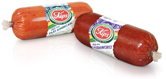
 For the Dutch company Kips (part of Zwanenberg Food Group), we designed a series of contemporary labels/banderols with optimum product visibility that convey top quality. Each label comes in a different colour setting for each different taste variety.


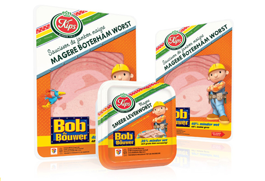
 The packaging design for the international figure Bob the BuilderTM baloney and liver paté was created by Stepfive, commissioned by Zwanenberg Food Group. This delicious sandwich filling for children appeals not only to the youngest ones. Due to it’s strong presence, it also looks very desireable on the shelf. Bob the BuilderTM makes lunch and breakfast even more fun!

 For Look-O-Look, Stepfive developed a new and contemporary line of packages (for 29 different candies) which will replace the current ‘kopkaartjes’ (transparent candy bags). These new flowpacks are designed in a handy size and are easy to open, which creates optimal ease in use. The new flowpacks have a fun, fresh and strong packaging design which corresponds perfectly with the target group. The flowpack design also contains a clear product-communication and an optimal visibility for a maximal impulse, which really distinguishes this packaging in stores from it’s competitors.

In a world of tremendous fast growing digitalization, packaging design can’t stay far behind. Want to ‘feel’ a package and see it’s benefits without having the actual package in hands? Apps and other digital media provides us, in combination with regular printed media, an innovative and even better way of advertising.
Stepfive Communication & Design designed and developed a mobile and desktop website for Dutch candy producer Look-O-Look, to be reached by a QR-code at advertisements. Consumers and sales managers can digitally feel and navigate around the new package design at this site. In combination with printed and social media it gives Look-O-Look a wide spread and an effective campaign to show their brand and products.

 Stepfive creates new distinctive retail and catering concepts for food and beverage brands on a daily basis. We develop new concepts, recipes, brands and packaging design together with our clients. We also revitalise existing products on our own initiative, because we are convinced many products could have a more successful brand appearance with the right adaption and repositioning. For example, we have created this new concept for Bloody Mary.
This Bloody Mary concept can be used for the catering and retail sector. The bottle has two facings (meant for standing and hanging) and can therefore be placed on a shelf, perhaps in a retail environment, or can be suspended within catering establishments. You also have the option of attaching a connecting piece with a hose, allowing drinking glasses to be filled with Bloody Mary from a bottle hanging on the bar.

 The packaging design for the international figure Bob the BuilderTM luncheon meat and liver paté was created by Stepfive for Zwanenberg Food Group. This delicious sandwich filling for children appeals not only to the youngest ones. Due to it’s strong presence, it also looks very desireable on the shelf. Bob the BuilderTM makes lunch and breakfast even more fun!

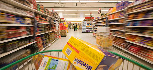
 A recent study by Accenture, ComScore and Dunnhumby USA shows the importance of an attractive webshop in relation to actual purchases in-store. Shoppers who visit websites for consumer packaged goods brands before setting foot in a store spend up to 37% more on those brands in-store than those who didn’t come to these websites. Web visitors also returned to the store more often to buy the brand: 3.2 buying occasions per month against 2.3 for non-visitors. Site visitors also spent more per month in the product category of a brand whose site they’ve gone to.
Read the complete study here.
More on (online) shopping and packaging design here.

 This manufactorer, based in Europe, delivers quality toys with a high degree of educational values. These toys are built to last and are internationally recognized with lots of prestigious awards. Stepfive created several packaging concepts that fitted this high standard of quality, while gaining presence due to the use of bright colours and clear typography. Using different materials was a handy tool that allowed us to make a clear difference between the many product groups. We also created an opening in each design that allows buyers to actually feel the products’ quality – an essential factor in deciding wether or not to buy the toy.

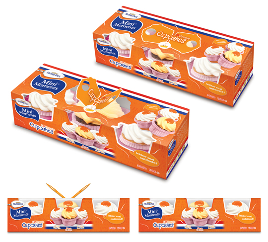
 Stepfive created these packaging designs for Maître Paul’s Oranje Cupcakes. The goal: creating a visually appealing and festive package which could be presented like, as it were, a real gift. Especially for typical Dutch traditions and parties such as ‘Queen’s Day’, but for (inter)national sport events as for instance soccer championships as well. ‘Cause after all, the Dutch colour is orange. Maître Paul’s Oranje Cupcakes are the perfect treat for those special little moments. They are nice to give and fun to get! There are three cupcakes per package.
More on Maître Paul Cupcakes original design here.

 Dutch bakery FreeOf produces all kinds of bread products completely gluten-free for people on a diet, for those who simply want to eat gluten-free or for those who suffer from gluten sensitivity. This disease can be defined as a non-allergic and non-autoimmune condition in which the consumption of gluten can lead to symptoms similar to those observed in coeliac disease or wheat allergy. For FreeOf, Stepfive created an appetizing looking and modern packaging design for the complete range of FreeOf products.
It’s time to enjoy healthier, better tasting and better looking gluten-free breads!


