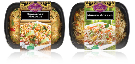
 A new branding and an optimized design on the sleeves of Aldi’s packaging design for their Oriental Delight ready to eat meals. The sleeves contain a tasteful product visual underneath the striking new branding and have all the legal information on its bottom. To be sold in Aldi Netherlands.


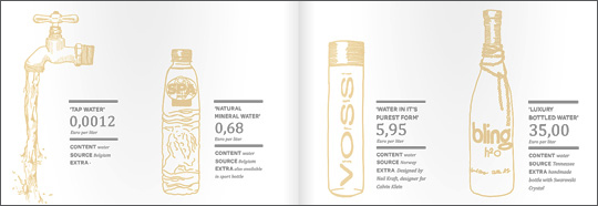 An inspiring and interesting brand new book by Dutch publisher BIS Publishers out this month about ‘the essence of retail branding and design’.
”Retail mirrors society and as society is constantly changing, retail has to be able to anticipate these changes in order to maintain its right of existence. In short; act, react or suffer! This book covers all the facets of retail branding, holistic formula development and the essential one-to-one relationship with your customers.” -> Buy at BIS Publishers or view large and read at ISSUU

 The more we consume, the bigger the pile of waste we leave behind. (…) Smart and edible packaging: the best examples. Read and see all of it in the first online international edition of ‘Food Inspiration Magazine’. Beautiful designed and loads of interesting stuff on food, packaging and everything else that connects with food one way or another.
Food Inspiration Magazine: Connecting through food.

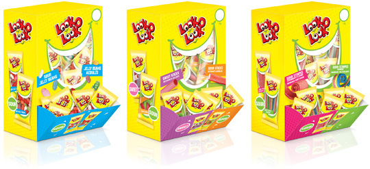 Look-O-Look, the Dutch candy producer with ‘The most delicious candies in one bag’ asked Stepfive Communication & Design to create candy boxes for the Out of Home segment. Each box is filled with 75 mini flowpacks in different flavours. Concept and packaging design of the boxes and mini flowpacks are integrated within the current line of Look-O-Look’s mixbags and familybags, which are done by Stepfive too.

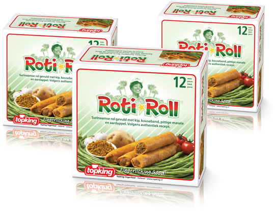 For Topking Fingerfood in The Netherlands, Stepfive created a packaging design and branding for the ‘Roti-Roll®’. This brand new product is a Surinam roll filled with chicken, long beans, spicy masala and potato and is aimed at the foodservice and cash & carry market. The packaging and logo are made in fresh colours with reference to the Surinam national colours. The typical recognizable Topking branding with the red line is also integrated. Fingerlicking good!

An interesting video from Packaging Digest, about the delicate balance between optimizing a package for sustainability and maintaining a quality usage experience for the consumer. Lisa Pierce, editor of Packaging Digest, interviews PepsiCo senior director of beverage packaging R&D on this issue.

 New study uncovers how the migration from in-store to online shopping is affecting the retail environment, and the changing role of packaging in these environments.
Read more on packaging design in an online world.

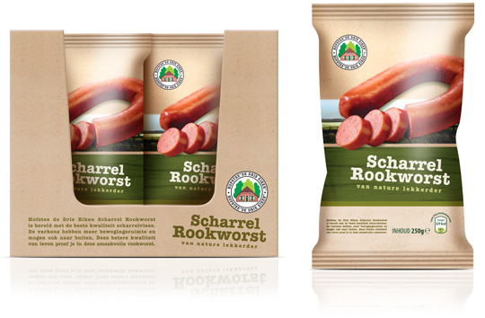 Following to the design of the frankfurters (see below), Stepfive also created the packaging design and the shelf ready packaging for Aldi’s free range smoked sausages. Packaging and carton tray of these sausages have the same ecological look & feel as the frankfurters to make it into a coherent range of products.

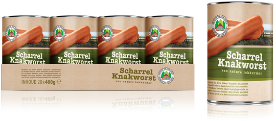 Stepfive created a new packaging design for the free range frankfurters (scharrel knakworst in Dutch) for Aldi. The new labels for these frankfurter cans and the carton tray are made with an identical and ecological look & feel to create a uniform and striking image for this shelf ready packaging (SRP) a.k.a. retail ready packaging (RRP).

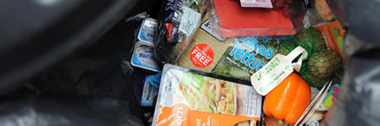 ”The primary role of packaging is protection, whether that be primary packaging to reduce oxidation, moisture change or insect/microbial access or transportation packaging to reduce crushing or other damage in distribution. It is more than coincidental that packaging usage per person is higher in the developed world and food availability is much greater. The benefits of (diverse) packaging are obvious to us but less so in many developing countries. Both use and quality of packaging is important to reduce food loss and impact sales.”
Read more on packaging design and food loss at Packaging Digest.


