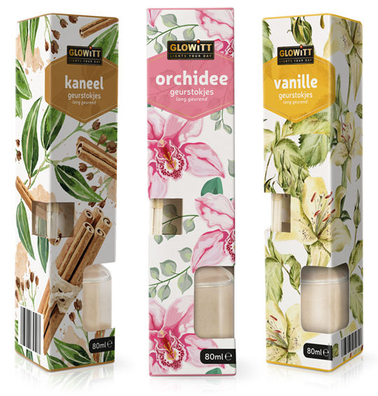
 For Aldi Nederland we have developed the packaging design for fragrance sticks under the private label Glowitt. The tasteful packaging is richly illustrated with ingredients from the respective fragrance and each has a clear color segmentation. The packaging form contains two windows which offers a view on the fragrance sticks themselves and the bottle in which they are placed.
==
Voor Aldi Nederland hebben wij onder private label Glowitt een drietal verpakkingen ontwikkeld voor geurstokjes. De smaakvolle verpakkingen zijn rijk geïllustreerd met ingrediënten van de betreffende geur en hebben elk een duidelijke kleursegmentering. De verpakkingsvorm biedt door twee afzonderlijke vensters zicht op zowel de geurstokjes zelf als op het flesje waarin ze worden geplaatst.


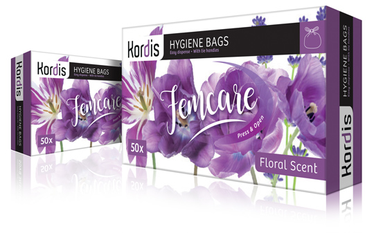 New branding and new packaging design for Kordis Supplies Household Products. The Kordis logo is modernized with a contemporary typography, in which the character ‘d’, like a chameleon, always adapts the base color from the packaging design. This creates in a sophisticated way connection and unity between logo and design. The packaging design is based on a fresh watercolor floral illustration, that communicates the required information in clear panels. Together with the handwritten, feminine typography of Femcare, a stylish and elegant packaging design is created.
==
Een nieuwe branding en nieuw packaging design voor Kordis Supplies Household Products. Het logo van Kordis is gemoderniseerd met een eigentijdse typografie, waarbij de ‘d’ als een kameleon altijd de basiskleur uit het packaging design overneemt. Zo ontstaat op een verfijnde manier steeds connectie en eenheid tussen logo en design. Het verpakkingsontwerp heeft als basis een frisse aquarel bloemen illustratie waar overheen in duidelijke panels de benodigde informatie wordt gecommuniceerd. Samen met de handgeschreven, vrouwelijke typografie van Femcare wordt zo een stijlvol en elegant verpakkingsontwerp gecreëerd.

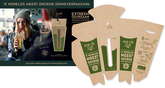 For the Horecava introduction of the Pop-Up Cup, the world’s most ‘green’ drink packaging, we have developed the packaging and a matching small introduction campaign. The Pop-Up Cup drink packaging is innovative and very suitable for filling of beverages on the spot. The Pop-Up Cup is a box with a pouch that comes flat. The box opens up, as one squeezes it from the side. Put a straw through the opening in the top and it is also 100% leak-proof.
The Pop-Up Cup is exclusively available via www.fonkels.com
==
Voor de Horecava introductie van de Pop-Up Cup, ‘s werelds meest groene drinkverpakking, hebben wij de introductie verpakking ontwikkeld, plus een bijpassende mini-campagne. De Pop-Up Cup drinkverpakking is innovatief en zeer geschikt voor het ter plekke vullen van dranken. De Pop-Up Cup is een doosje met een zakje dat plat wordt geleverd en dus weinig plaats inneemt. Het doosje opent zich doordat je het aan de zijkant samenknijpt. Even vullen, de bovenkant samenvouwen en klaar is deze drinkverpakking! Tot slot enkel nog een rietje door de opening in de bovenkant steken en het is ook nog 100% lekvrij.
De Pop-Up Cup is exclusief verkrijbaar via www.fonkels.com

Last year there were still a few design agencies and food photographers present. Unfortunately, this 4th edition of the Packaging Innovations Event in Zaandam has become more and more a representation of the printing industry. Of course it’s always nice to meet colleagues in the profession to speak with, but you can barely still call it ‘the most innovative and inspirational packaging event’. Next year, a new opportunity?
See more at: www.easyfairs.com

 On November 26th & 27th Packaging Innovations will bring together the best professionals of branded packaging and retail design. Specialists show designs, product presentations, new materials and solutions for packaging problems.
See more at: www.easyfairs.com

 As already introduced here, Stepfive takes care of the new Wrapitt packaging design for Aldi Netherlands. Above two examples of the new aluminum foil packaging and the new micro wave packaging. Recognizable little drawings and strong typography are typical for this household consumers product line.

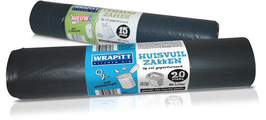 Wrapitt (Kitchen Aid) is one the new household brands that was introduced by Aldi Netherlands the last few months. Wrapitt consists of products like carbage bags, aluminum foils, fresh foils, (doggy) bags, culinary parchment paper, freezer bags and so on. Brand identity and all packaging design was conceptualized and created by Stepfive Communication & Design BNO.

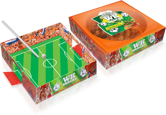 The countdown to the FIFA 2014 World Cup in Brazil has started, so merchandising and marketing campaigns are running overtime already. Zwanenberg Food Group asked Stepfive to create an original packaging design for their ‘soccer snacks’ in The Netherlands and to support the Dutch soccer team in Brazil. And so we did. The result: a carton stadium which can be used as a blow soccer board game! First take out the plate with the delicious snacks of course. Then cut out the goals with scissors. When this is done, the stadium is almost ready to use. Just take two straws, a little ball and let the games begin!

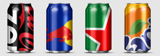 Wondering how far you can push your packaging design to the limit? Designer Ewan Yap presents his ”Big Brand Theory” on Behance with some major and iconic brands (think Heineken, Coca-Cola, Pepsi, Red Bull etc.). His beautiful work is an experiment in brand aesthetics, and also informs us on the cropability of logos in terms of image cropability.
Check out the cropability of a brand (or the guts to leave things out).

 Until recently, direct bottle printing was really only an option for glass bottles. But that’s changing. Today, there are a number of options for direct printing bottles, both glass and plastic. Yet another step forward in sustainable packaging design techniques.
Read more on the next wave of bottle and container decorating here.


