 Stepfive created several design concepts for the toys including the ones you can see here. White, combined with a strong primary colour or colours gives a stronger result than white with weakened pastels, because that makes it look old fashioned and dirty. In contrary, white gives the designs a fresh and modern look with yet a responsable touch at the same time. Therefore we choose to work mainly with white combined with fresh and bright colours. The design above are shown as 3D view, as separate packaging and as separate packaging on a plastic display stand.


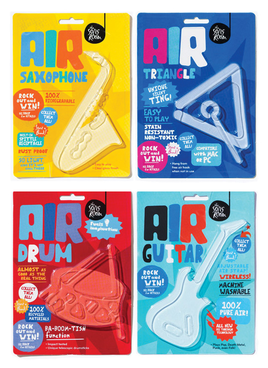 A fine example of what pakaging can do besides just containing and/or selling a product, given by Designworks Melbourne. These air-instruments are part of a ‘Play Air Campagne’, a campaign which helped raise money for an organisation called The Song Room. The Song Room is a charitable organisation who help ensure that underprivileged schools can allow their students to partake in creativity. Deservedly nominated for a Cannes Lions award for Promo & Activation.

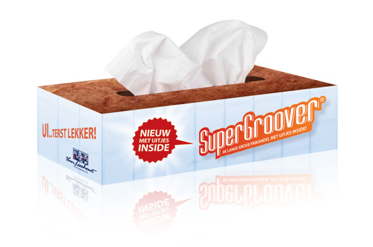 Stepfive developed packaging design (a tissue box) as part of an introduction campaign for a new take on a typical Dutch snack, the Frikandel. This new breed contains onion, so we thought it was appropriate to reach out to anyone eating it by providing free tissues for all those teary eyes. ‘So good, you could cry’.

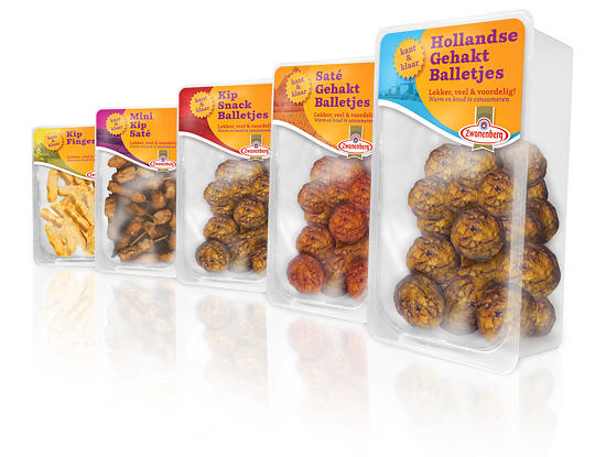 For the Dutch company Zwanenberg Food Group, Stepfive created this serie of packaging labels for a range of tasteful snacks. This graphic and colorful look with much attention to branding and visibility of the products is successfully introduced at the Dutch consumer market.

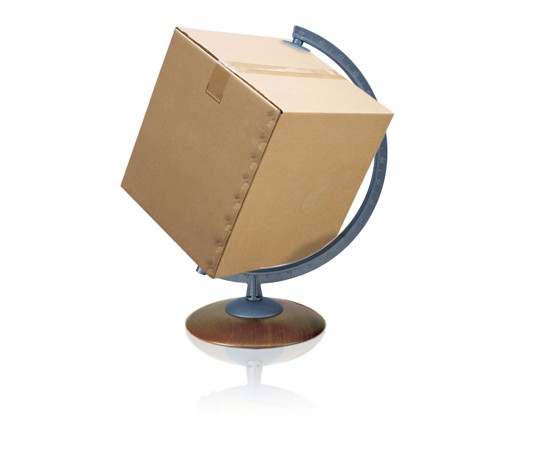 The British Standards Institution, BSI, has launched a new standard to streamline food safety systems between food manufacturers and the packaging they use for their products.
PAS 223—Prerequisite programmes and design requirements for food safety in the manufacture and provision of food packaging—provides a common international methodology for developing a prerequisite program for food and drink packaging safety. PAS 223 aims to bring consistency across global packaging industry practices. It could also potentially reduce tendering costs for packaging manufacturers who adhere to it and as help align packaging activities more closely with their clients’ requirements.
Read more

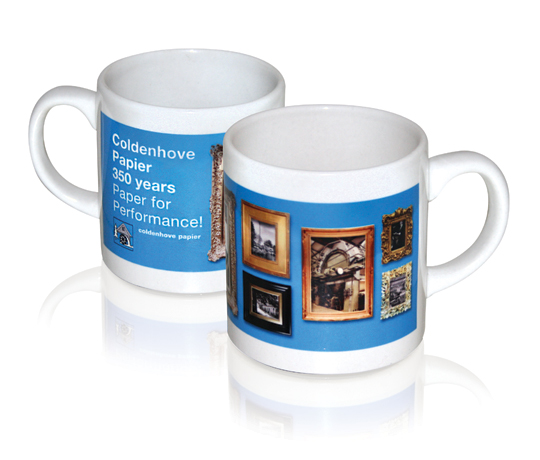 For Coldenhove Paper, Stepfive designed the company’s Stand including the give-away mug, all for the FESPA Digital 2011 in Hamburg. This paper manufactorer develops innovative paper like Digital dye sublimation paper, which is particularly interesting for designers in the field of product-, interior- and packaging design. The mug shows how the sublimation really gets into the material! Its not just a print on a mug, but a print in the actual glaze! Almost every item and material can easily be sublimed with designs you like. It’s solid, sharp and scratch-proof.
Digital dye sublimation is probably the most spectacular innovation of the last decades in the digital graphics industry. This leading-edge application represents the adaptation of advanced digital printing to the conventional process of dye sublimation transfer. By developing a range of transfer papers that offers the highest transfer yield, the best printabillity and runnability, in close co-operation with (amongst others) customers and leading equipment and media manufacturers.
see also: www.coldenhove.com

 Involving designers in new product development leads to greater emphasis on experiential and functional design. Emphasis on experiential and functional design leads to improved new product performance, particularly if designers are given a high degree of freedom to explore ideas outside the project scope, experiential design is innovative, functional design is innovative and customer involvement is limited.
These are some of the findings by the Rotterdam School of Management in collaboration with the Faculty of Industrial Design Engineering.
According to their research, products will be almost 20% more profitable when more attention is being paid to design and visual appearance during development of products.
Click here to download the complete research (PDF).

 Len Ostroff, CEO of Informous, a vertical content marketing search engine for the packaging and plastics industries, pleads for QR codes on packaging:
”If including social media is the packaging trend of today, QR codes are the trend of tomorrow.”
More on smart packaging design and QR codes here, here and here.

As far as our crystal ball can tell us, we present you with what generally is considered as the ‘top five most promising trends in packaging’. We look forward to the day we can look back on this and see what more or less ‘happened’, and what turned out to be total BS. Here we go:
1. Sustainability – reduced packaging material; reusable and refillable packaging; and lighter-weight and biodegradable plastics. The latter reduces transportation costs and the overall carbon footprint.
2. Decorating – “Retro” and “vintage” packaging remains a top decorating trend in 2011. Also popular is packaging with simple, minimalist decorating.
3. Electronic-Enabled Packaging – we will keep on integrating the use of our mobile technology (smart-phones) in our package designs. QR codes will appear more often.
4. Packaging is Shrinking – Packaging is getting smaller because prices of certain materials are increasing. So we shrink because consumers seem to notice price increases more readily than they notice package reduction or weight loss.
5. Made in … – when your offset is mostly situated in the country where you produce, a ‘made in …’ will likely to be seen as an added bonus. It tells that there were little transportation costs involved (sustainability), and makes you think the product suits you better than it’s cousins from the other side of the continent, world, galaxy.
For what it’s worth …
