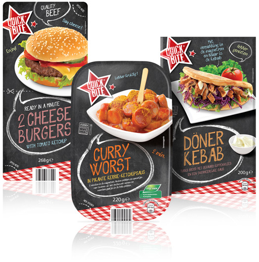
 Want it quick and easy? You can now eat your heart out with the new snackline For Aldi Netherlands: Quick Bite. Stepfive conceptualized this new brand and created the packaging design for several ready-to-eat snack products. These products are packed in different forms and types of packaging with a similar design.
The new snackline also comes with matching shelf ready packaging cardboard carton boxes.


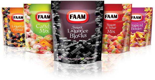 Faam (part of Astra Sweets Ltd.) asked Stepfive to redesign their range of doypack candies with a clear communication of the product(s) inside. This new packaging design therefore has an important role for product photography in order to establish a maximum of impulse purchase and is appealing to young and old, man and woman.

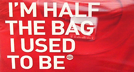 At Dutch website Groene Offerte you’ll find loads of interesting packaging design related articles, opinions and other stuff (all in Dutch). Especially the serie ‘Food for Thought’ gives entertaining and remarkable examples of packaging design in all its aspects, good or bad.
Groene Offerte is established for the complete design industry. The site is set up to grow: more and more contacts, knowledge and new insights. In this way Groene Offerte wants to help and encourage the design industry with their key role of this industry in the sustainable development of society and economy.
Food for Thought at Groene Offerte (all in Dutch).

With a superb show, Heineken showed their latest invention at this year’s Milan Design Week: an interactive bottle to re-invent your night out!
Cool.

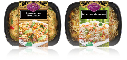 A new branding and an optimized design on the sleeves of Aldi’s packaging design for their Oriental Delight ready to eat meals. The sleeves contain a tasteful product visual underneath the striking new branding and have all the legal information on its bottom. To be sold in Aldi Netherlands.

 An inspiring and interesting brand new book by Dutch publisher BIS Publishers out this month about ‘the essence of retail branding and design’.
”Retail mirrors society and as society is constantly changing, retail has to be able to anticipate these changes in order to maintain its right of existence. In short; act, react or suffer! This book covers all the facets of retail branding, holistic formula development and the essential one-to-one relationship with your customers.” -> Buy at BIS Publishers or view large and read at ISSUU

 The more we consume, the bigger the pile of waste we leave behind. (…) Smart and edible packaging: the best examples. Read and see all of it in the first online international edition of ‘Food Inspiration Magazine’. Beautiful designed and loads of interesting stuff on food, packaging and everything else that connects with food one way or another.
Food Inspiration Magazine: Connecting through food.

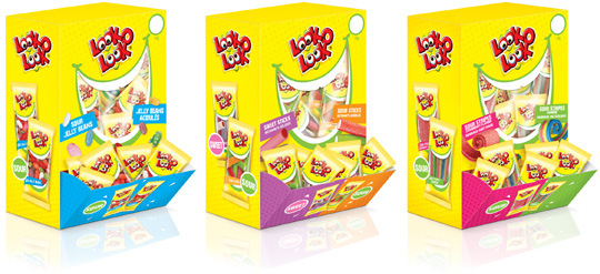 Look-O-Look, the Dutch candy producer with ‘The most delicious candies in one bag’ asked Stepfive Communication & Design to create candy boxes for the Out of Home segment. Each box is filled with 75 mini flowpacks in different flavours. Concept and packaging design of the boxes and mini flowpacks are integrated within the current line of Look-O-Look’s mixbags and familybags, which are done by Stepfive too.

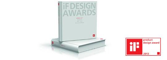 The iF product design award was introduced in 1954. Each year the iF award attracts more than 2000 entries from 37 countries, which are then judged by experts in the respective fields. This Product and Material yearbook features the best in international product design, focusing on newly developed materials and the innovative use of existing materials.

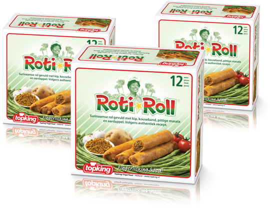 For Topking Fingerfood in The Netherlands, Stepfive created a packaging design and branding for the ‘Roti-Roll®’. This brand new product is a Surinam roll filled with chicken, long beans, spicy masala and potato and is aimed at the foodservice and cash & carry market. The packaging and logo are made in fresh colours with reference to the Surinam national colours. The typical recognizable Topking branding with the red line is also integrated. Fingerlicking good!


