January 31st, 2013 | 05:00 pm
 A niche topic, a clear defined target group, a sharp program content, up to 80 stand units, a low entry fee et voilá, the ingredients that’ll make ‘Foodpacking Event 2013’ into a special event. The exhibition will take place on October 9 and 10 (Wednesday and Thursday) and will be held in ‘High Five’ in the ‘Jaarbeurscomplex’ in Utrecht, The Netherlands.
This event has been given the subtitle: High knowledge event on packaging in the food industry.
Read more here (Dutch).
TAGS: Dutch, exhibition, food, food industry, innovation, Jaarbeurscomplex, Netherlands, packaging design, Stepfive
POSTED IN food, legislation, non food | no comments »
January 25th, 2013 | 12:27 pm
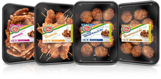
 Chickenfingers, mini chicken skewers, Dutch meatballs and meatballs satéh. Four new products by Kips (a brand of Zwanenberg Food Group) of which Stepfive created packaging labels for. The labels have unique colours for each product and are placed right in the middle so there’s still a good spot on the delicious snacks.
TAGS: Dutch, food, Kips, Netherlands, packaging design, retail, Stepfive, Zwanenberg Food Group
POSTED IN food | no comments »
January 11th, 2013 | 12:55 pm
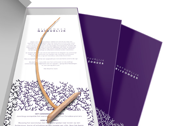
 As we’re used to each end of the year, we created a special gift last december to send to our clients and other relations for the successful cooperation in 2012. This year we designed an extraordinary box named ‘Bijzonder Natuurlijk’ (‘Especially Naturally’ in English) with a specific Canadian piece of wood in it, able to predict the weather: a natural barometer.
Curious for more? Check the latest and past projects for our clients over there.
POSTED IN food | no comments »
January 04th, 2013 | 04:40 pm
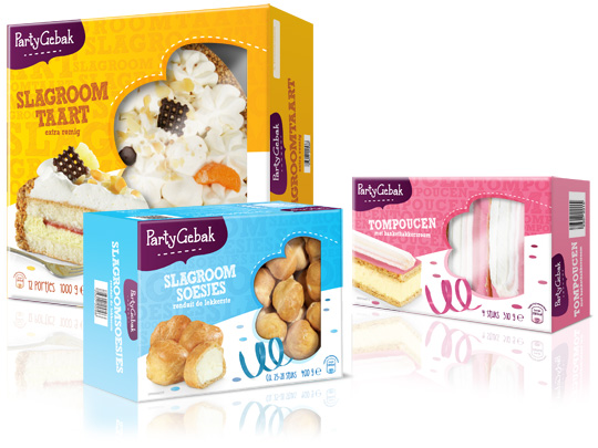
 Throwing a party? Make it extra festive with Aldi’s ‘PartyGebak’ (Party Pastries). Stepfive created the new packaging design for the complete range of PartyGebak products in The Netherlands and also created the new branding.
A visually appealing, festive and joyous packaging design that lightens up every party and any other moment of fun.
TAGS: Aldi, brand creation, brand identity, Dutch, food, Netherlands, packaging design, retail, Stepfive
POSTED IN food | no comments »
December 21st, 2012 | 04:55 pm
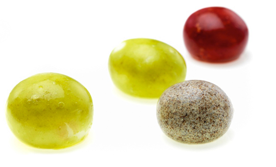
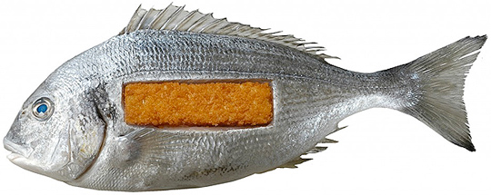
 Few people eat an orange peel, but it is edible. We do eat the peels of other fruits, like peaches and apples. The peel is a kind of durable, biodegradable packaging. The fact that these fruits come in their own built-in packaging is convenient. It means they do not have to be sold in boxes or bags.
That idea is the inspiration behind a company that David Edwards has founded. He wants to change the way we package and eat food. His vision is that one day you will go to the supermarket and, instead of buying cartons of juice and cans of soup, you will fill your cart up with balls of food and drink.
Read the rest of this entry »
TAGS: Dutch, edible, food, fruit, packaging design, Stepfive
POSTED IN food | no comments »
December 14th, 2012 | 04:32 pm
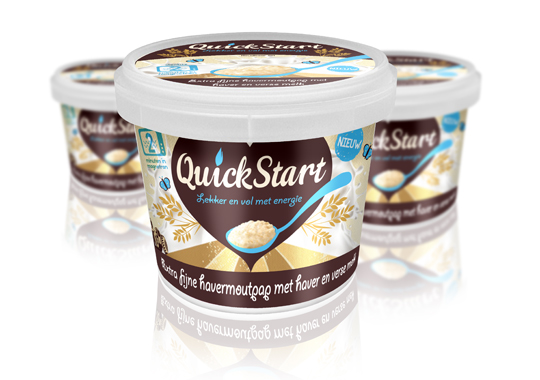
 For the launch of a ready-to-eat Oat Porridge concept to the Dutch market, we devised the name ‘QuickStart’ and the pay-off. The name describes a quick preparation and the moment of consumption. It’s based on Kickstart, so there’s a strong reference to terms like ‘energy boost’ and, besides that, it’s multilingual as well. This fashionable name will easily fit between similar products on the shelves.
TAGS: Dutch, oatmeal, packaging design, quickstart, retail, Stepfive
POSTED IN food | no comments »
November 30th, 2012 | 01:22 pm
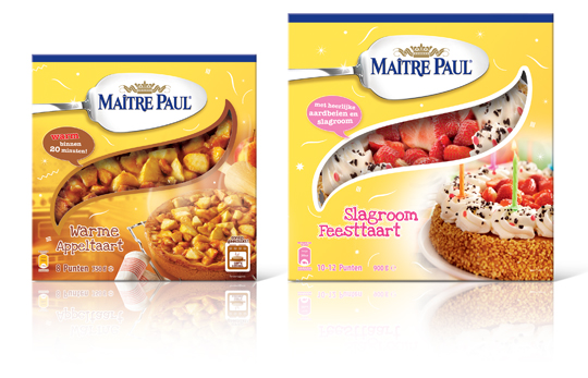
 Stepfive created this packaging design for Maître Paul’s Warme Appeltaart (Warm Apple Pie) and Slagroom Feesttaart (Party Cream Cake). The design for the apple pie box is a combination of the recognizable Maître Paul yellow color and a warm productvisual with an oven in the background. The cream cake box is also a combination of Maître Paul’s yellow color, with colorful and festive productvisuals of the cream cake added. The boxes are decorated with fun white graphics.
TAGS: Dutch, Maître Paul, Netherlands, packaging design, pie, retail, Stepfive
POSTED IN food | no comments »
November 14th, 2012 | 01:26 pm
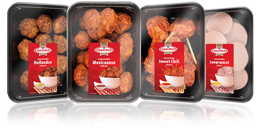
 For the Dutch company Zwanenberg Food Group, Stepfive created this serie of packaging labels for a range of tasteful snacks. The bright red color used in all labels really draws your attention and makes the packages stand out on store shelves.
TAGS: Dutch, food, Netherlands, packaging design, retail, snacks, Stepfive, Zwanenberg Food Group
POSTED IN food | no comments »
October 30th, 2012 | 11:24 am
 In De Etende Mens (Food Culture: Eating by Design) Premsela explores how design can enable us to make the changes to our food chain that are necessary to ensure a healthy future. Mediamatic’s High Density Aquaponics Edifice and the Diesel Kantine (a collaboration with João Negro) are featured in the exhibition.
The exhibition De Etende Mens showcases work by designers who concern themselves with the relationship between design, food, and (the origins of) what we eat. Curated by Marije Vogelzang, the works on display map people’s complex relationship with food and make visitors aware of how our food is produced.
Throughout the year, Premsela offers educational activities in connection with the Designhuis exhibitions for students in Dutch secondary and higher education. De Etende Mens is on view until January 6, 2013 at the Designhuis in Eindhoven. The exhibition is open from Tuesday till Sunday, from 11.00-18.00. Entrance fee is 5,-. Go to the Designhuis website for more information.
TAGS: Designhuis, Dutch, exhibition, food, packaging design, Premsela, Stepfive
POSTED IN bno, food, non food | no comments »

October 11th, 2012 | 08:31 am
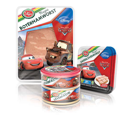
 The packaging design for Disney Cars baloney and liver paté was created by Stepfive, commissioned by Zwanenberg Food Group. This delicious sandwich filling for children appeals not only to the youngest ones. Due to it’s strong presence, it also looks very desirable on the shelf. Disney Cars makes lunch and breakfast even more fun!
TAGS: cars, disney, Dutch, Kips, packaging design, retail, Stepfive, Zwanenberg Food Group
POSTED IN food | no comments »
 A niche topic, a clear defined target group, a sharp program content, up to 80 stand units, a low entry fee et voilá, the ingredients that’ll make ‘Foodpacking Event 2013’ into a special event. The exhibition will take place on October 9 and 10 (Wednesday and Thursday) and will be held in ‘High Five’ in the ‘Jaarbeurscomplex’ in Utrecht, The Netherlands.
