December 23rd, 2016 | 11:15 am
 Just hear those sleigh bells jingle-ing, Ring ting tingle-ing too.
Come on, it’s lovely weather, For a sleigh ride together with you!
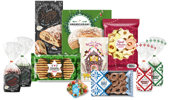
It’s Christmas time again and just as last year Aldi Netherlands asked Stepfive to create a series of concepts for their 2016 Christmas packaging design. This resulted in a wide range of different designs, all with that special time of the year feel.
==
Just hear those sleigh bells jingle-ing, Ring ting tingle-ing too.
Come on, it’s lovely weather, For a sleigh ride together with you!
Het is alweer Kerstmis en net zoals vorig jaar heeft Aldi Nederland Stepfive gevraagd concepten te creëren voor hun Kerst packaging design. Dat heeft geresulteerd in een uitgebreide lijn van verschillende designs, allemaal met het speciale gevoel dat bij deze tijd van het jaar hoort.
TAGS: Aldi, christmas, Dutch, food, Netherlands, packaging design, Stepfive
POSTED IN food | no comments »
December 21st, 2016 | 03:50 pm
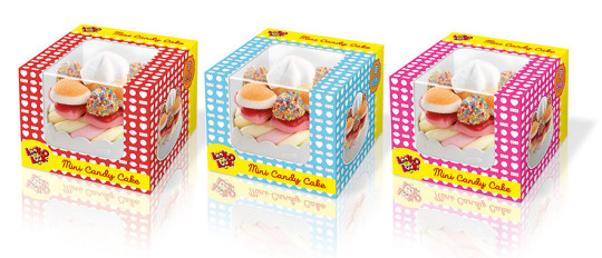
In the past few months Stepfive collaborated with Look-O-Look on the packaging design for the Mini Candy Cake, a tasteful candy treat shaped like a small cake. With this design we found the balance between a candy wrapper and the recognizable design of a pastry box. The visibility of the product is of great importance in this design , hence the transparent window on the front of the box extending to the top. The boxes come in the colors red, light blue and pink.
The cake boxes have a storage function and can (when the cake has been eaten) still be used to play with.
==
Afgelopen maanden heeft Stepfive samen met Look-O-Look mogen werken aan de verpakking van de Mini Candy Cake, een smaakvolle snoeptraktatie in de vorm van een klein taartje. In het packaging design hebben wij de balans gevonden tussen een snoepverpakking en de herkenbare vormgeving van een taartverpakking. Vooral de zichtbaarheid van het product is van groot belang, vandaar dat het zichtvenster van de voorzijde doorloopt naar de bovenzijde. De doosjes zijn uitgevoerd in rood, lichtblauw en roze.
De taartdoosjes hebben een bewaarfunctie en kunnen (als het taartje is opgegeten) nog gebruikt worden om mee te spelen.
TAGS: candy, Dutch, Look-O-Look, Netherlands, packaging design, Stepfive
POSTED IN food | no comments »

October 21st, 2016 | 02:09 pm
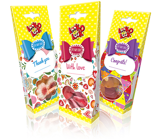 Stepfive conceptualized and created the look & feel for the packaging design of Look-O-Looks new line that goes under the name ‘Give Away Candy’. Each bag has its own colour coded bow tie and cheerful illustrations on the front in combination with unique and large windows for great product visibility. Five different designs for five different moments, because there’s always something to celebrate.
These Give Away Candy bags were also created for Chupa Chups international by Stepfive.
==
Stepfive ontwikkelde voor Look-O-Look het packaging design voor een nieuwe lijn snoep, genaamd ‘Give Away Candy’. Elk zakje heeft in de strik voorop zijn eigen kleurcodering en vrolijke illustraties in combinatie met een uniek, groot venster voor optimale product zichtbaarheid. Vijf verschillende designs voor vijf verschillende momenten, want er is altijd wel iets te vieren.
Deze Give Away Candy zakjes zijn ook door Stepfive gecreëerd voor Chupa Chups international.
TAGS: candy, Dutch, Look-O-Look, Netherlands, packaging design, Stepfive
POSTED IN food | no comments »

September 23rd, 2016 | 01:55 pm
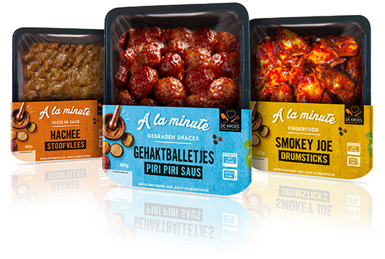 Stepfive designed a series of twenty sleeves commissioned by De Kroes for their ready-to-eat fingerfood, meat in sauce and fried snacks. The packaging design sleeves have an authentic look with its background of a plaster wall, the specific use of colour and the somewhat retro typography. This large new line goes by the name ‘A la minute’ and is for sale in several supermarkets in The Netherlands.
==
In opdracht van De Kroes heeft Stepfive een serie van twintig sleeves ontwikkeld voor hun ready-to-eat fingerfood, gebraden vlees en vlees in saus. De sleeves hebben door het gebruik van de gepleisterde wand op de achtergrond, het specifieke kleurgebruik en de retro typografie een authentieke look. Deze uitgebreide nieuwe lijn heeft de naam ‘A la minute’ mee gekregen en is te koop bij de grotere supermarkten in Nederland.
TAGS: Dutch, Fingerfood, Netherlands, packaging design, Stepfive, supermarket
POSTED IN food | no comments »
July 29th, 2016 | 01:59 pm
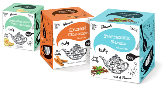 New tea boxes packaging design for Xenos Netherlands commissioned by Axxent Masters in Tea, made by Stepfive. A complete range of 24 flavours in a fresh and modern illustrative, typographic look. The tea envelopes inside are designed and coloured in accordance with the outer box.
==
Nieuw packaging design van theedoosjes voor Xenos Nederland in opdracht van Axxent Masters in Tea. Een volledige lijn van 24 smaken is opgezet in een modern frisse en typografische look. Ook de thee envelopjes in de theedoosjes zijn in dezelfde stijl en kleur opgezet.
TAGS: axxent, Dutch, Netherlands, packaging design, Stepfive, tea, xenos
POSTED IN food | no comments »
June 24th, 2016 | 11:37 am
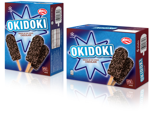
 The past few months Stepfive conceptualized and created a whole bunch of new ice cream packaging design for Aldi Netherlands. The one showed above has a double facing (and so has all the rest of the ice cream packaging), an eye catching and strong typography for the productname and tasteful visuals on front. This ice cream packaging design and all the others created by Stepfive are in store now.
==
De afgelopen maanden heeft Stepfive een hele reeks concepten voor ijsverpakkingen uitgevoerd voor Aldi Nederland. De verpakking hierboven is voorzien van een dubbele facing (net zoals alle andere verpakkingen), heeft een opvallende typografie voor de productnaam en smakelijke visuals. Deze en alle andere ijsverpakkingen die door Stepfive zijn ontwikkeld zijn nu te koop.
TAGS: Aldi, chocolate, Dutch, food, ice cream, mucci, Netherlands, packaging design, Stepfive
POSTED IN food | no comments »
May 27th, 2016 | 11:33 am
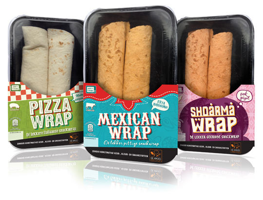
 New packaging design for all kind of different ready-to-eat wraps for De Kroes have been designed by Stepfive. The carton sleeves have a strong graphic, colourful and typographic look, based on the country of origin. Only half of the product is covered by the sleeve, which results in a high product visibility. The wraps are for sale in supermarkets in The Netherlands like Albert Heijn.
==
Nieuw packaging design voor verschillende soorten ready-to-eat wraps van De Kroes is ontwikkeld door Stepfive. De kartonnen sleeves zijn grafisch sterk, opvallend van kleur en typografie die in vorm zijn gebaseerd op het land van herkomst. Alleen de onderzijde van het product wordt door de sleeve omvat, waardoor er een goede zichtbaarheid van het product ontstaat. De wraps worden in Nederland verkocht bij o.a. de Albert Heijn.
TAGS: Albert Heijn, De Kroes, Dutch, food, graphic design, Netherlands, packaging design, Stepfive
POSTED IN food | no comments »
March 04th, 2016 | 03:15 pm
 For Best Life animal food, a Dutch company, Stepfive created packaging design for a complete range of high quality dog and cat food. Small doy packs for small weights, big bags for the heavy weights and everything in between with a clear colour signing and paw prints. This packaging design is developed in collaboration with ‘De Dierenbescherming’, the Dutch authority on animal welfare and therefor meets all the requirements Dutch animal welfare demands.
==
Voor Best Life dierenvoeders heeft Stepfive het packaging design ontwikkeld voor een volledige range hoge kwaliteit honden- en kattenvoer. Kleine doypacks, grote zakken en alles daar tussenin met een heldere kleurcodering en pootafdrukken. Deze verpakkingslijn is opgezet in nauwe samenwerking met De Dierenbescherming en voldoet daarom aan alle eisen die er aan dierenwelzijn en de daar bijbehorende verpakkingen gesteld worden.
TAGS: animal, Animal Welfare Institute, Dierenbescherming, Dutch, food, Netherlands, packaging design
POSTED IN food | no comments »

January 15th, 2016 | 04:12 pm
 New packaging design for three new chocolate cookies with filling for Dutch company Nora Biscuits. Designed in a classic style, this packaging has tasteful visuals and a strong specific colour setting for caramel, hazelnut and milk cream. For German market only.
==
Nieuw packaging design voor drie nieuwe gevulde chocolade koekjes van Nora Biscuits uit Maastricht. De verpakking is klassiek van opzet, met smakelijke productvisuals en een sterke kleurcodering voor de drie smaken, caramel, hazelnoot en melk crème. Voor de Duitse markt.
TAGS: chocolate, cookies, Dutch, Netherlands, Nora Biscuits, packaging design, Stepfive
POSTED IN food | no comments »
November 06th, 2015 | 04:25 pm
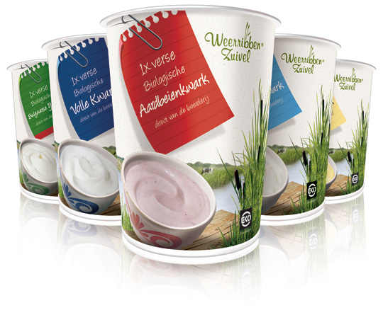
 ”Weerribben Zuivel BV has won the National Business Success Award 2015 in the Dutch dairy industry. According to the nomination committee, the company became one of the most significant dairy producers in the Netherlands, with a very strong position in a relatively short time.”
Stepfive created the packaging design for them. See some examples here.
Read more about this bio-award here.
==
”Weerribben Zuivel BV is door de Nationale Business Succes Award uitgeroepen tot branchewinnaar 2015 in de melkvee/ zuivelbranche. Het bedrijf heeft zich volgens de Nominatiecommissie in betrekkelijk korte tijd ontwikkeld tot één van de meest markante zuivelproducenten van Nederland, met een zeer sterke positionering.”
Stepfive heeft het packaging design voor hen ontwikkeld. Voorbeelden hiervan vind u hier.
Meer over deze bio-award leest u hier.
TAGS: Award, Dutch, Netherlands, packaging design, Weerribben
POSTED IN food | no comments »
 Just hear those sleigh bells jingle-ing, Ring ting tingle-ing too.

 Stepfive conceptualized and created the look & feel for the packaging design of Look-O-Looks new line that goes under the name ‘Give Away Candy’. Each bag has its own colour coded bow tie and cheerful illustrations on the front in combination with unique and large windows for great product visibility. Five different designs for five different moments, because there’s always something to celebrate.
 Stepfive designed a series of twenty sleeves commissioned by De Kroes for their ready-to-eat fingerfood, meat in sauce and fried snacks. The packaging design sleeves have an authentic look with its background of a plaster wall, the specific use of colour and the somewhat retro typography. This large new line goes by the name ‘A la minute’ and is for sale in several supermarkets in The Netherlands.
 New tea boxes packaging design for Xenos Netherlands commissioned by Axxent Masters in Tea, made by Stepfive. A complete range of 24 flavours in a fresh and modern illustrative, typographic look. The tea envelopes inside are designed and coloured in accordance with the outer box.