August 02nd, 2018 | 04:23 pm
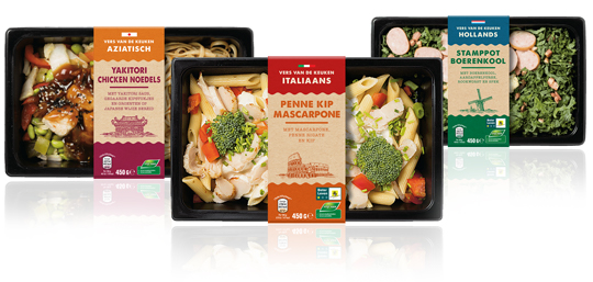 A complete new designed series of sleeves for Aldi Netherlands for their private label ‘Vers van de Keuken’, which means fresh from your kitchen. The packaging design sleeves have an authentic feel with the used typography and craft paper look. The iconic images emphasises, in combination with the signal colours, the country of origin of the meals inside.
==
Een geheel nieuwe serie sleeves voor Aldi Nederland voor het private label ‘Vers van de Keuken’. De sleeves hebben een authentieke uitstraling door de gebruikte typografie en de look van kraft papier. De iconische afbeeldingen benadrukken, in combinatie met de gebruikte signaalkleuren, de herkomst van de maaltijden.
TAGS: Aldi, Dutch, food, graphic design, packaging design
POSTED IN food | no comments »
June 25th, 2018 | 11:34 am
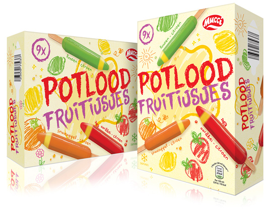 A new ice cream in the Aldi range means a new packaging design. For these fruity colour pencils ice creams by Mucci, Stepfive created a playful packaging design, fully in line with the product in the box. A pencil written typography and line drawings of fruit which are hatched with different color pencils, together with the tasty productvisuals are the ingredients of this cheerful, summery design.
==
Een nieuw ijsje in het Aldi assortiment betekent een nieuw packaging design. Voor deze fruit kleurpotloodijsjes van Mucci heeft Stepfive een speels packaging design gecre�erd, geheel in overeenstemming met het product in de doos. Een potlood typografie en lijntekeningen van fruit die zijn gearceerd met verschillende kleurpotloden vormen samen met de lekkere productvisuals de ingredi�nten van dit vrolijke, zomerse ontwerp.
TAGS: Aldi, Dutch, ice cream, mucci, Netherlands, packaging design, Stepfive
POSTED IN food | no comments »
November 20th, 2017 | 11:07 am
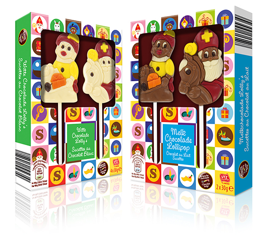 Each year at the end of november, St. Nicholas is coming to The Netherlands, Belgium en parts of Germany. All the way from Spain as the story goes. We celebrate his birthday on the 5th of december. A great time of the year for children, because he’s bringing presents, candy and chocolate together with personalised poems.
For Aldi Belgium we created cheerful and colourful St. Nicholas packaging design, built around icons which represent typical St. Nicholas features such as presents, Nicholas’ horse Amerigo, black Pete’s baret, a shoe with carrots and chocolate letters. This packaging design is developed for white and milk chocolate St. Nicholas lollipops.
==
Elk jaar eind november komt Sinterklaas weer aan in Nederland, Belgi� en delen van Duitsland. Helemaal vanuit Spanje, zoals het verhaal gaat. Op 5 december vieren we pakjesavond. Een fantastische periode voor de kinderen, want hij brengt weer veel cadeau’s, snoep en chocola en een mooi persoonlijk gedicht.
Voor Aldi Belgi� hebben we een vrolijk en kleurrijk packaging design gecre�erd, dat is opgebouwd uit iconen die de verschillende typische Sinterklaas items weergeven, zoals cadeautjes, een zwarte Pieten baret, wortels in een schoen en chocolade letters. Het is ontwikkeld voor witte en melkchocolade Pieten en Sinterklazen.
TAGS: Aldi, children, chocolate, Martinez Chocolade, Netherlands, packaging design, Sinterklaas, St. Nicholas, St. Nicolaas, Stepfive
POSTED IN food | no comments »

October 26th, 2017 | 10:46 am
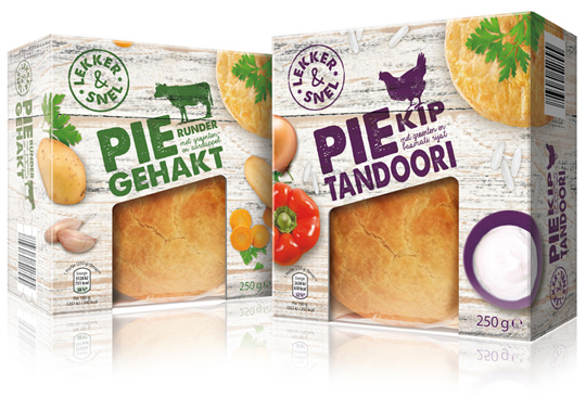 A couple of years ago, we developed the private label Smakelijk Gemak for Aldi NL and now it was about time for something new. Chosen is for an entirely new name, branding and packaging design. All this is developed by Stepfive, with which the new private label ‘Lekker & Snel’ was created, which is now going to be introduced in phases.
The packaging design always consists of a base of wood structure, which is used in different shapes and colors for the various products. The tasteful photography of both the product and the ingredients is shot with the perspective from above. Combined with the solid looking typography and use of woodcut illustrations, there is an effective, new packaging design that is completely contemporary.
==
Enkele jaren geleden hebben wij voor Aldi NL het private label Smakelijk Gemak ontwikkeld, dat na al die tijd wel weer eens toe was aan een opfrisbeurt. Gekozen is voor een geheel nieuwe naamstelling, branding en bijbehorend packaging design. Dit alles is door ons in huis ontwikkeld, waarmee het nieuwe private label ‘Lekker & Snel’ is ontstaan, dat nu gefaseerd ingevoerd gaat worden. Het verpakkingsdesign bestaat altijd uit een basis van houtstructuur, die in verschillende vormen en kleuren voor de diverse producten wordt gebruikt. De smakelijke fotografie van zowel het product als de ingredi�nten valt op door het perspectief van bovenaf. In combinatie met de stevig en ambachtelijk ogende typografie en het gebruik van houtsnede illustraties staat er een doeltreffend, nieuw packaging design dat weer helemaal van nu is.
TAGS: Aldi, brand identity, Dutch, food, Lekker & Snel, Netherlands, packaging design, smakelijk gemak, Stepfive, typography
POSTED IN food | no comments »

September 08th, 2017 | 11:26 am
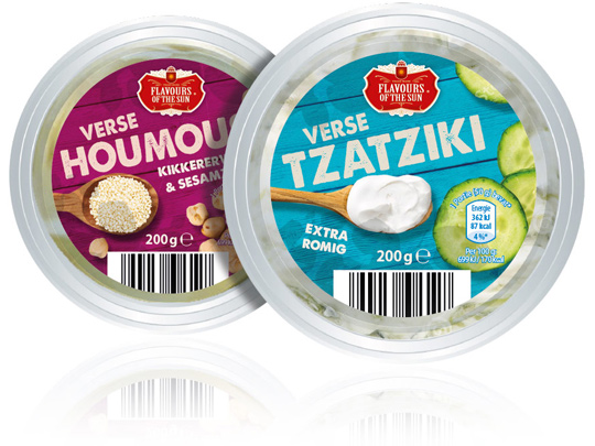 Stepfive was asked by Aldi Netherlands to redesign their private label Flavours of the Sun. A few years ago Stepfive already developed the name, branding and packaging design and now it was about time for something new. The packaging design is enriched with intense and bright colors that refer to the countries of the South. The wooden texture in the background and the tasteful photography of ingredients makes this restyle complete.
==
Aldi Nederland heeft Stepfive gevraagd een redesign aan het private label Flavours of the Sun te geven. Nadat Stepfive voor dit merk enkele jaren geleden al de naamstelling, branding en het packaging design had ontwikkeld, was het merk toe aan een opfrisbeurt. Het verpakkingsdesign is verrijkt met intense en heldere kleuren die refereren aan de zuidelijke landen. De houtstructuur op de achtergrond en de smaakvolle fotografie van ingredi�nten maken deze restyle helemaal af.
TAGS: Aldi, Dutch, Flavours of the Sun, Netherlands, packaging design, rebranding, redesign, Stepfive
POSTED IN food | no comments »

December 23rd, 2016 | 11:15 am
 Just hear those sleigh bells jingle-ing, Ring ting tingle-ing too.
Come on, it’s lovely weather, For a sleigh ride together with you!
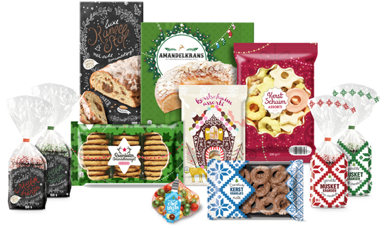
It’s Christmas time again and just as last year Aldi Netherlands asked Stepfive to create a series of concepts for their 2016 Christmas packaging design. This resulted in a wide range of different designs, all with that special time of the year feel.
==
Just hear those sleigh bells jingle-ing, Ring ting tingle-ing too.
Come on, it’s lovely weather, For a sleigh ride together with you!
Het is alweer Kerstmis en net zoals vorig jaar heeft Aldi Nederland Stepfive gevraagd concepten te cre�ren voor hun Kerst packaging design. Dat heeft geresulteerd in een uitgebreide lijn van verschillende designs, allemaal met het speciale gevoel dat bij deze tijd van het jaar hoort.
TAGS: Aldi, christmas, Dutch, food, Netherlands, packaging design, Stepfive
POSTED IN food | no comments »
June 24th, 2016 | 11:37 am
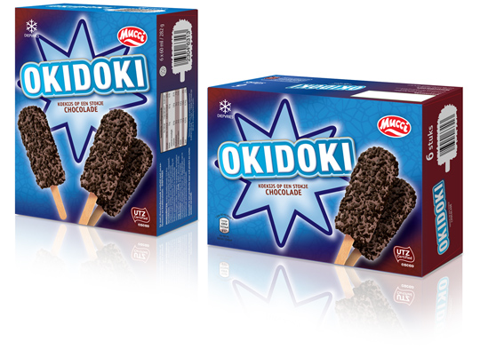
 The past few months Stepfive conceptualized and created a whole bunch of new ice cream packaging design for Aldi Netherlands. The one showed above has a double facing (and so has all the rest of the ice cream packaging), an eye catching and strong typography for the productname and tasteful visuals on front. This ice cream packaging design and all the others created by Stepfive are in store now.
==
De afgelopen maanden heeft Stepfive een hele reeks concepten voor ijsverpakkingen uitgevoerd voor Aldi Nederland. De verpakking hierboven is voorzien van een dubbele facing (net zoals alle andere verpakkingen), heeft een opvallende typografie voor de productnaam en smakelijke visuals. Deze en alle andere ijsverpakkingen die door Stepfive zijn ontwikkeld zijn nu te koop.
TAGS: Aldi, chocolate, Dutch, food, ice cream, mucci, Netherlands, packaging design, Stepfive
POSTED IN food | no comments »
August 28th, 2015 | 03:13 pm
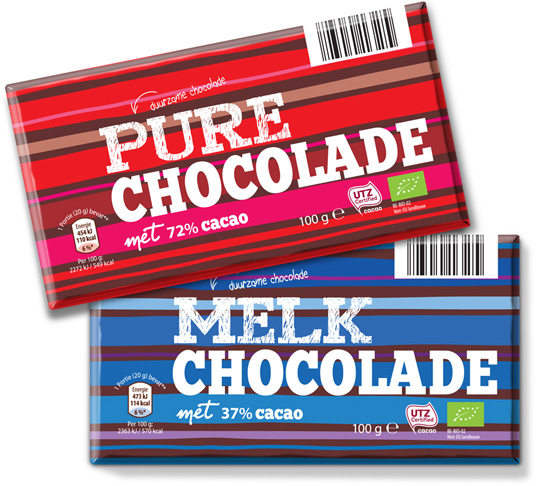
 Awareness and sustainability are written large for private label Mama Nature and are not seen as a necessary evil by them. Together with this colorful and strong graphic packaging design conceptualized by Stepfive, Aldi Netherlands brings another desirable article into its chocolate range.
==
Bewustzijn en duurzaamheid staan hoog in het vaandel bij private label Mama Nature en worden niet gezien als noodzakelijk kwaad. Samen met het sterk grafische en kleurrijke verpakkingsdesign van Stepfive kan Aldi Nederland weer een heerlijk product toevoegen aan haar totale chocolade range.
TAGS: Aldi, bio, chocolate, Dutch, eco, Netherlands, packaging design, Stepfive, sustainability
POSTED IN food | no comments »
August 24th, 2015 | 02:17 pm
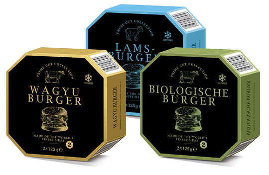
 Stepfive created the packaging design for a range of high quality burgers for Aldi. Each different burger is packed in a luxurious box with eight sides and has its own specific colour setting. Classy and trendy design for premium quality meat.
==
Stepfive heeft voor Aldi het packaging design gecre�erd voor een range burgers van hoge kwaliteit. De verschillende soorten burgers zijn verpakt in een luxueus doosje met acht zijden en hebben elk hun eigen kleurcodering. Stijlvol en trendy design voor premium kwaliteit vlees.
TAGS: Aldi, brand identity, Dutch, Netherlands, packaging design, Stepfive
POSTED IN food | no comments »
May 29th, 2015 | 02:50 pm
 A cool and modern look with a high ‘eco-feel’, that’s what Aldi Netherlands wanted to create for a new chocolate bar for their chocolate private label Ch�teau. And see: Choco Cooky and Choco Biscy were born. Packaging with a strong purple color, product color signing and fashionable hipster typography.
==
Een moderne verpakking met een ‘eco-feel’, dat is wat Aldi Nederland wilde neerzetten met de nieuwe chocoladereep voor het private label Ch�teau. Et voil�: Choco Cooky en Choco Biscy werden geboren. Een verpakking met een sterke paarse basiskleur, smaakcodering en hippe typografie van nu.
TAGS: Aldi, Chateau, chocolate, Dutch, eco, hipster, Netherlands, packaging design, typography
POSTED IN food | no comments »
 A complete new designed series of sleeves for Aldi Netherlands for their private label ‘Vers van de Keuken’, which means fresh from your kitchen. The packaging design sleeves have an authentic feel with the used typography and craft paper look. The iconic images emphasises, in combination with the signal colours, the country of origin of the meals inside.
 A new ice cream in the Aldi range means a new packaging design. For these fruity colour pencils ice creams by Mucci, Stepfive created a playful packaging design, fully in line with the product in the box. A pencil written typography and line drawings of fruit which are hatched with different color pencils, together with the tasty productvisuals are the ingredients of this cheerful, summery design.
 Each year at the end of november, St. Nicholas is coming to The Netherlands, Belgium en parts of Germany. All the way from Spain as the story goes. We celebrate his birthday on the 5th of december. A great time of the year for children, because he’s bringing presents, candy and chocolate together with personalised poems.
 Stepfive was asked by Aldi Netherlands to redesign their private label Flavours of the Sun. A few years ago Stepfive already developed the name, branding and packaging design and now it was about time for something new. The packaging design is enriched with intense and bright colors that refer to the countries of the South. The wooden texture in the background and the tasteful photography of ingredients makes this restyle complete.