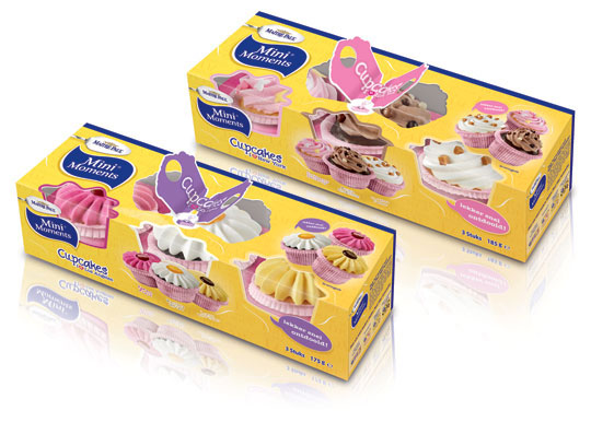
 Stepfive created this packaging design for Maître Paul’s Cupcakes. The goal was to create a visually appealing and festive package which could be presented like, as it were, a real gift. Maître Paul’s Cupcakes are the perfect treat for those special little moments. They are nice to give and fun to get! There are three cupcakes per package and you can choose from two different cupcake styles: New York Cupcakes and Los Angeles Cupcakes.


 Again a wonderfull asset for our bookshelf, “packed” with inspiration: THE ART OF PACKAGE DESIGN. A recent assembly of international designers is creating highly outstanding and savvy designs to complement the nature and function of a product. Editor Wendy Xu included the Atelier LaDurance Japanese Denim packaging in the publication that is about innovative packaging designs that functions beyond ‘simply product wrappers’. A creative treasure published by Gingko Press: www.gingkopress.com


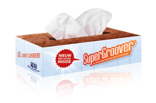 Stepfive developed packaging design (a tissue box) as part of an introduction campaign for a new take on a typical Dutch snack, the Frikandel. This new breed contains onion, so we thought it was appropriate to reach out to anyone eating it by providing free tissues for all those teary eyes. ‘So good, you could cry’.

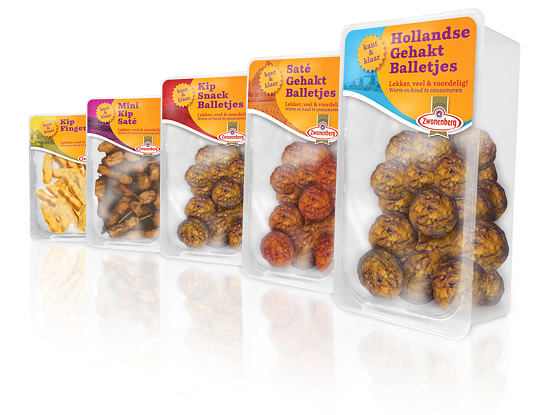 For the Dutch company Zwanenberg Food Group, Stepfive created this serie of packaging labels for a range of tasteful snacks. This graphic and colorful look with much attention to branding and visibility of the products is successfully introduced at the Dutch consumer market.

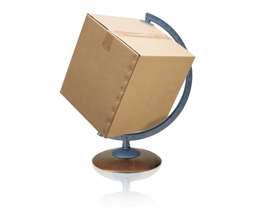 The British Standards Institution, BSI, has launched a new standard to streamline food safety systems between food manufacturers and the packaging they use for their products.
PAS 223—Prerequisite programmes and design requirements for food safety in the manufacture and provision of food packaging—provides a common international methodology for developing a prerequisite program for food and drink packaging safety. PAS 223 aims to bring consistency across global packaging industry practices. It could also potentially reduce tendering costs for packaging manufacturers who adhere to it and as help align packaging activities more closely with their clients’ requirements.
Read more

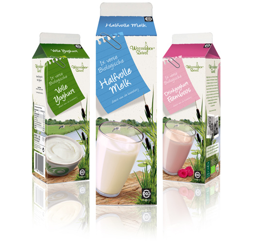 Following to this restyling, a similar fresh and natural packaging design was created by Stepfive of milk and drinks for Dutch company Weerribben Zuivel. The visuals on the packaging are showing us the origin of the milk and drinks: National Park ‘De Weerribben’ in The Netherlands with its characteristic feather reed grass. The coloured shopping list is a powerful asset to match all twelve products into a coherent range.

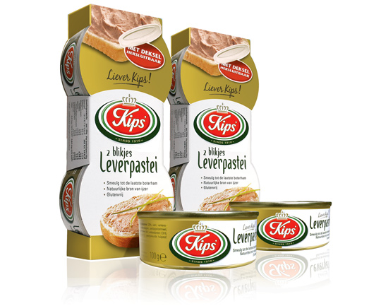 For the Dutch company Kips’, who actually celebrate their 100th anniversary this year, Stepfive created a golden packaging design for their tins with excellent liver pâté. This exclusive and tasteful look with much attention to branding and product experience is successfully introduced at the Dutch consumer market. Kips’ is part of Zwanenberg Food Group.

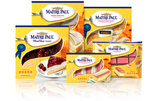 Preliminary to the rebranding of Carnaby into Maître Paul Professional, the whole range of Maître Paul’s pie boxes itself were renewed too. For the Dutch, French, English and German consumer market a new bright and yellow packaging design with a friendly festive and yet high-quality look was developed by Stepfive. The new boxes also have a renewed locking system and smaller windows to prevent them from freezing. This succesfull new packaging line includes seventeen flavors in various formats.

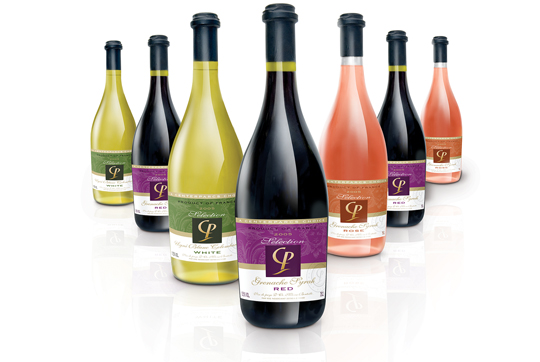 With first class facilities, a wide range of indoor and outdoor activities and restaurants and bars, an own range of wines couldn’t be missed. That’s why Stepfive was asked to develop the total brand identity for the new wine selection of Center Parcs Europe: Selection CP. Stepfive designed a series of tasteful labels with a high quality appearance for the rosé and the red and white wines. After the introduction the sales increased with 20%. Mission accomplished!


