October 26th, 2017 | 10:46 am
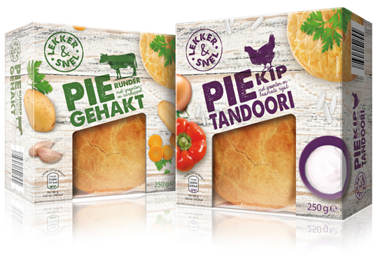 A couple of years ago, we developed the private label Smakelijk Gemak for Aldi NL and now it was about time for something new. Chosen is for an entirely new name, branding and packaging design. All this is developed by Stepfive, with which the new private label ‘Lekker & Snel’ was created, which is now going to be introduced in phases.
The packaging design always consists of a base of wood structure, which is used in different shapes and colors for the various products. The tasteful photography of both the product and the ingredients is shot with the perspective from above. Combined with the solid looking typography and use of woodcut illustrations, there is an effective, new packaging design that is completely contemporary.
==
Enkele jaren geleden hebben wij voor Aldi NL het private label Smakelijk Gemak ontwikkeld, dat na al die tijd wel weer eens toe was aan een opfrisbeurt. Gekozen is voor een geheel nieuwe naamstelling, branding en bijbehorend packaging design. Dit alles is door ons in huis ontwikkeld, waarmee het nieuwe private label ‘Lekker & Snel’ is ontstaan, dat nu gefaseerd ingevoerd gaat worden. Het verpakkingsdesign bestaat altijd uit een basis van houtstructuur, die in verschillende vormen en kleuren voor de diverse producten wordt gebruikt. De smakelijke fotografie van zowel het product als de ingrediënten valt op door het perspectief van bovenaf. In combinatie met de stevig en ambachtelijk ogende typografie en het gebruik van houtsnede illustraties staat er een doeltreffend, nieuw packaging design dat weer helemaal van nu is.
TAGS: Aldi, brand identity, Dutch, food, Lekker & Snel, Netherlands, packaging design, smakelijk gemak, Stepfive, typography
POSTED IN food | no comments »

October 12th, 2017 | 04:03 pm
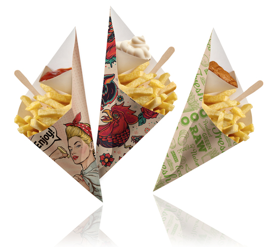 Stepfive created a series of striking designs for Fonkels Disposables Artist Line (fonkels.com). This is a special series of Chip ‘n Dip cones. They are made of fat resistant FSC certified cardboard. The material is sourced from renewable forests and is 100% recyclable after use. There is a complete line developed with different themes that all connect well to the the market needs to be distinctive in the cafeteria segment.
==
Voor de Artist Line van Fonkels Disposables (fonkels.com) heeft Stepfive een serie opvallende designs gecreëerd. De Artist Line is een speciale serie van Chip ‘n Dip frietzakken. Deze zijn gemaakt van vetwerend FSC gecertificeerd karton. Het materiaal is afkomstig uit hernieuwbare bossen en is na gebruik 100% recyclebaar. Er is een complete lijn ontwikkeld met verschillende thema’s die allemaal goed aansluiten op de behoefte uit de markt om onderscheidend te zijn in het cafetaria segment.
POSTED IN food | no comments »
September 26th, 2017 | 04:10 pm
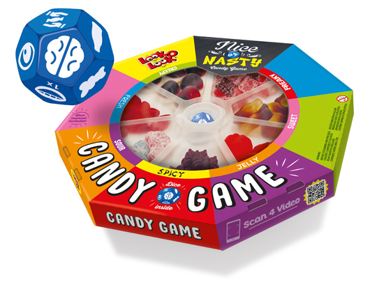 Board games are fun and that’s why Look-O-Look created a board game that brings people back together to play a game: Nice Or Nasty, The Candy Game. Roll the dice and find out who has the best poker face while daring to eat a sweet, fresh, sour or perhaps spicy candy.
In collaboration with Look-O-Look we developed an attractive packaging design for this new concept with the look of a real board game. Wondering how Nice Or Nasty is played? Click here for the video.
Nice Or Nasty. Do you take the challenge?!
==
Bordspellen zijn leuk en van alle tijden en daarom heeft Look-O-Look met Nice Or Nasty, The Candy Game een bordspel gerealiseerd dat je weer écht samen om de tafel brengt. Speel het spel met vrienden en familie. De speciaal voor dit spel ontwikkelde dobbelsteen laat je ontdekken wie er met de beste pokerface een zoet, fris, zuur of misschien juist wel pittig snoepje durft te eten.
Met het door ons in samenwerking met Look-O-Look ontwikkelde aantrekkelijke packaging design heeft dit nieuwe concept de uitstraling van een echt bordspel meegekregen. Ook benieuwd hoe Nice Or Nasty gespeeld wordt? Klik hier voor de video.
Nice Or Nasty, durf jij het aan?!
TAGS: candy, Dutch, Look-O-Look, Netherlands, nice or nasty, packaging design, Stepfive
POSTED IN food | no comments »

September 08th, 2017 | 11:26 am
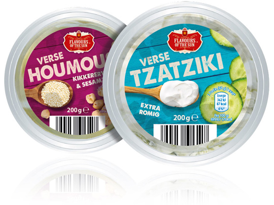 Stepfive was asked by Aldi Netherlands to redesign their private label Flavours of the Sun. A few years ago Stepfive already developed the name, branding and packaging design and now it was about time for something new. The packaging design is enriched with intense and bright colors that refer to the countries of the South. The wooden texture in the background and the tasteful photography of ingredients makes this restyle complete.
==
Aldi Nederland heeft Stepfive gevraagd een redesign aan het private label Flavours of the Sun te geven. Nadat Stepfive voor dit merk enkele jaren geleden al de naamstelling, branding en het packaging design had ontwikkeld, was het merk toe aan een opfrisbeurt. Het verpakkingsdesign is verrijkt met intense en heldere kleuren die refereren aan de zuidelijke landen. De houtstructuur op de achtergrond en de smaakvolle fotografie van ingrediënten maken deze restyle helemaal af.
TAGS: Aldi, Dutch, Flavours of the Sun, Netherlands, packaging design, rebranding, redesign, Stepfive
POSTED IN food | no comments »

April 14th, 2017 | 01:32 pm
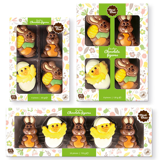 Another new project for Martinez Chocolade found its way to the stores. A modern line for the Easter was created especially for their brand MartiChoc. Little naive illustrations in soft colors constructed a wallpaper that was applied on all kind of boxes and all kind of formats. The delicious chocolate figures inside makes the Easter feeling complete.
==
En weer heeft een nieuw project voor Martinez Chocolade haar weg naar de winkels gevonden. Een nieuwe, moderne lijn is ontwikkeld speciaal voor het merk MartiChoc. Kleine, naïeve illustraties in zachte kleuren vormen de basis voor het achtergrondpatroon dat is uitgerold over verschillende formaten en doosjes. De heerlijke chocolade figuurtje in de doos zorgen voor het totale Paasgevoel.
TAGS: chocolate, Dutch, food, MartiChoc, Martinez Chocolade, Netherlands, packaging design, Stepfive
POSTED IN food | no comments »
April 14th, 2017 | 01:18 pm
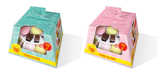 The English love their tea and their typical high tea. To celebrate that, Chupa Chups decided to make their own candy version of it: the Candy Tea Party! And again Stepfive was asked to create the packaging design. This resulted in colourful packaging design with a large window on the front and a cleverly constructed handle on top. Ideal for gifting and because of the ability to put the handle down, there’s no obstruction when stacking the boxes on the shelf.
==
De Engelsen zijn dol op hun thee én op hun fameuze high teas. Om dat te vieren heeft Chupa Chups haar eigen snoep versie gecreëerd: de Candy Tea Party! En Stepfive is weer gevraagd het packaging design te verzorgen. Dit heeft geresulteerd in een kleurrijke verpakking met een groot zichtvenster aan de voorzijde en een handig handvat bovenop. Ideaal om te dragen en voor gifting. Het handvat kan bovendien neer geklapt worden, waardoor het stapeling in het schap niet in de weg staat.
TAGS: candy, Chupa Chups, Dutch, Look-O-Look, Netherlands, packaging design, Stepfive
POSTED IN food | no comments »

February 10th, 2017 | 12:19 pm
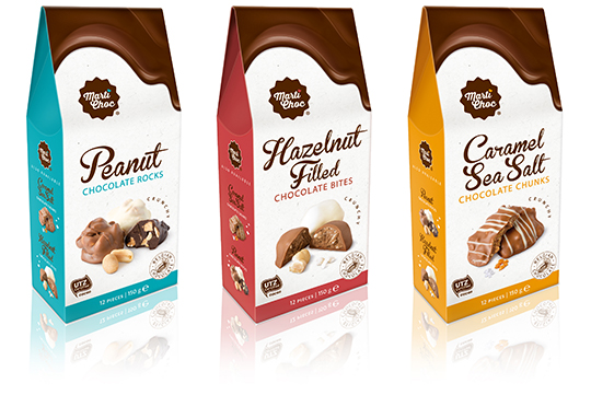 MartiChoc is a new brand of the internationally operating Dutch company Martinez Chocolade. Stepfive got the opportunity to develop the branding of this new chocolate brand. The packaging design of this ‘on the go’ line consists of three delicious flavors and was also conceptualized and created by Stepfive.
==
Voor het nieuwe merk MartiChoc van het internationaal opererende Nederlandse bedrijf Martinez Chocolade heeft Stepfive de complete branding mogen ontwikkelen. Ook het verpakkingsontwerp van deze uit drie smaken bestaande nieuwe ‘on the go’ chocolade lijn is ontwikkeld en uitgevoerd door Stepfive.
TAGS: chocolate, Dutch, MartiChoc, Martinez Chocolade, Netherlands, packaging design, Stepfive
POSTED IN food | no comments »
December 23rd, 2016 | 11:15 am
 Just hear those sleigh bells jingle-ing, Ring ting tingle-ing too.
Come on, it’s lovely weather, For a sleigh ride together with you!
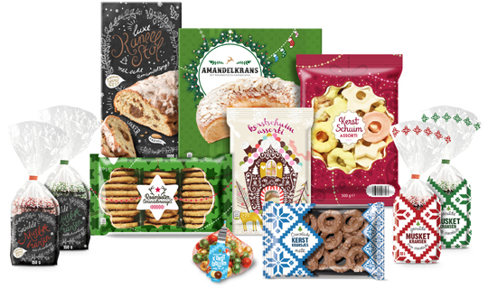
It’s Christmas time again and just as last year Aldi Netherlands asked Stepfive to create a series of concepts for their 2016 Christmas packaging design. This resulted in a wide range of different designs, all with that special time of the year feel.
==
Just hear those sleigh bells jingle-ing, Ring ting tingle-ing too.
Come on, it’s lovely weather, For a sleigh ride together with you!
Het is alweer Kerstmis en net zoals vorig jaar heeft Aldi Nederland Stepfive gevraagd concepten te creëren voor hun Kerst packaging design. Dat heeft geresulteerd in een uitgebreide lijn van verschillende designs, allemaal met het speciale gevoel dat bij deze tijd van het jaar hoort.
TAGS: Aldi, christmas, Dutch, food, Netherlands, packaging design, Stepfive
POSTED IN food | no comments »
December 21st, 2016 | 04:49 pm

The reducing consumption of meat is nothing new. Recent research shows that the Dutch are eating less meat for the fifth year in a row. The meat consumption in 2015 dropped to an average of 75,4 kg per person. This is almost 1 kg less compared to 2014.
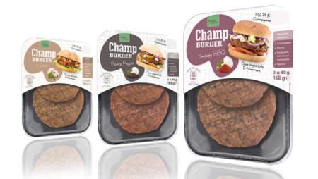
Accompanying this, is the growing supply for tasty alternatives to meat. Even within our own circle of clients we notice plenty of movement. For example, we recently had the opportunity to work together with Banken Champignons on a new project for an alternative to meat. This is the Champ Burger, made from 75% to 82% mushrooms and is available in the flavors Smokey BBQ, Black pepper, spiced Asian and Natural, all with a great bite.
The target for positioning within the German market was to make clear that the Champburger is a mushroom based product and an ideal alternative to meat. This resulted in a distinctive packaging line of four flavors.
This development also offers great opportunities for meat processors. Furthermore, looking at alternative markets and innovative products is an exciting challenge. We can help you with brainstorming and designing and developing concepts (along with our students from the HAS University of Applied Sciences).
==
Dat er minder vlees gegeten wordt is niet nieuw. Onlangs bleek uit onderzoek dat de Nederlander voor het vijfde jaar op rij minder vlees eet. Per persoon daalde de consumptie in 2015 tot gemiddeld 75,4 kilo. Bijna 1 kilo minder vergeleken met 2014.
Daar staat tegenover dat het aanbod van lekkere alternatieven voor vlees groeit. Ook binnen onze eigen klantenkring zien we volop beweging. Zo hebben wij recentelijk een mooi project mogen doen met Banken Champignons. Het gaat hier om de Champburger, gemaakt van 75% tot 82% champignons en verkrijgbaar in de smaken Smokey BBQ, Black pepper, Asian spiced en Naturel, allen met een krachtige bite. Doelstelling voor de positionering in de Duitse markt was om in één oogopslag duidelijk te maken dat het hier een champignonproduct betreft dat ideaal is als alternatief voor vlees. Dit resulteerde in een opvallende verpakkingslijn van vier smaakvarianten.
Deze ontwikkeling biedt echter ook kansen voor vleesverwerkers. Verder kijken naar alternatieve markten en innovatieve producten is een spannende uitdaging. Wij helpen u graag met het brainstormen en bedenken en uitwerken van concepten (samen met onze studenten van de HAS Hogeschool).
POSTED IN food | no comments »

December 21st, 2016 | 03:50 pm

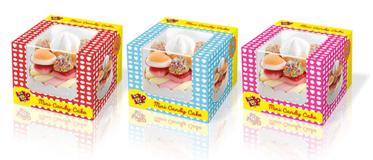
In the past few months Stepfive collaborated with Look-O-Look on the packaging design for the Mini Candy Cake, a tasteful candy treat shaped like a small cake. With this design we found the balance between a candy wrapper and the recognizable design of a pastry box. The visibility of the product is of great importance in this design , hence the transparent window on the front of the box extending to the top. The boxes come in the colors red, light blue and pink.
The cake boxes have a storage function and can (when the cake has been eaten) still be used to play with.
==
Afgelopen maanden heeft Stepfive samen met Look-O-Look mogen werken aan de verpakking van de Mini Candy Cake, een smaakvolle snoeptraktatie in de vorm van een klein taartje. In het packaging design hebben wij de balans gevonden tussen een snoepverpakking en de herkenbare vormgeving van een taartverpakking. Vooral de zichtbaarheid van het product is van groot belang, vandaar dat het zichtvenster van de voorzijde doorloopt naar de bovenzijde. De doosjes zijn uitgevoerd in rood, lichtblauw en roze.
De taartdoosjes hebben een bewaarfunctie en kunnen (als het taartje is opgegeten) nog gebruikt worden om mee te spelen.
TAGS: candy, Dutch, Look-O-Look, Netherlands, packaging design, Stepfive
POSTED IN food | no comments »
 A couple of years ago, we developed the private label Smakelijk Gemak for Aldi NL and now it was about time for something new. Chosen is for an entirely new name, branding and packaging design. All this is developed by Stepfive, with which the new private label ‘Lekker & Snel’ was created, which is now going to be introduced in phases.
 Stepfive created a series of striking designs for Fonkels Disposables Artist Line (
 Board games are fun and that’s why Look-O-Look created a board game that brings people back together to play a game: Nice Or Nasty, The Candy Game. Roll the dice and find out who has the best poker face while daring to eat a sweet, fresh, sour or perhaps spicy candy.
 Stepfive was asked by Aldi Netherlands to redesign their private label Flavours of the Sun. A few years ago Stepfive already developed the name, branding and packaging design and now it was about time for something new. The packaging design is enriched with intense and bright colors that refer to the countries of the South. The wooden texture in the background and the tasteful photography of ingredients makes this restyle complete.
 Another new project for Martinez Chocolade found its way to the stores. A modern line for the Easter was created especially for their brand MartiChoc. Little naive illustrations in soft colors constructed a wallpaper that was applied on all kind of boxes and all kind of formats. The delicious chocolate figures inside makes the Easter feeling complete.
 The English love their tea and their typical high tea. To celebrate that, Chupa Chups decided to make their own candy version of it: the Candy Tea Party! And again Stepfive was asked to create the packaging design. This resulted in colourful packaging design with a large window on the front and a cleverly constructed handle on top. Ideal for gifting and because of the ability to put the handle down, there’s no obstruction when stacking the boxes on the shelf.
 MartiChoc is a new brand of the internationally operating Dutch company Martinez Chocolade. Stepfive got the opportunity to develop the branding of this new chocolate brand. The packaging design of this ‘on the go’ line consists of three delicious flavors and was also conceptualized and created by Stepfive.