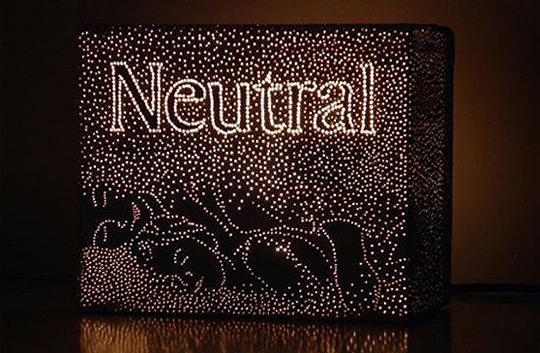
 Already back in 2007, Anke Weiss, a Dutch modern designer who uses recycled materials, has designed a series of beautiful lights made from recycled food and drink packaging. Weiss takes – for instance – juice cartons that have been emptied of their contents and pokes holes in them, through which light will shine after the piece is completed. Recycling to the max that is.
More on this project and Anke Weiss’ work here, here and here.


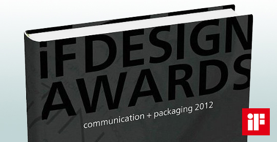 A compilation of yearly design awards, this book features the best in communication and packaging design from around the world. The iF communication design awards have been conferred since 2004 by a panel of design experts from across the world. Showcased in this volume are the most outstanding examples of communication and packaging design. This yearbook presents trendsetting achievement in advertising, media, campaigns, packaging, and websites.
Read more here, or buy here.

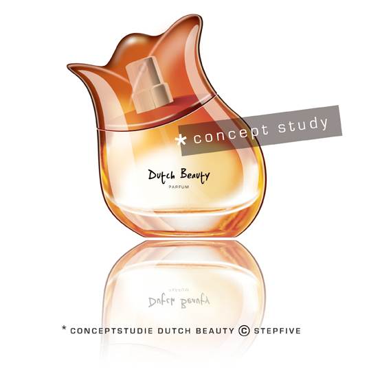 Stepfive develops new brands and concepts for the foodbranche, beverages and luxurious products (i.e. cosmetics) on a daily basis. We analyze various markets in search of opportunities commissioned by our clients, but also on our own initiative.� This perfume “Dutch Beauty” is a fine example of said initiative and is developed to spread the wonderful sent of Dutch tulips all around the world. The shape of the bottle is based on (obviously) a tulip, the top of the bottle can be removed and the perfume can be applied by using the dispenser. The bottle is made of glass except for the top which is made of glossy plastic. Are you interested in this concept? Please contact us www.stepfive.nl

 Stepfive creates new distinctive retail and catering concepts for food and beverage brands on a daily basis. We develop new concepts, recipes, brands and packaging design together with our clients. We also revitalise existing products on our own initiative, because we are convinced many products could have a more successful brand appearance with the right adaption and repositioning. For example, we have created this new concept for Bloody Mary.
This Bloody Mary concept can be used for the catering and retail sector. The bottle has two facings (meant for standing and hanging) and can therefore be placed on a shelf, perhaps in a retail environment, or can be suspended within catering establishments. You also have the option of attaching a connecting piece with a hose, allowing drinking glasses to be filled with Bloody Mary from a bottle hanging on the bar.

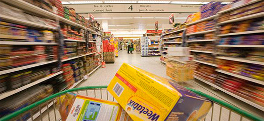 A recent study by Accenture, ComScore and Dunnhumby USA shows the importance of an attractive webshop in relation to actual purchases in-store. Shoppers who visit websites for consumer packaged goods brands before setting foot in a store spend up to 37% more on those brands in-store than those who didn’t come to these websites. Web visitors also returned to the store more often to buy the brand: 3.2 buying occasions per month against 2.3 for non-visitors. Site visitors also spent more per month in the product category of a brand whose site they’ve gone to.
Read the complete study here.
More on (online) shopping and packaging design here.

 This manufactorer, based in Europe, delivers quality toys with a high degree of educational values. These toys are built to last and are internationally recognized with lots of prestigious awards. Stepfive created several packaging concepts that fitted this high standard of quality, while gaining presence due to the use of bright colours and clear typography. Using different materials was a handy tool that allowed us to make a clear difference between the many product groups. We also created an opening in each design that allows buyers to actually feel the products� quality � an essential factor in deciding wether or not to buy the toy.

 The event for everyone who admits that packaging is ”more than just a box around a product”. If you’re responsible for your company’s goods, such as SRP, shelf standout, the development of new designs or a product’s life span, then PACKAGING INNOVATIONS 2012 is your number one must-see exhibition of the year.
Wednesday 28 / thursday 29 november 2012, Passenger Terminal, Amsterdam

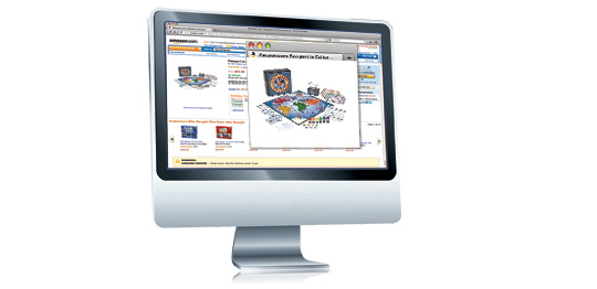 Packaging design always had to look slick on the shelves, be functional, protective and attractive, not too heavy and most important: at a prominent place in stores, dying to be bought. But what remains from all of this when we’re shopping online? Do we choose only the products nowadays, or is there still an important role left for packaging design?
Shikatani Lacroix’ Design Lounge did an interesting study on this theme.
Want to know the answers? Go here.

 Again a wonderfull asset for our bookshelf, “packed” with inspiration: THE ART OF PACKAGE DESIGN. A recent assembly of international designers is creating highly outstanding and savvy designs to complement the nature and function of a product. Editor Wendy Xu included the Atelier LaDurance Japanese Denim packaging in the publication that is about innovative packaging designs that functions beyond ‘simply product wrappers’. A creative treasure published by Gingko Press: www.gingkopress.com

 Stepfive created several design concepts for the toys including the ones you can see here. White, combined with a strong primary colour or colours gives a stronger result than white with weakened pastels, because that makes it look old fashioned and dirty. In contrary, white gives the designs a fresh and modern look with yet a responsable touch at the same time. Therefore we choose to work mainly with white combined with fresh and bright colours. The design above are shown as 3D view, as separate packaging and as separate packaging on a plastic display stand.


