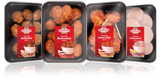
 For the Dutch company Zwanenberg Food Group, Stepfive created this serie of packaging labels for a range of tasteful snacks. The bright red color used in all labels really draws your attention and makes the packages stand out on store shelves.


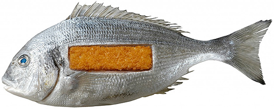 In De Etende Mens (Food Culture: Eating by Design) Premsela explores how design can enable us to make the changes to our food chain that are necessary to ensure a healthy future. Mediamatic’s High Density Aquaponics Edifice and the Diesel Kantine (a collaboration with Jo�o Negro) are featured in the exhibition.
The exhibition De Etende Mens showcases work by designers who concern themselves with the relationship between design, food, and (the origins of) what we eat. Curated by Marije Vogelzang, the works on display map people�s complex relationship with food and make visitors aware of how our food is produced.
Throughout the year, Premsela offers educational activities in connection with the Designhuis exhibitions for students in Dutch secondary and higher education. De Etende Mens is on view until January 6, 2013 at the Designhuis in Eindhoven. The exhibition is open from Tuesday till Sunday, from 11.00-18.00. Entrance fee is 5,-. Go to the Designhuis website for more information.

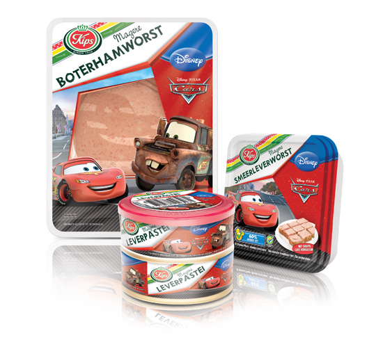 The packaging design for Disney Cars baloney and liver pat� was created by Stepfive, commissioned by Zwanenberg Food Group. This delicious sandwich filling for children appeals not only to the youngest ones. Due to it’s strong presence, it also looks very desirable on the shelf. Disney Cars makes lunch and breakfast even more fun!

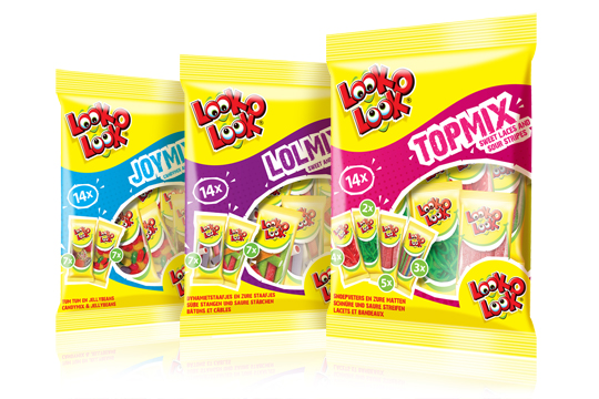 After a successful redesign of Look-O-Look’s Family Bags, Flowpacks and Toppermix, the redesign and packaging for the international Mix Bags of Look-O-Look is done by Stepfive Communication & Design too. The Dutch candy producer with “The most delicious candies in one bag” wanted a fun and diverting bag with small flowpacks in it, appealing to all family members, young and old. These Mix Bags differ from the other Look-O-Look bags by having small and handy portion packs in each mix bag. Each different bag has its own colour coding, visuals of aforementioned small portion packs/flowpacks (drawn in realistic style) and a large window for optimal visibility of the delicious candies.

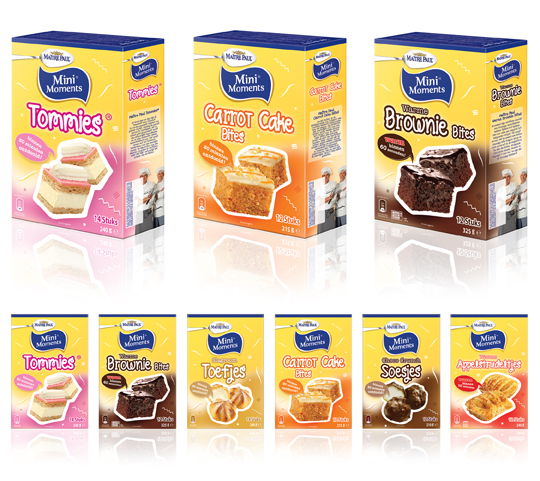 Stepfive created new packaging design for Ma�tre Paul�s MiniMoments range, a range of small pastries that are the perfect treat for ‘those special little moments’. The MiniMoments are nice to give and fun to get! The goal was to create a visually appealing and recognizable range.

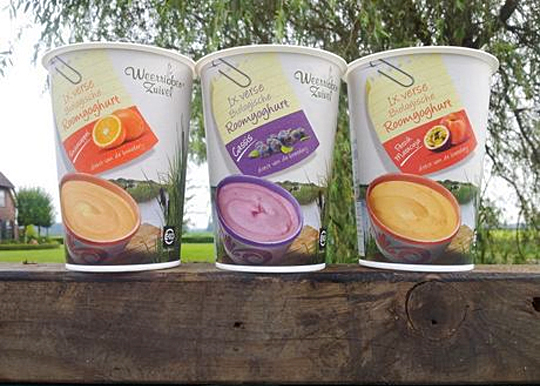 In addition to this restyling, a new organic cream yoghurt (with fruits) packaging design was created for Dutch company Weerribben Zuivel. Fresh and natural visuals on the packaging are showing us the origin of this organic cream yoghurt: National Park �De Weerribben� in The Netherlands. These visuals and the coloured shopping list on top derives from the complete restyling by Stepfive of all the other Weerribben products and herewith makes it into a coherent and appetizing product range. Also to distinguish the cream yoghurts from the other yoghurts, we’ve added visuals of the fruits used in the yoghurt.

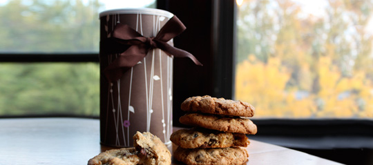 Ever thought about just how persuasive packaging can be? Supermarkets use carefully designed packaging to influence customers’ perceptions of their products. But does it work? It was tested with chocolate chip cookies on two groups of people, one group tasted and rated the cookies without seeing any of the packaging, while the other group did the same thing while the packets were shown beforehand. Read about the results here.
Packaging is one way of making a product get your attention. But there’s more. Every element of the in-store environment is carefully deliberated over; from the general layout to the position of products on the shelf and even the smell and sound.
Read more about psychological tactic in stores here.

 For the Dutch brand Kips, Stepfive created two reclosable ‘out of home’ freshpacks for cheeses and meats including printable stickers. Each freshpack contains ten slices and is designed with an apparent color setting (yellow for cheeses and red for meats). The packs have a basic, clean design with clear Kips branding for optimum product visibility that convey top quality products. Kips is a brand of Zwanenberg Food Group.

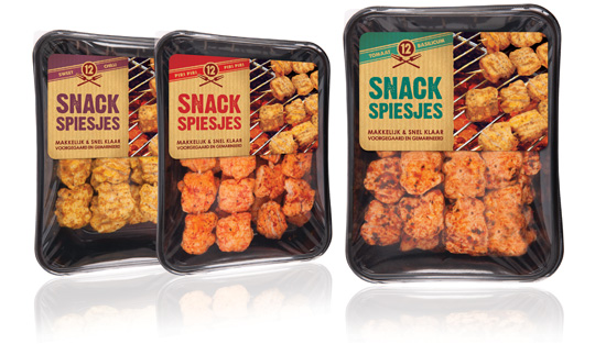 Piece of cake for the urban grillmeisters behind their BBQ’s these days with the new and delicious Snack Skewers (Snack Spiesjes) from Dutch company Zwanenberg Food Group. Stepfive created the labels for this new product range. Each different taste variety has its own colour setting and the labels are placed at the top in order to have a good spot on the tasteful skewers.

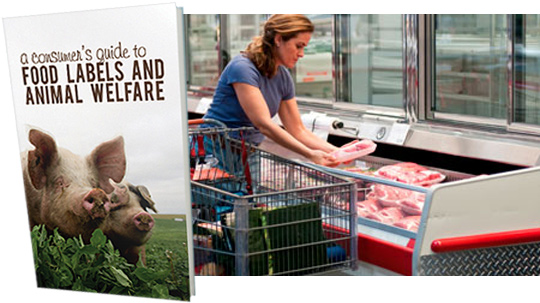 Many food labels are confusing (and some downright misleading) especially with regard to animal welfare claims. To help navigate the confusion, the Animal Welfare Institute (AWI) has released A Consumer’s Guide to Food Labels and Animal Welfare.
This new guide aims to help consumers who purchase meat, dairy and eggs interpret the meaning of label claims and locate products from animals who were humanely raised and handled.
More on ‘A Consumer’s Guide to Food Labels and Animal Welfare’ here.


