January 31st, 2013 | 05:00 pm
 A niche topic, a clear defined target group, a sharp program content, up to 80 stand units, a low entry fee et voil�, the ingredients that’ll make ‘Foodpacking Event 2013’ into a special event. The exhibition will take place on October 9 and 10 (Wednesday and Thursday) and will be held in ‘High Five’ in the ‘Jaarbeurscomplex’ in Utrecht, The Netherlands.
This event has been given the subtitle: High knowledge event on packaging in the food industry.
Read more here (Dutch).
TAGS: Dutch, exhibition, food, food industry, innovation, Jaarbeurscomplex, Netherlands, packaging design, Stepfive
POSTED IN food, legislation, non food | no comments »
January 25th, 2013 | 12:27 pm
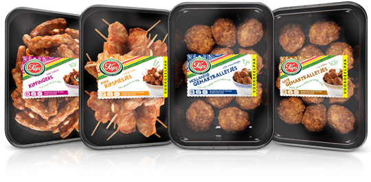 Chickenfingers, mini chicken skewers, Dutch meatballs and meatballs sat�h. Four new products by Kips (a brand of Zwanenberg Food Group) of which Stepfive created packaging labels for. The labels have unique colours for each product and are placed right in the middle so there’s still a good spot on the delicious snacks.
TAGS: Dutch, food, Kips, Netherlands, packaging design, retail, Stepfive, Zwanenberg Food Group
POSTED IN food | no comments »
January 04th, 2013 | 04:40 pm
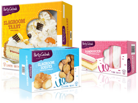 Throwing a party? Make it extra festive with Aldi’s ‘PartyGebak’ (Party Pastries). Stepfive created the new packaging design for the complete range of PartyGebak products in The Netherlands and also created the new branding.
A visually appealing, festive and joyous packaging design that lightens up every party and any other moment of fun.
TAGS: Aldi, brand creation, brand identity, Dutch, food, Netherlands, packaging design, retail, Stepfive
POSTED IN food | no comments »
November 30th, 2012 | 01:22 pm
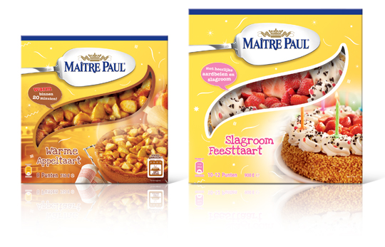 Stepfive created this packaging design for Ma�tre Paul’s Warme Appeltaart (Warm Apple Pie) and Slagroom Feesttaart (Party Cream Cake). The design for the apple pie box is a combination of the recognizable Ma�tre Paul yellow color and a warm productvisual with an oven in the background. The cream cake box is also a combination of Ma�tre Paul’s yellow color,� with colorful and festive productvisuals of the cream cake added. The boxes are decorated with fun white graphics.
TAGS: Dutch, Ma�tre Paul, Netherlands, packaging design, pie, retail, Stepfive
POSTED IN food | no comments »
November 14th, 2012 | 01:26 pm
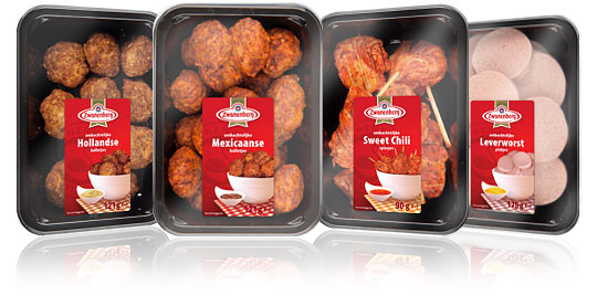 For the Dutch company Zwanenberg Food Group, Stepfive created this serie of packaging labels for a range of tasteful snacks. The bright red color used in all labels really draws your attention and makes the packages stand out on store shelves.
TAGS: Dutch, food, Netherlands, packaging design, retail, snacks, Stepfive, Zwanenberg Food Group
POSTED IN food | no comments »
October 08th, 2012 | 04:24 pm
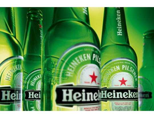 The characteristic brown beer bottle will turn just as green as the bottles that Heineken sells worldwide. The Brown bottle is a relic of Dutch appointments made decades ago to redeem deposit-bottles. Brown glass is recycled by most Dutch brewers, so it doesn’t matter which Brewer is taking in a bottle. Green glass is much less established. First, the green bottle was intended as an export bottle, but over the years it has become the color of the Heineken brand. The exchange operation began twenty years ago. In 1992 the Red cap disappeared, six years afterwards the yellow crates turned green and since 2000 all Lightboxes are green as well.
TAGS: beverage, brand identity, design, Dutch, food, graphic design, innovation, inspiration, Netherlands, packaging design
POSTED IN food | no comments »
October 05th, 2012 | 12:23 pm
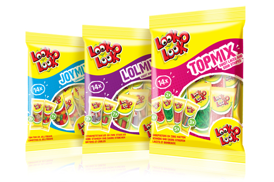
 After a successful redesign of Look-O-Look’s Family Bags, Flowpacks and Toppermix, the redesign and packaging for the international Mix Bags of Look-O-Look is done by Stepfive Communication & Design too. The Dutch candy producer with “The most delicious candies in one bag” wanted a fun and diverting bag with small flowpacks in it, appealing to all family members, young and old. These Mix Bags differ from the other Look-O-Look bags by having small and handy portion packs in each mix bag. Each different bag has its own colour coding, visuals of aforementioned small portion packs/flowpacks (drawn in realistic style) and a large window for optimal visibility of the delicious candies.
TAGS: candy, Dutch, Look-O-Look, Netherlands, packaging design, retail, Stepfive
POSTED IN food | 1 comment »
September 13th, 2012 | 02:25 pm
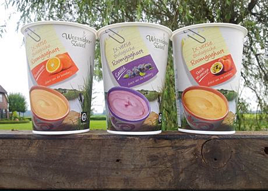
 In addition to this restyling, a new organic cream yoghurt (with fruits) packaging design was created for Dutch company Weerribben Zuivel. Fresh and natural visuals on the packaging are showing us the origin of this organic cream yoghurt: National Park �De Weerribben� in The Netherlands. These visuals and the coloured shopping list on top derives from the complete restyling by Stepfive of all the other Weerribben products and herewith makes it into a coherent and appetizing product range. Also to distinguish the cream yoghurts from the other yoghurts, we’ve added visuals of the fruits used in the yoghurt.
TAGS: Dutch, food, Netherlands, packaging design, Stepfive, Weerribben
POSTED IN food | no comments »
September 07th, 2012 | 02:38 pm
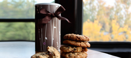
 Ever thought about just how persuasive packaging can be? Supermarkets use carefully designed packaging to influence customers’ perceptions of their products. But does it work? It was tested with chocolate chip cookies on two groups of people, one group tasted and rated the cookies without seeing any of the packaging, while the other group did the same thing while the packets were shown beforehand. Read about the results here.
Packaging is one way of making a product get your attention. But there’s more. Every element of the in-store environment is carefully deliberated over; from the general layout to the position of products on the shelf and even the smell and sound.
Read more about psychological tactic in stores here.
TAGS: Dutch, Netherlands, packaging design, Stepfive
POSTED IN food, non food | no comments »
August 24th, 2012 | 03:05 pm
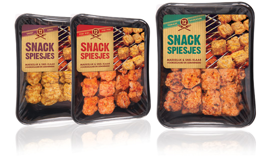
 Piece of cake for the urban grillmeisters behind their BBQ’s these days with the new and delicious Snack Skewers (Snack Spiesjes) from Dutch company Zwanenberg Food Group. Stepfive created the labels for this new product range. Each different taste variety has its own colour setting and the labels are placed at the top in order to have a good spot on the tasteful skewers.
TAGS: bbq, Dutch, food, label, Netherlands, packaging design, Stepfive, Zwanenberg Food Group
POSTED IN food | no comments »
 A niche topic, a clear defined target group, a sharp program content, up to 80 stand units, a low entry fee et voil�, the ingredients that’ll make ‘Foodpacking Event 2013’ into a special event. The exhibition will take place on October 9 and 10 (Wednesday and Thursday) and will be held in ‘High Five’ in the ‘Jaarbeurscomplex’ in Utrecht, The Netherlands.


 The characteristic brown beer bottle will turn just as green as the bottles that Heineken sells worldwide. The Brown bottle is a relic of Dutch appointments made decades ago to redeem deposit-bottles. Brown glass is recycled by most Dutch brewers, so it doesn’t matter which Brewer is taking in a bottle. Green glass is much less established. First, the green bottle was intended as an export bottle, but over the years it has become the color of the Heineken brand. The exchange operation began twenty years ago. In 1992 the Red cap disappeared, six years afterwards the yellow crates turned green and since 2000 all Lightboxes are green as well.