August 10th, 2012 | 02:03 pm
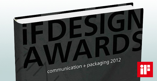 A compilation of yearly design awards, this book features the best in communication and packaging design from around the world. The iF communication design awards have been conferred since 2004 by a panel of design experts from across the world. Showcased in this volume are the most outstanding examples of communication and packaging design. This yearbook presents trendsetting achievement in advertising, media, campaigns, packaging, and websites.
Read more here, or buy here.
TAGS: Dutch, graphic design, iF Design Awards, innovation, inspiration, Netherlands, packaging design, Stepfive
POSTED IN bookshelf, food, non food | no comments »
July 03rd, 2012 | 04:15 pm
 On January 1st, 2013, taxes on packaging in The Netherlands will possibly be abolished. Owing to an agreement between Dutch State Secretary Joop Atsma (Infrastructure and Environment) and the business world, manufacturers, importers and sellers of packaged products will be responsible for the costs of collection and recycling of plastic packaging over the next ten years.
Read the complete article (in Dutch).
TAGS: Dutch, environment, Netherlands, packaging, recycling, tax
POSTED IN food, legislation, non food | no comments »
June 22nd, 2012 | 01:12 pm
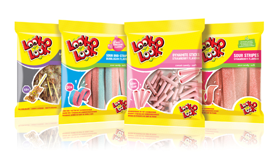
 After a successful redesign of Look-O-Look�s Flowpacks and Toppermix, the redesign and packaging for the international familybags of Look-O-Look is done by Stepfive Communication & Design too.
The Dutch candy producer with �The most delicious candies in one bag� wanted a fun and diverting familybag, appealing for all family members, young and old. Each different bag has its own colour coding, illustrated candies on the front (drawn in realistic style) and a large window for optimal visibility of the delicious candies.
TAGS: bags, candy, Dutch, family, Look-O-Look, Netherlands, packaging design, Stepfive
POSTED IN food | 1 comment »
May 29th, 2012 | 01:52 pm
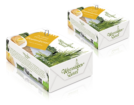
 In addition to this restyling, a new organic butter packaging design was created for Dutch company Weerribben Zuivel. Fresh and natural visuals on the packaging are showing us the origin of this organic butter: National Park �De Weerribben� in The Netherlands. These visuals and the coloured shopping list on top derives from the complete restyling by Stepfive of all the other Weerribben products and herewith makes it into a coherent and appetizing product range.
TAGS: butter, Dutch, food, Netherlands, packaging design, Stepfive, Weerribben
POSTED IN food | no comments »
April 27th, 2012 | 04:02 pm
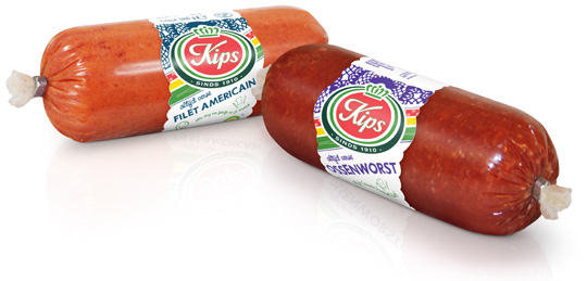
 For the Dutch company Kips (part of Zwanenberg Food Group), we designed a series of contemporary labels/banderols with optimum product visibility that convey top quality. Each label comes in a different colour setting for each different taste variety.
TAGS: banderol, Dutch, Kips, label, Netherlands, packaging design, Stepfive, Zwanenberg Food Group
POSTED IN food | no comments »
April 18th, 2012 | 11:21 am
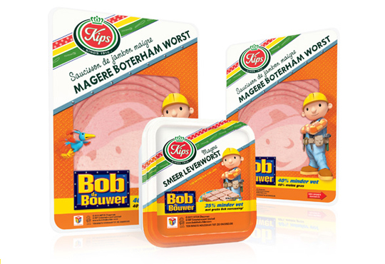
 The packaging design for the international figure Bob the BuilderTM baloney and liver pat� was created by Stepfive, commissioned by Zwanenberg Food Group. This delicious sandwich filling for children appeals not only to the youngest ones. Due to it�s strong presence, it also looks very desireable on the shelf. Bob the BuilderTM makes lunch and breakfast even more fun!
TAGS: Bob de Bouwer, Bob the Builder, brand identity, Dutch, food, Kips, Netherlands, packaging design, Stepfive
POSTED IN food | no comments »
April 13th, 2012 | 08:40 am
 For Look-O-Look, Stepfive developed a new and contemporary line of packages (for 29 different candies) which will replace the current ‘kopkaartjes’ (transparent candy bags). These new flowpacks are designed in a handy size and are easy to open, which creates optimal ease in use. The new flowpacks have a fun, fresh and strong packaging design which corresponds perfectly with the target group. The flowpack design also contains a clear product-communication and an optimal visibility for a maximal impulse, which really distinguishes this packaging in stores from it’s competitors.
TAGS: brand identity, candy, Dutch, flowpacks, food, Look-O-Look, Netherlands, packaging design, Stepfive
POSTED IN food | 2 comments »
March 30th, 2012 | 10:34 am
 Stepfive creates new distinctive retail and catering concepts for food and beverage brands on a daily basis. We develop new concepts, recipes, brands and packaging design together with our clients. We also revitalise existing products on our own initiative, because we are convinced many products could have a more successful brand appearance with the right adaption and repositioning. For example, we have created this new concept for Bloody Mary.
This Bloody Mary concept can be used for the catering and retail sector. The bottle has two facings (meant for standing and hanging) and can therefore be placed on a shelf, perhaps in a retail environment, or can be suspended within catering establishments. You also have the option of attaching a connecting piece with a hose, allowing drinking glasses to be filled with Bloody Mary from a bottle hanging on the bar.
TAGS: concept, Dutch, graphic design, innovation, inspiration, Netherlands, packaging design, Stepfive
POSTED IN food, non food | no comments »

March 23rd, 2012 | 03:42 pm
 The packaging design for the international figure Bob the BuilderTM luncheon meat and liver pat� was created by Stepfive for Zwanenberg Food Group. This delicious sandwich filling for children appeals not only to the youngest ones. Due to it’s strong presence, it also looks very desireable on the shelf. Bob the BuilderTM makes lunch and breakfast even more fun!
TAGS: Bob de Bouwer, Bob the Builder, Dutch, Netherlands, packaging design, Stepfive, Zwanenberg Food Group
POSTED IN food | no comments »
February 09th, 2012 | 02:17 pm
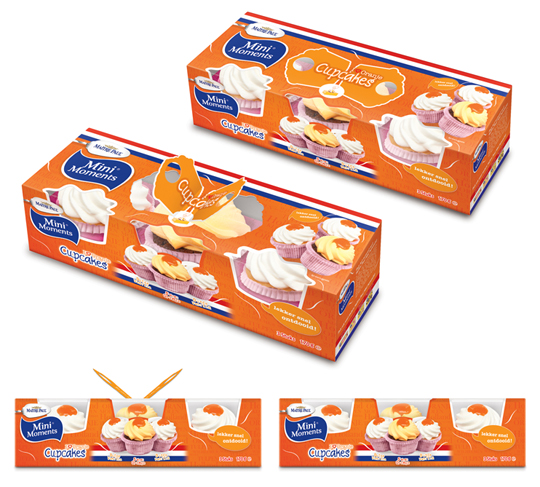
 Stepfive created these packaging designs for Ma�tre Paul�s Oranje Cupcakes. The goal: creating a visually appealing and festive package which could be presented like, as it were, a real gift. Especially for typical Dutch traditions and parties such as ‘Queen’s Day’, but for (inter)national sport events as for instance soccer championships as well. ‘Cause after all, the Dutch colour is orange. Ma�tre Paul�s Oranje Cupcakes are the perfect treat for those special little moments. They are nice to give and fun to get!� There are three cupcakes per package.
More on Ma�tre Paul Cupcakes original design here.
TAGS: cupcakes, Dutch, food, Ma�tre Paul, Netherlands, packaging design, Stepfive
POSTED IN food | no comments »
 A compilation of yearly design awards, this book features the best in communication and packaging design from around the world. The iF communication design awards have been conferred since 2004 by a panel of design experts from across the world. Showcased in this volume are the most outstanding examples of communication and packaging design. This yearbook presents trendsetting achievement in advertising, media, campaigns, packaging, and websites.

