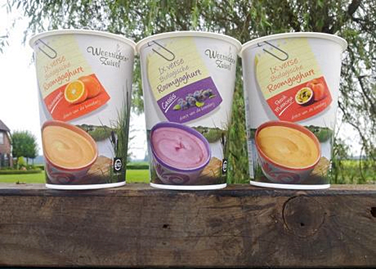
 In addition to this restyling, a new organic cream yoghurt (with fruits) packaging design was created for Dutch company Weerribben Zuivel. Fresh and natural visuals on the packaging are showing us the origin of this organic cream yoghurt: National Park �De Weerribben� in The Netherlands. These visuals and the coloured shopping list on top derives from the complete restyling by Stepfive of all the other Weerribben products and herewith makes it into a coherent and appetizing product range. Also to distinguish the cream yoghurts from the other yoghurts, we’ve added visuals of the fruits used in the yoghurt.


 For the Dutch brand Kips, Stepfive created two reclosable ‘out of home’ freshpacks for cheeses and meats including printable stickers. Each freshpack contains ten slices and is designed with an apparent color setting (yellow for cheeses and red for meats). The packs have a basic, clean design with clear Kips branding for optimum product visibility that convey top quality products. Kips is a brand of Zwanenberg Food Group.

 On January 1st, 2013, taxes on packaging in The Netherlands will possibly be abolished. Owing to an agreement between Dutch State Secretary Joop Atsma (Infrastructure and Environment) and the business world, manufacturers, importers and sellers of packaged products will be responsible for the costs of collection and recycling of plastic packaging over the next ten years.
Read the complete article (in Dutch).

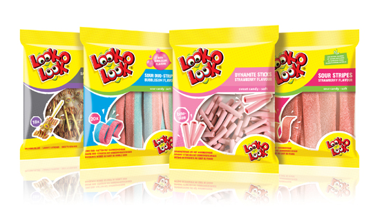 After a successful redesign of Look-O-Look�s Flowpacks and Toppermix, the redesign and packaging for the international familybags of Look-O-Look is done by Stepfive Communication & Design too.
The Dutch candy producer with �The most delicious candies in one bag� wanted a fun and diverting familybag, appealing for all family members, young and old. Each different bag has its own colour coding, illustrated candies on the front (drawn in realistic style) and a large window for optimal visibility of the delicious candies.

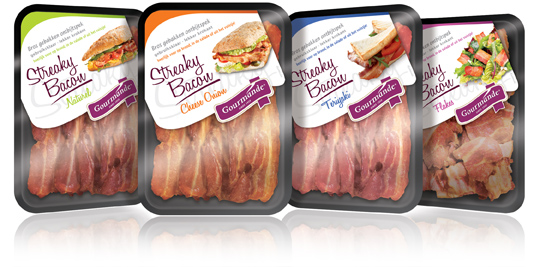 Gourmande is the consumers brand of ‘henri van de bilt vleeswaren’, who produces deli meats from single meat cuts and convenience products. Stepfive rebranded the Gourmande logo and also created four remarkable packaging labels for their range of Streaky Bacon products. These labels come with much attention for branding and meanwhile have a spot on the visibility of the products. Each label has it’s own fresh colour setting for each different taste variety.

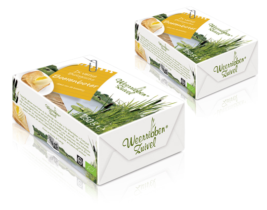 In addition to this restyling, a new organic butter packaging design was created for Dutch company Weerribben Zuivel. Fresh and natural visuals on the packaging are showing us the origin of this organic butter: National Park �De Weerribben� in The Netherlands. These visuals and the coloured shopping list on top derives from the complete restyling by Stepfive of all the other Weerribben products and herewith makes it into a coherent and appetizing product range.

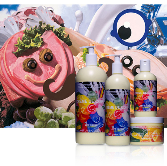 A while ago, MOTI (Museum Of The Image, Breda) held an exhibit about packaging. This led to an interesting question: why is there currently a substantial shortage of packaging designers in the Netherlands? The answer can be found somewhere between �current art education is mainly focussed on the encouragement on autonomy instead of serving commercial goals�, and � as a logical result of this: �designers consider themselves belonging to a cultural avantgarde�.
In other words: packaging belongs to low-culture. Low culture = not sexy. Meanwhile, packaging specialized agencies (like ours) keep getting busier. So it�s high time to turn some persistent assumptions around by pointing out precisely how �sexy� the trade of packaging really is. After all, it evokes graphic design, (strongly based on psychology), marketing, brand-development, environmental matters, innovation and (brand)activation.
So, art schools: here�s a start for an interesting discussion on what Dutch Design really can be all about. And who will be the first to flick the switch and jump into the trade that�s as design-extensive as it is a guarantee on an interesting job? In the meanwhile you can enjoy some work made by �commercial explorer� Jeff Koons (shown above) and his design for body milk, by which he turned his art into �the daily�, instead of �the daily� into art. Oh, and the first run of packaging-trained students can send their portfolio to us � but that goes without saying.

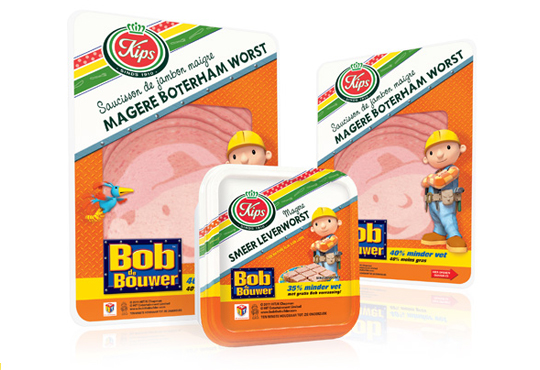 The packaging design for the international figure Bob the BuilderTM baloney and liver pat� was created by Stepfive, commissioned by Zwanenberg Food Group. This delicious sandwich filling for children appeals not only to the youngest ones. Due to it�s strong presence, it also looks very desireable on the shelf. Bob the BuilderTM makes lunch and breakfast even more fun!

 For Look-O-Look, Stepfive developed a new and contemporary line of packages (for 29 different candies) which will replace the current ‘kopkaartjes’ (transparent candy bags). These new flowpacks are designed in a handy size and are easy to open, which creates optimal ease in use. The new flowpacks have a fun, fresh and strong packaging design which corresponds perfectly with the target group. The flowpack design also contains a clear product-communication and an optimal visibility for a maximal impulse, which really distinguishes this packaging in stores from it’s competitors.

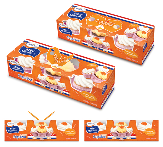 Stepfive created these packaging designs for Ma�tre Paul�s Oranje Cupcakes. The goal: creating a visually appealing and festive package which could be presented like, as it were, a real gift. Especially for typical Dutch traditions and parties such as ‘Queen’s Day’, but for (inter)national sport events as for instance soccer championships as well. ‘Cause after all, the Dutch colour is orange. Ma�tre Paul�s Oranje Cupcakes are the perfect treat for those special little moments. They are nice to give and fun to get!� There are three cupcakes per package.
More on Ma�tre Paul Cupcakes original design here.


