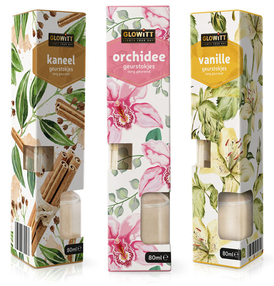
 For Aldi Nederland we have developed the packaging design for fragrance sticks under the private label Glowitt. The tasteful packaging is richly illustrated with ingredients from the respective fragrance and each has a clear color segmentation. The packaging form contains two windows which offers a view on the fragrance sticks themselves and the bottle in which they are placed.
==
Voor Aldi Nederland hebben wij onder private label Glowitt een drietal verpakkingen ontwikkeld voor geurstokjes. De smaakvolle verpakkingen zijn rijk ge�llustreerd met ingredi�nten van de betreffende geur en hebben elk een duidelijke kleursegmentering. De verpakkingsvorm biedt door twee afzonderlijke vensters zicht op zowel de geurstokjes zelf als op het flesje waarin ze worden geplaatst.

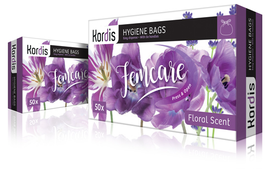 New branding and new packaging design for Kordis Supplies Household Products. The Kordis logo is modernized with a contemporary typography, in which the character ‘d’, like a chameleon, always adapts the base color from the packaging design. This creates in a sophisticated way connection and unity between logo and design. The packaging design is based on a fresh watercolor floral illustration, that communicates the required information in clear panels. Together with the handwritten, feminine typography of Femcare, a stylish and elegant packaging design is created.
==
Een nieuwe branding en nieuw packaging design voor Kordis Supplies Household Products. Het logo van Kordis is gemoderniseerd met een eigentijdse typografie, waarbij de ‘d’ als een kameleon altijd de basiskleur uit het packaging design overneemt. Zo ontstaat op een verfijnde manier steeds connectie en eenheid tussen logo en design. Het verpakkingsontwerp heeft als basis een frisse aquarel bloemen illustratie waar overheen in duidelijke panels de benodigde informatie wordt gecommuniceerd. Samen met de handgeschreven, vrouwelijke typografie van Femcare wordt zo een stijlvol en elegant verpakkingsontwerp gecre�erd.
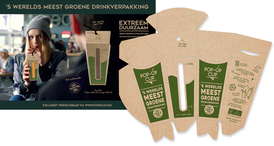 For the Horecava introduction of the Pop-Up Cup, the world’s most ‘green’ drink packaging, we have developed the packaging and a matching small introduction campaign. The Pop-Up Cup drink packaging is innovative and very suitable for filling of beverages on the spot. The Pop-Up Cup is a box with a pouch that comes flat. The box opens up, as one squeezes it from the side. Put a straw through the opening in the top and it is also 100% leak-proof.
The Pop-Up Cup is exclusively available via www.fonkels.com
==
Voor de Horecava introductie van de Pop-Up Cup, ‘s werelds meest groene drinkverpakking, hebben wij de introductie verpakking ontwikkeld, plus een bijpassende mini-campagne. De Pop-Up Cup drinkverpakking is innovatief en zeer geschikt voor het ter plekke vullen van dranken. De Pop-Up Cup is een doosje met een zakje dat plat wordt geleverd en dus weinig plaats inneemt. Het doosje opent zich doordat je het aan de zijkant samenknijpt. Even vullen, de bovenkant samenvouwen en klaar is deze drinkverpakking! Tot slot enkel nog een rietje door de opening in de bovenkant steken en het is ook nog 100% lekvrij.
De Pop-Up Cup is exclusief verkrijbaar via www.fonkels.com
 On November 26th & 27th Packaging Innovations will bring together the best professionals of branded packaging and retail design. Specialists show designs, product presentations, new materials and solutions for packaging problems.
See more at: www.easyfairs.com
 As already introduced here, Stepfive takes care of the new Wrapitt packaging design for Aldi Netherlands. Above two examples of the new aluminum foil packaging and the new micro wave packaging. Recognizable little drawings and strong typography are typical for this household consumers product line.
 Wrapitt (Kitchen Aid) is one the new household brands that was introduced by Aldi Netherlands the last few months. Wrapitt consists of products like carbage bags, aluminum foils, fresh foils, (doggy) bags, culinary parchment paper, freezer bags and so on. Brand identity and all packaging design was conceptualized and created by Stepfive Communication & Design BNO.
 Until recently, direct bottle printing was really only an option for glass bottles. But that�s changing. Today, there are a number of options for direct printing bottles, both glass and plastic. Yet another step forward in sustainable packaging design techniques.
Read more on the next wave of bottle and container decorating here.
 At Dutch website Groene Offerte you’ll find loads of interesting packaging design related articles, opinions and other stuff (all in Dutch). Especially the serie ‘Food for Thought’ gives entertaining and remarkable examples of packaging design in all its aspects, good or bad.
Groene Offerte is established for the complete design industry. The site is set up to grow: more and more contacts, knowledge and new insights. In this way Groene Offerte wants to help and encourage the design industry with their key role of this industry in the sustainable development of society and economy.
Food for Thought at Groene Offerte (all in Dutch).
 In De Etende Mens (Food Culture: Eating by Design) Premsela explores how design can enable us to make the changes to our food chain that are necessary to ensure a healthy future. Mediamatic’s High Density Aquaponics Edifice and the Diesel Kantine (a collaboration with Jo�o Negro) are featured in the exhibition.
The exhibition De Etende Mens showcases work by designers who concern themselves with the relationship between design, food, and (the origins of) what we eat. Curated by Marije Vogelzang, the works on display map people�s complex relationship with food and make visitors aware of how our food is produced.
Throughout the year, Premsela offers educational activities in connection with the Designhuis exhibitions for students in Dutch secondary and higher education. De Etende Mens is on view until January 6, 2013 at the Designhuis in Eindhoven. The exhibition is open from Tuesday till Sunday, from 11.00-18.00. Entrance fee is 5,-. Go to the Designhuis website for more information.
 Stepfive develops new brands and concepts for the foodbranche, beverages and luxurious products (i.e. cosmetics) on a daily basis. We analyze various markets in search of opportunities commissioned by our clients, but also on our own initiative.� This perfume “Dutch Beauty” is a fine example of said initiative and is developed to spread the wonderful sent of Dutch tulips all around the world. The shape of the bottle is based on (obviously) a tulip, the top of the bottle can be removed and the perfume can be applied by using the dispenser. The bottle is made of glass except for the top which is made of glossy plastic. Are you interested in this concept? Please contact us www.stepfive.nl


-
Archives
- August 2018
- July 2018
- June 2018
- May 2018
- April 2018
- March 2018
- February 2018
- January 2018
- November 2017
- October 2017
- September 2017
- April 2017
- February 2017
- December 2016
- October 2016
- September 2016
- July 2016
- May 2016
- March 2016
- January 2016
- November 2015
- October 2015
- August 2015
- June 2015
- May 2015
- April 2015
- February 2015
- January 2015
- December 2014
- November 2014
- October 2014
- September 2014
- August 2014
- June 2014
- May 2014
- April 2014
- March 2014
- February 2014
- January 2014
- December 2013
- November 2013
- October 2013
- September 2013
- August 2013
- June 2013
- May 2013
- April 2013
- March 2013
- February 2013
- January 2013
- December 2012
- November 2012
- October 2012
- September 2012
- August 2012
- July 2012
- June 2012
- May 2012
- April 2012
- March 2012
- February 2012
- January 2012
- December 2011
- November 2011
- October 2011
- September 2011
- August 2011
- July 2011
- June 2011
- May 2011
- April 2011
- March 2011
- February 2011
- January 2011