June 24th, 2016 | 11:37 am
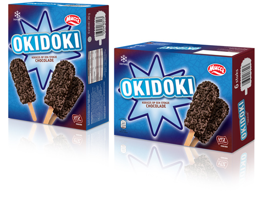 The past few months Stepfive conceptualized and created a whole bunch of new ice cream packaging design for Aldi Netherlands. The one showed above has a double facing (and so has all the rest of the ice cream packaging), an eye catching and strong typography for the productname and tasteful visuals on front. This ice cream packaging design and all the others created by Stepfive are in store now.
==
De afgelopen maanden heeft Stepfive een hele reeks concepten voor ijsverpakkingen uitgevoerd voor Aldi Nederland. De verpakking hierboven is voorzien van een dubbele facing (net zoals alle andere verpakkingen), heeft een opvallende typografie voor de productnaam en smakelijke visuals. Deze en alle andere ijsverpakkingen die door Stepfive zijn ontwikkeld zijn nu te koop.
TAGS: Aldi, chocolate, Dutch, food, ice cream, mucci, Netherlands, packaging design, Stepfive
POSTED IN food | no comments »
May 27th, 2016 | 11:33 am
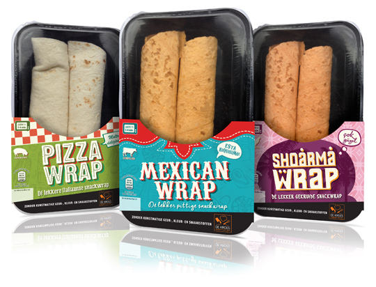 New packaging design for all kind of different ready-to-eat wraps for De Kroes have been designed by Stepfive. The carton sleeves have a strong graphic, colourful and typographic look, based on the country of origin. Only half of the product is covered by the sleeve, which results in a high product visibility. The wraps are for sale in supermarkets in The Netherlands like Albert Heijn.
==
Nieuw packaging design voor verschillende soorten ready-to-eat wraps van De Kroes is ontwikkeld door Stepfive. De kartonnen sleeves zijn grafisch sterk, opvallend van kleur en typografie die in vorm zijn gebaseerd op het land van herkomst. Alleen de onderzijde van het product wordt door de sleeve omvat, waardoor er een goede zichtbaarheid van het product ontstaat. De wraps worden in Nederland verkocht bij o.a. de Albert Heijn.
TAGS: Albert Heijn, De Kroes, Dutch, food, graphic design, Netherlands, packaging design, Stepfive
POSTED IN food | no comments »
January 15th, 2016 | 04:12 pm
 New packaging design for three new chocolate cookies with filling for Dutch company Nora Biscuits. Designed in a classic style, this packaging has tasteful visuals and a strong specific colour setting for caramel, hazelnut and milk cream. For German market only.
==
Nieuw packaging design voor drie nieuwe gevulde chocolade koekjes van Nora Biscuits uit Maastricht. De verpakking is klassiek van opzet, met smakelijke productvisuals en een sterke kleurcodering voor de drie smaken, caramel, hazelnoot en melk cr�me. Voor de Duitse markt.
TAGS: chocolate, cookies, Dutch, Netherlands, Nora Biscuits, packaging design, Stepfive
POSTED IN food | no comments »
October 09th, 2015 | 04:17 pm
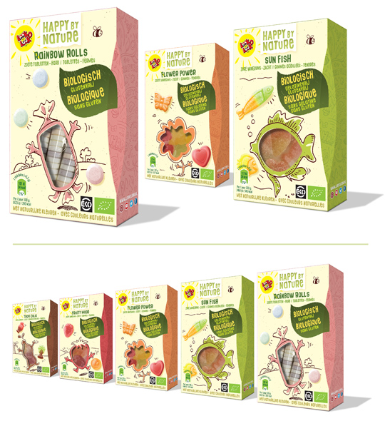 Happy by Nature is Look-O-Look’s biological candy which comes in five different flavours. Stepfive conceptualized the look & feel for the packaging design of these products with craft paper look and funny hand drawn pictures and a candy shaped window for product visability. Happy by Nature branding was also done by Stepfive.
==
Happy by Nature is de biologische snoep lijn van Look-O-Look. Stepfive heeft het packaging design ontwikkeld voor deze producten. Grappige, hand getekende afbeeldingen op craft papier en een venster in de vorm van de snoep. Ook de branding van Happy by Nature is door Stepfive ontwikkeld.
TAGS: biological, candy, Dutch, Look-O-Look, Netherlands, packaging design, Stepfive
POSTED IN food | no comments »
August 28th, 2015 | 03:13 pm
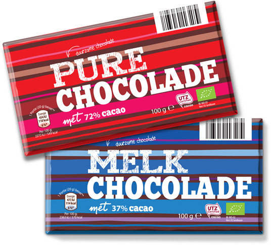 Awareness and sustainability are written large for private label Mama Nature and are not seen as a necessary evil by them. Together with this colorful and strong graphic packaging design conceptualized by Stepfive, Aldi Netherlands brings another desirable article into its chocolate range.
==
Bewustzijn en duurzaamheid staan hoog in het vaandel bij private label Mama Nature en worden niet gezien als noodzakelijk kwaad. Samen met het sterk grafische en kleurrijke verpakkingsdesign van Stepfive kan Aldi Nederland weer een heerlijk product toevoegen aan haar totale chocolade range.
TAGS: Aldi, bio, chocolate, Dutch, eco, Netherlands, packaging design, Stepfive, sustainability
POSTED IN food | no comments »
August 24th, 2015 | 02:17 pm
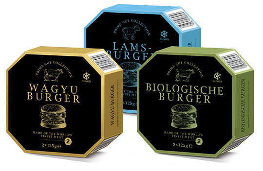 Stepfive created the packaging design for a range of high quality burgers for Aldi. Each different burger is packed in a luxurious box with eight sides and has its own specific colour setting. Classy and trendy design for premium quality meat.
==
Stepfive heeft voor Aldi het packaging design gecre�erd voor een range burgers van hoge kwaliteit. De verschillende soorten burgers zijn verpakt in een luxueus doosje met acht zijden en hebben elk hun eigen kleurcodering. Stijlvol en trendy design voor premium kwaliteit vlees.
TAGS: Aldi, brand identity, Dutch, Netherlands, packaging design, Stepfive
POSTED IN food | no comments »
June 29th, 2015 | 02:35 pm
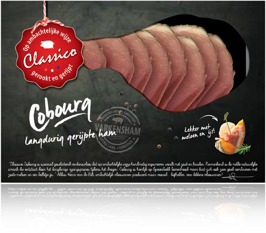
Cobourg bacon for private label Classico packed in a stylish and reclosable freshpack. The free shaped window gives a peek of de the product inside. A serving suggestion with tasteful food visual is printed on the front.
==
Cobourg ham voor het private label Classico is verpakt in een stijlvolle, hersluitbare freshpack. Het venster heeft een vrije vorm en biedt zicht op het product. Een serveersuggestie met smakelijke food visual wordt getoond op de voorzijde.
TAGS: brand identity, classico, Dutch, food, freshpack, Netherlands, packaging design, Stepfive
POSTED IN food | no comments »
May 22nd, 2015 | 04:21 pm
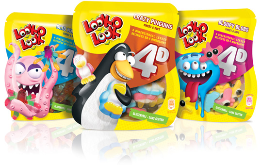 For Look-O-Look Stepfive developed a striking, distinctive packaging and name for their 4D candy. The theme 4D is communicated as 3D dimensional sweets + the fun of Look-O-Look. Visibility of the Crazy Penguins, Bloopy Blobs and Octo Madness bags was a condition.
View the commercial Look-O-Look made to promote 4D candy here.
==
Stepfive ontwikkelde voor Look-O-Look een opvallende, onderscheidende verpakking en naamstelling voor hun 4D snoep, welke een extra hoge funfactor en speelsheid uitstralen. Het thema 4 dimensionaal lekker wordt gecommuniceerd als 3D snoep + de fun van Look-O-Look. Zichtbaarheid van de Crazy Pinguins, Bloopy Blobs en Octo Madness zakken was een voorwaarde.
De commercial die Look-O-Look ter ondersteuning heeft laten maken kun je hier bekijken.
TAGS: 4D, candy, Dutch, Look-O-Look, Netherlands, packaging design, Stepfive
POSTED IN food | no comments »
April 24th, 2015 | 02:31 pm
 With the brand ‘Pure Pracht’ Stepfive conceptualized a broad range of products for a big Dutch company in retail and foodservice. This brand emphasizes on the importance of a personal touch, that’s why the farmers, bakers and butchers are on the packaging itself. With their appearance they guarantee the quality of the products and the ingredients.
TAGS: Dutch, foodservice, Netherlands, packaging design, Pure Pracht, retail, Stepfive
POSTED IN food | no comments »
April 10th, 2015 | 01:10 pm
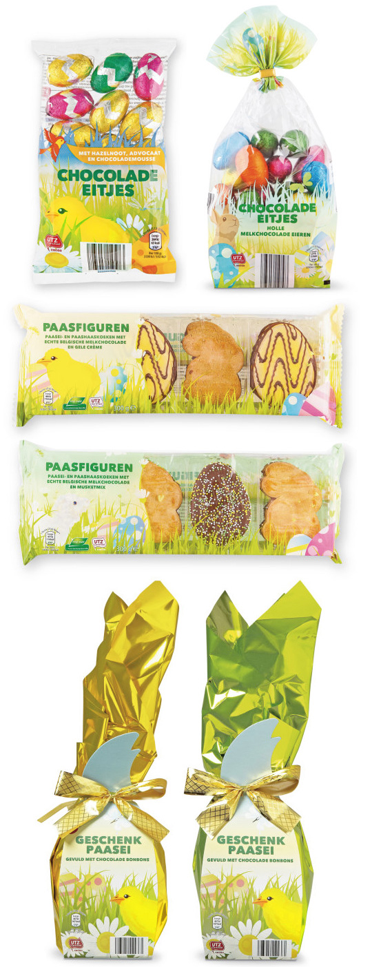 Chocolate eggs, gift eggs, egg shaped cookies, hollow Easter treasures characters, chocolate Easter bunnies, caramel eggs, Easter eggs filled with chocolates, bunny shaped cookies, chocolate covered cookie bunnies. Want more? Decorated easter characters, Chocolate easter coins, beanie bunnies and chocolate egg lollies. Just to name a few.
All of these were packed in packaging design created by Stepfive for Aldi Netherlands.
TAGS: Aldi, candy, chocolate, Dutch, Easter, Netherlands, packaging design, Stepfive
POSTED IN food | no comments »


