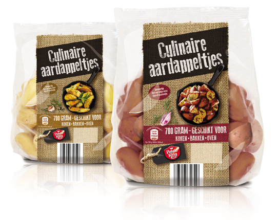
 The private label Potato King of Aldi Netherlands has expanded its range of potatoes with two varieties of culinary potatoes. With the jute in the background so recognizable for Potato King, a suitable design has been developed for the pouches in which the culinary potatoes are sold. Eye-catcher is the photography from above of the potatoes in the pan. The design is placed on the pouches as a kind of banderole, so there is an optimal view of the product from every angle.
==
Het private label Potato King van Aldi Nederland heeft haar assortiment aardappelen uitgebreid met twee varianten culinaire aardappeltjes. Met het voor Potato King zo herkenbare jute op de achtergrond, is er een passend design ontwikkeld voor de stazakken waarin de culinaire aardappeltjes worden verkocht. Blikvanger is de fotografie van bovenaf van de aardappeltjes in de pan. Doordat het design als een soort banderol op de stazakken is geplaatst, is er vanuit elke hoek optimaal zicht op het product.

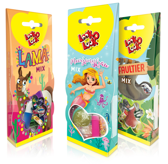 For Look-O-Look we have, in addition to the successful Unicorn theme packaging, developed three new cheerful candy mix packaging designs for the German market. This packaging design is once again richly illustrated in three different trendy themes; a Lama Mix, a Mermaid Mix and a Sloth Mix. These candy boxes are superb for gifting and sharing as well. The window at the bottom of the packaging that can both hang and stand gives a good view on the mix of candies inside the package.
==
Voor Look-O-Look hebben wij in navolging van het succesvolle Eenhoorn themadoosje, drie nieuwe vrolijke snoepmix verpakkingen ontwikkeld voor de Duitse markt. Dit packaging design is opnieuw rijk ge�llustreerd in drie verschillende trendy thema’s; een Lama Mix, een Zeemeermin Mix en een Luiaard Mix. De speelse verpakkingen zijn ideaal voor gifting en ook om samen te delen. De verpakkingen die zowel kunnen hangen als staan, geven door middel van de vensters onderin goed zicht op de mix van snoep binnenin de verpakking.
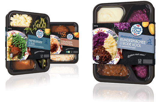 The introduction of the Aldi NL private label ‘Lekker & Snel’ is steadily on. The Hollandse Maaltijden (Typical Dutch Meals) are in the chilled shelves with new sleeves now. There are ten new sleeves developed for the different weights and meals.
The design of the entire range consists of a tasty visual and photos of loose ingredients combined with an authentic typography on a black slate surface. The clear signal colours ensures that consumers will not pick the wrong product. In addition, the sleeves don’t cover the complete tray, which results in a good view on the product.
==
De uitrol van het Aldi NL private label Lekker & Snel gaat gestaag door. Ook de Hollandse Maaltijden zijn nu met nieuwe sleeves in de koelvers schappen terug te vinden. Er zijn een tiental sleeves ontwikkeld voor de verschillende gramsgewichten en maaltijden.
Het design van de gehele range bestaat uit een smakelijke visual en foto’s van losse ingredi�nten in combinatie met een authentieke typografie op een zwart leistenen ondergrond. De duidelijke kleurcodering zorgt ervoor dat de consument niet mis grijpt. Daarnaast omvat de sleeve de tray niet volledig, waardoor er goed zicht is op het product.
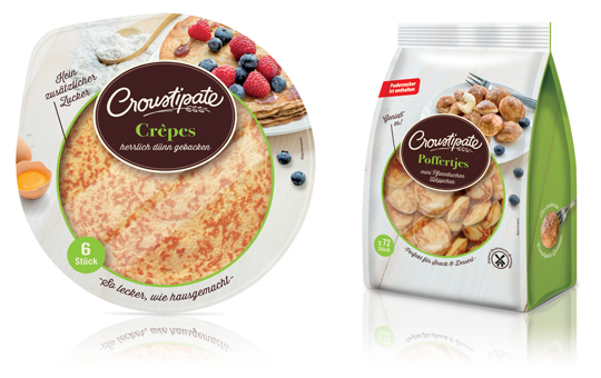 For Croustipate, we have developed and upgraded the pancakes and poffertjes packaging design for the German market. The packs are fresh of color by the use of bright green as signal colour and have a trusted look by the use of the wooden whitewash background. The windows in both foil packaging provide a good view on the products and the tasteful new photography that we have made, makes this packaging even more attractive. A striking modern line-extension of Croustipate is born.
==
Voor Croustipate hebben wij een upgrade van het pannenkoeken en poffertjes packaging design voor de Duitse markt ontwikkeld. De verpakkingen zijn fris van kleur door het gebruik van de helder groen als signaalkleur en ogen ambachtelijk en vertrouwd door de houten whitewash achtergrond. De vensters in beide folieverpakkingen geven goed zicht op de producten en de smaakvolle nieuwe fotografie die wij hebben laten plegen maakt deze verpakkingen nog aantrekkelijker en weer helemaal van nu. Een opvallende en ingetogen moderne line-extension van Croustipate is hiermee geboren.
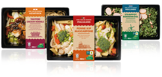 A complete new designed series of sleeves for Aldi Netherlands for their private label ‘Vers van de Keuken’, which means fresh from your kitchen. The packaging design sleeves have an authentic feel with the used typography and craft paper look. The iconic images emphasises, in combination with the signal colours, the country of origin of the meals inside.
==
Een geheel nieuwe serie sleeves voor Aldi Nederland voor het private label ‘Vers van de Keuken’. De sleeves hebben een authentieke uitstraling door de gebruikte typografie en de look van kraft papier. De iconische afbeeldingen benadrukken, in combinatie met de gebruikte signaalkleuren, de herkomst van de maaltijden.
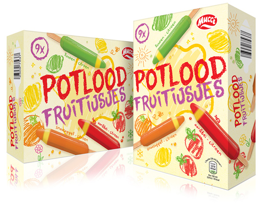 A new ice cream in the Aldi range means a new packaging design. For these fruity colour pencils ice creams by Mucci, Stepfive created a playful packaging design, fully in line with the product in the box. A pencil written typography and line drawings of fruit which are hatched with different color pencils, together with the tasty productvisuals are the ingredients of this cheerful, summery design.
==
Een nieuw ijsje in het Aldi assortiment betekent een nieuw packaging design. Voor deze fruit kleurpotloodijsjes van Mucci heeft Stepfive een speels packaging design gecre�erd, geheel in overeenstemming met het product in de doos. Een potlood typografie en lijntekeningen van fruit die zijn gearceerd met verschillende kleurpotloden vormen samen met de lekkere productvisuals de ingredi�nten van dit vrolijke, zomerse ontwerp.
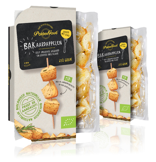 The organic PolderGoud baking potatoes from potato producer Schaap Holland are still in their skin, but now also in new packaging design! The developed sleeves have been given a natural feeling by the use of kraft cardboard, which means that the organic of the product is also further loaded by the packaging. A handwritten white and yellow typography on a black panel with chalkboard look gives an authentic look to the sleeves, which also shows a tasteful visual of a preparation tip on top.
==
De biologische PolderGoud bakaardappelen van aardappelproducent Schaap Holland zitten nog lekker in de schil, maar nu ook in een nieuwe verpakking! De ontwikkelde sleeves hebben een natuurlijk gevoel meegekregen door het gebruik van kraft karton, waardoor het biologische van het product ook door de verpakking nog extra wordt geladen. Een handgeschreven wit en gele typografie op een zwart panel met krijtbordlook geeft een authentieke uitstraling mee aan de sleeves, waarop ook nog een smaakvolle visual van een bereidingstip op de bovenzijde staat afgebeeld.
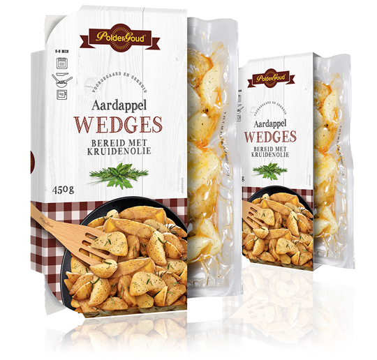 For the brand PolderGoud of potato producer Schaap Holland we’ve developed the sleeves of the potato wedges. It resulted in clear sleeves with a leading role for the potato wedges itself. They are located in a stylish black scale, photographed from above, which is on a whitewash wooden floor. The typography in the color of the tablecloth under the scale gives the whole a familiar and authentic feeling.
==
Voor het merk PolderGoud van aardappelproducent Schaap Holland hebben wij de sleeves van de aardappel wedges mogen ontwikkelen. Het heeft geresulteerd in heldere sleeves met een hoofdrol voor de aardappel wedges zelf. Ze liggen in een stijlvol zwarte schaal, van bovenaf gefotografeerd, die op een whitewash houten vloer is gepositioneerd. De typografie in de kleur van het kleedje onder de schaal geeft het geheel een vertrouwd en ambachtelijk gevoel.
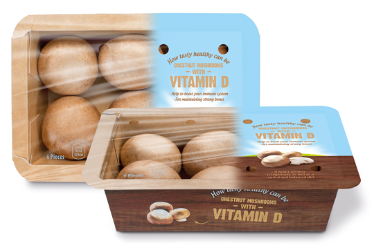 Banken Champignons serves with the vitamin D mushrooms the still growing demand for healthy and natural food. The innovative (chestnut) mushrooms are available in England, Germany and The Netherlands since last year. We were asked to develop the branding and packaging design. This resulted in a tray of kraft paper carton with an organic touch, due to the wood structure printing on it. The topseal communicates clearly the benefits of this unique product with a bright visual of air, sun and grass which emphasizes the healthyness of the product once again.
==
Banken Champignons speelt met haar vitamine D champignons in op de nog altijd groeiende vraag naar gezonde en natuurlijke voeding. De innovatieve (kastanje)champignons zijn sinds vorig jaar op de Nederlandse, Duitse en Engelse markt verkrijgbaar en wij mochten voor de branding en het design zorgen. Het heeft geresulteerd in een bakje van kraftkarton met een hoog biologische feel door de bedrukking van houtstructuur. De topseal communiceert nogmaals helder en duidelijk de benefits van het unieke product in een visual van lucht, zon en gras wat het gezonde van het product nog eens nadrukkelijk onderstreept.
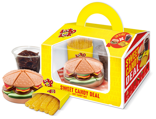 Look-O-Look’s Sweet Candy Deal is a playful gifting that contains three candy products: a candy burger, a cup of coke and a bag of French fries, all made of small candies. The packaging design developed by Stepfive has a great recognition and is convenient to be carried by the handle. In addition, it offers a good view of the products in the box through the large viewing window. The napkin at the bottom makes it a wrap!
A QR code on the packaging leads to an online Scan & Win promotion. The Sweet Candy Deal is a real eye-catcher, a surprising gift and a delicious treat.
==
De Sweet Candy Deal van Look-O-Look is een speelse gifting die bestaat uit een drietal snoepproducten: de Candy Burger, een bekertje cola en een zakje Franse frietjes, allemaal gemaakt van kleine snoepjes. Het door ons ontwikkelde packaging design heeft een grote herkenbaarheid en is handig te dragen door het handvat. Daarnaast biedt het goed zicht op de producten in de box door middel van het grote zichtvenster. Het servetje op de bodem maakt de look van de box helemaal af.
Op de verpakking staat een QR-code waarmee kan worden meegedaan aan de online Scan & Win actie. De Sweet Candy Deal is hiermee een echte packaging eye-catcher geworden, een verrassend cadeau bovendien en een heerlijke traktatie.


-
Archives
- August 2018
- July 2018
- June 2018
- May 2018
- April 2018
- March 2018
- February 2018
- January 2018
- November 2017
- October 2017
- September 2017
- April 2017
- February 2017
- December 2016
- October 2016
- September 2016
- July 2016
- May 2016
- March 2016
- January 2016
- November 2015
- October 2015
- August 2015
- June 2015
- May 2015
- April 2015
- February 2015
- January 2015
- December 2014
- November 2014
- October 2014
- September 2014
- August 2014
- June 2014
- May 2014
- April 2014
- March 2014
- February 2014
- January 2014
- December 2013
- November 2013
- October 2013
- September 2013
- August 2013
- June 2013
- May 2013
- April 2013
- March 2013
- February 2013
- January 2013
- December 2012
- November 2012
- October 2012
- September 2012
- August 2012
- July 2012
- June 2012
- May 2012
- April 2012
- March 2012
- February 2012
- January 2012
- December 2011
- November 2011
- October 2011
- September 2011
- August 2011
- July 2011
- June 2011
- May 2011
- April 2011
- March 2011
- February 2011
- January 2011