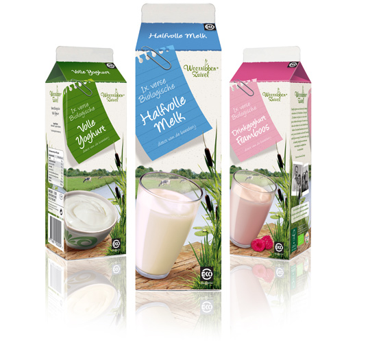
 Following to this restyling, a similar fresh and natural packaging design was created by Stepfive of milk and drinks for Dutch company Weerribben Zuivel. The visuals on the packaging are showing us the origin of the milk and drinks: National Park ‘De Weerribben’ in The Netherlands with its characteristic feather reed grass. The coloured shopping list is a powerful asset to match all twelve products into a coherent range.


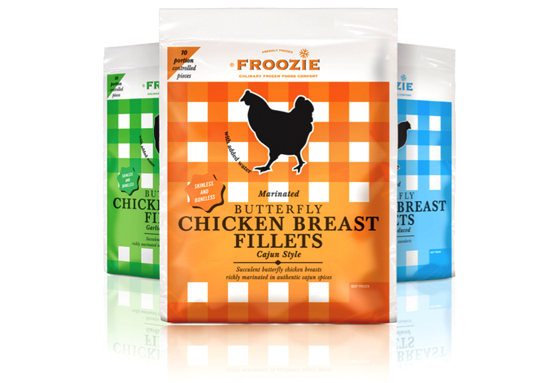 Dalco Food specialises in developing and producing meat and vegetarian meal components in The Netherlands and the United Kingdom. For their private label ‘Froozie’ on the English market, we created a new packaging design for the fresh frozen Butterfly Chicken Breast Fillets in flexible plastic bags. There are three strong color variations, matching the three different styles: cajun, garlic and regular. Along with this design, the new Froozie logo brand identity (also designed by Stepfive) was successfully introduced.

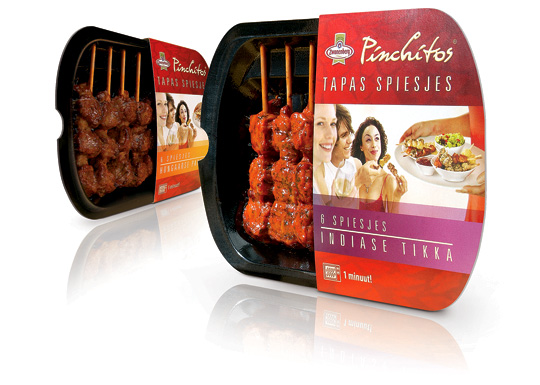 Health and convenience also becomes more and more important within the Dutch food industry. That’s why Zwanenberg Food Group choose for ‘the other way to snack’ with Pinchitos Tapas Spears: no chips, but a healthy and light meat snack, that only takes one minute in the microwave to prepare. Together with Boom Packaging, Stepfive created a fresh and open packaging design along with the Pinchitos brand identity for this healthy snack in five different flavors.

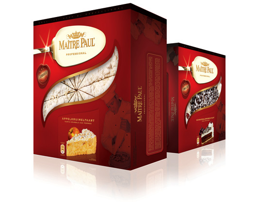 One of Ma�tre Pauls successful private labels, Carnaby, is rebranded into Ma�tre Paul Professional in the past few months. The Ma�tre Paul Professional brand is aimed at the foodservice and cash & carry market. Their high-quality pies are unique in their kind, but accessible to all foodservice customers. The new packaging design made by Stepfive, reflects the high-quality and craftsmanship of the Dutch Ma�tre Paul bakers and is developed in a range for 16 different products with 16 different labels.

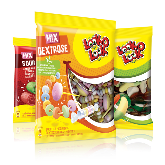 After a successful redesign of Look-O-Look’s Toppermix, the redesign and packaging for the familybags of Look-O-Look is done by Stepfive Communication & Design too.
The Dutch candy producer with ”The most delicious candies in one bag” wanted a fun and diverting familybag, appealing for all family members, young and old. Each different bag has its own colour coding, but all bags have the same window (a laughing mouth shape) and illustrated candies, drawn in comic style.

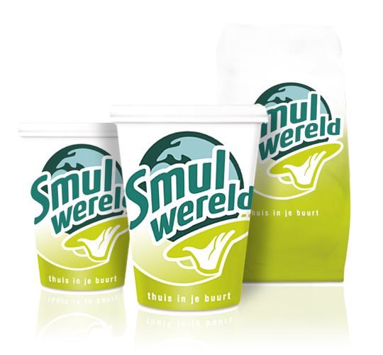 FFC (Franchise Friendly Concepts) is the largest independent Dutch food franchise organization with several success formulas. One of them: Smulwereld. The new logo created for their rebranding is modern with a healthy look and symbolizes the propositions. Along with this rebranding a complete range of disposables was designed. This rebranding was implemented in all 100 Smulwereld companies in The Netherlands, together with signings and interior adjustments.

 Dutch entrepeneurs in the food industry are producing durable products more and more often. It appears consumers choose durably produced food over regularly produced food and because of that, the Ministry of EL&I wants to increase the supply of durable products on the market.
These are some conclusions that were made during the ‘Duurzaam Food Congres’ (Durable Food Congress) that took place the 25th of january.
Read more

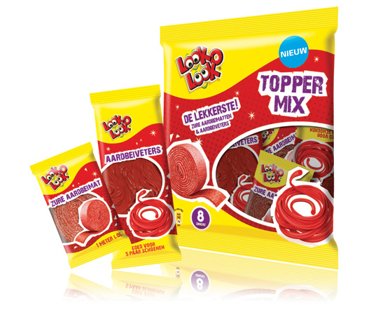 ”The most delicious candies in one bag”. A new design in a tough and streetwise style that also fits to the regular Look-O-Look brand identity. The products: sour strawberry stripes and laces. This packaging design with a clear product communication is appealing for kids and tweens as it shows quite clearly ‘what’s in it for them’. Literally that is.

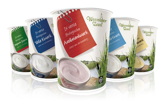 Delicious and fresh curds on your shopping list every day! A packaging design that makes the difference and takes care of a distinct shop shelf impact with a bright and natural appearance.
The visual at the package shows us the origin of the milk used for the curds: National Park ‘De Weerribben’ in The Netherlands with its characteristic feather reed grass. The coloured shopping list is a powerful way to give all five sort of curds its own unique look.


