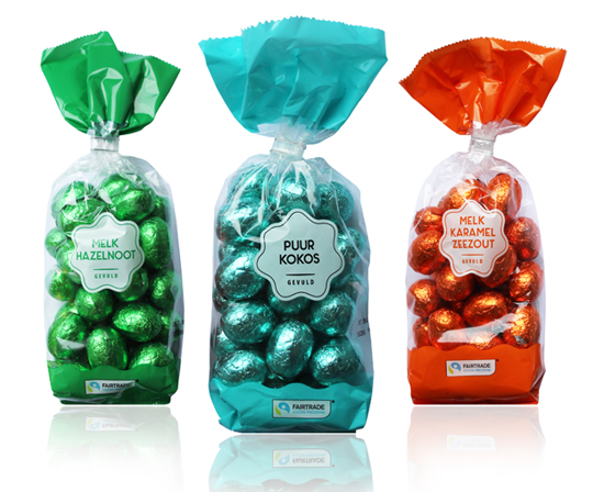
 Chocolate eggs really belong to Easter. Just like painting eggs, a tasty Easter breakfast and looking for eggs of course. This year again, we’ve developed the total Easter chocolate line for Aldi, such as the filled chocolate eggs for which the product’s visibility was the starting point. One of these is this modest design with only a white rosette as a design element, on which the taste indication is stated. The product is the hero in this packaging design, because the film is also completely transparent. The brightly colored foils around the eggs make it complete. Happy Easter!
==
Chocolade eieren horen echt bij Pasen. Net zoals eieren beschilderen, een lekker Paasontbijt en eieren zoeken natuurlijk. Ook dit jaar hebben wij voor Aldi weer de totale Paas chocoladelijn ontwikkeld, zoals bijvoorbeeld de gevulde chocolade eitjes waarbij zichtbaarheid van het product het vertrekpunt was. E�n daarvan is dit ingetogen design met enkel een witte rozet als design element, waarop de smaakaanduiding vermeld staat. Het product is in dit verpakkingsontwerp de hero, doordat de folie verder volledig transparant is. De fel gekleurde folies om de eitjes maken het helemaal af. Fijne Pasen!

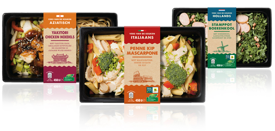 A complete new designed series of sleeves for Aldi Netherlands for their private label ‘Vers van de Keuken’, which means fresh from your kitchen. The packaging design sleeves have an authentic feel with the used typography and craft paper look. The iconic images emphasises, in combination with the signal colours, the country of origin of the meals inside.
==
Een geheel nieuwe serie sleeves voor Aldi Nederland voor het private label ‘Vers van de Keuken’. De sleeves hebben een authentieke uitstraling door de gebruikte typografie en de look van kraft papier. De iconische afbeeldingen benadrukken, in combinatie met de gebruikte signaalkleuren, de herkomst van de maaltijden.
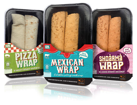 New packaging design for all kind of different ready-to-eat wraps for De Kroes have been designed by Stepfive. The carton sleeves have a strong graphic, colourful and typographic look, based on the country of origin. Only half of the product is covered by the sleeve, which results in a high product visibility. The wraps are for sale in supermarkets in The Netherlands like Albert Heijn.
==
Nieuw packaging design voor verschillende soorten ready-to-eat wraps van De Kroes is ontwikkeld door Stepfive. De kartonnen sleeves zijn grafisch sterk, opvallend van kleur en typografie die in vorm zijn gebaseerd op het land van herkomst. Alleen de onderzijde van het product wordt door de sleeve omvat, waardoor er een goede zichtbaarheid van het product ontstaat. De wraps worden in Nederland verkocht bij o.a. de Albert Heijn.
 At Dutch website Groene Offerte you’ll find loads of interesting packaging design related articles, opinions and other stuff (all in Dutch). Especially the serie ‘Food for Thought’ gives entertaining and remarkable examples of packaging design in all its aspects, good or bad.
Groene Offerte is established for the complete design industry. The site is set up to grow: more and more contacts, knowledge and new insights. In this way Groene Offerte wants to help and encourage the design industry with their key role of this industry in the sustainable development of society and economy.
Food for Thought at Groene Offerte (all in Dutch).
 The characteristic brown beer bottle will turn just as green as the bottles that Heineken sells worldwide. The Brown bottle is a relic of Dutch appointments made decades ago to redeem deposit-bottles. Brown glass is recycled by most Dutch brewers, so it doesn’t matter which Brewer is taking in a bottle. Green glass is much less established. First, the green bottle was intended as an export bottle, but over the years it has become the color of the Heineken brand. The exchange operation began twenty years ago. In 1992 the Red cap disappeared, six years afterwards the yellow crates turned green and since 2000 all Lightboxes are green as well.
 A compilation of yearly design awards, this book features the best in communication and packaging design from around the world. The iF communication design awards have been conferred since 2004 by a panel of design experts from across the world. Showcased in this volume are the most outstanding examples of communication and packaging design. This yearbook presents trendsetting achievement in advertising, media, campaigns, packaging, and websites.
Read more here, or buy here.
In a world of tremendous fast growing digitalization, packaging design can’t stay far behind. Want to ‘feel’ a package and see it’s benefits without having the actual package in hands? Apps and other digital media provides us, in combination with regular printed media, an innovative and even better way of advertising.
Stepfive Communication & Design designed and developed a mobile and desktop website for Dutch candy producer Look-O-Look, to be reached by a QR-code at advertisements. Consumers and sales managers can digitally feel and navigate around the new package design at this site. In combination with printed and social media it gives Look-O-Look a wide spread and an effective campaign to show their brand and products.
 Stepfive creates new distinctive retail and catering concepts for food and beverage brands on a daily basis. We develop new concepts, recipes, brands and packaging design together with our clients. We also revitalise existing products on our own initiative, because we are convinced many products could have a more successful brand appearance with the right adaption and repositioning. For example, we have created this new concept for Bloody Mary.
This Bloody Mary concept can be used for the catering and retail sector. The bottle has two facings (meant for standing and hanging) and can therefore be placed on a shelf, perhaps in a retail environment, or can be suspended within catering establishments. You also have the option of attaching a connecting piece with a hose, allowing drinking glasses to be filled with Bloody Mary from a bottle hanging on the bar.
 The exhibition ‘Food Forward‘ presents scenarios for the future of our food based on the work of artists and designers. The starting point is the video �The Hunt’ by Christian Jankowski (DE) that humorously puts the estrangement between city dwellers and food on edge. John O’Shea (UK) pushes the limits of the law in his attempts to achieve a more humane meat production and meat consumption scheme. Michiko Nitta and Michael Burton (UK) will present two scenarios from their larger study of life after agriculture: the symbiosis between humans and algae and a functional food regime. Arne Hendriks (NL) finally explores the possibilities and consequences of shrinking men to 50 centimeters.
Food Forward Exhibition:
15 January 2012 / 01 April 2012. Location: Hogewal 1-9, The Hague, The Netherlands
 It’s that time of the year again. And as we’re used to, we like to thank our clients and other relations with a special gift for the successful cooperation this past year.
This years theme is ‘All the Best!’ (‘Het Beste’ in Dutch). Not only because the wine, a Domiziano Negroamaro del Salento, is best judged by a professional specialist journal, but also because we launched our renewed website this week. You can find all the best of our latest and past projects with our clients over there.
Stepfive Communication & Design wishes you All The Best for 2012!


-
Archives
- August 2018
- July 2018
- June 2018
- May 2018
- April 2018
- March 2018
- February 2018
- January 2018
- November 2017
- October 2017
- September 2017
- April 2017
- February 2017
- December 2016
- October 2016
- September 2016
- July 2016
- May 2016
- March 2016
- January 2016
- November 2015
- October 2015
- August 2015
- June 2015
- May 2015
- April 2015
- February 2015
- January 2015
- December 2014
- November 2014
- October 2014
- September 2014
- August 2014
- June 2014
- May 2014
- April 2014
- March 2014
- February 2014
- January 2014
- December 2013
- November 2013
- October 2013
- September 2013
- August 2013
- June 2013
- May 2013
- April 2013
- March 2013
- February 2013
- January 2013
- December 2012
- November 2012
- October 2012
- September 2012
- August 2012
- July 2012
- June 2012
- May 2012
- April 2012
- March 2012
- February 2012
- January 2012
- December 2011
- November 2011
- October 2011
- September 2011
- August 2011
- July 2011
- June 2011
- May 2011
- April 2011
- March 2011
- February 2011
- January 2011