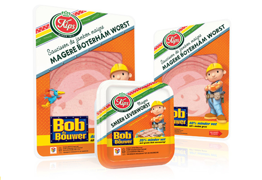
 The packaging design for the international figure Bob the BuilderTM baloney and liver pat� was created by Stepfive, commissioned by Zwanenberg Food Group. This delicious sandwich filling for children appeals not only to the youngest ones. Due to it�s strong presence, it also looks very desireable on the shelf. Bob the BuilderTM makes lunch and breakfast even more fun!


 For Look-O-Look, Stepfive developed a new and contemporary line of packages (for 29 different candies) which will replace the current ‘kopkaartjes’ (transparent candy bags). These new flowpacks are designed in a handy size and are easy to open, which creates optimal ease in use. The new flowpacks have a fun, fresh and strong packaging design which corresponds perfectly with the target group. The flowpack design also contains a clear product-communication and an optimal visibility for a maximal impulse, which really distinguishes this packaging in stores from it’s competitors.

In a world of tremendous fast growing digitalization, packaging design can’t stay far behind. Want to ‘feel’ a package and see it’s benefits without having the actual package in hands? Apps and other digital media provides us, in combination with regular printed media, an innovative and even better way of advertising.
Stepfive Communication & Design designed and developed a mobile and desktop website for Dutch candy producer Look-O-Look, to be reached by a QR-code at advertisements. Consumers and sales managers can digitally feel and navigate around the new package design at this site. In combination with printed and social media it gives Look-O-Look a wide spread and an effective campaign to show their brand and products.

 Stepfive creates new distinctive retail and catering concepts for food and beverage brands on a daily basis. We develop new concepts, recipes, brands and packaging design together with our clients. We also revitalise existing products on our own initiative, because we are convinced many products could have a more successful brand appearance with the right adaption and repositioning. For example, we have created this new concept for Bloody Mary.
This Bloody Mary concept can be used for the catering and retail sector. The bottle has two facings (meant for standing and hanging) and can therefore be placed on a shelf, perhaps in a retail environment, or can be suspended within catering establishments. You also have the option of attaching a connecting piece with a hose, allowing drinking glasses to be filled with Bloody Mary from a bottle hanging on the bar.

 The packaging design for the international figure Bob the BuilderTM luncheon meat and liver pat� was created by Stepfive for Zwanenberg Food Group. This delicious sandwich filling for children appeals not only to the youngest ones. Due to it’s strong presence, it also looks very desireable on the shelf. Bob the BuilderTM makes lunch and breakfast even more fun!

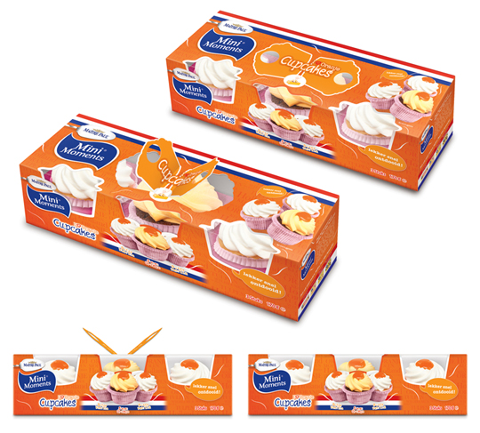 Stepfive created these packaging designs for Ma�tre Paul�s Oranje Cupcakes. The goal: creating a visually appealing and festive package which could be presented like, as it were, a real gift. Especially for typical Dutch traditions and parties such as ‘Queen’s Day’, but for (inter)national sport events as for instance soccer championships as well. ‘Cause after all, the Dutch colour is orange. Ma�tre Paul�s Oranje Cupcakes are the perfect treat for those special little moments. They are nice to give and fun to get!� There are three cupcakes per package.
More on Ma�tre Paul Cupcakes original design here.

 Dutch bakery FreeOf produces all kinds of bread products completely gluten-free for people on a diet, for those who simply want to eat gluten-free or for those who suffer from gluten sensitivity. This disease can be defined as a non-allergic and non-autoimmune condition in which the consumption of gluten can lead to symptoms similar to those observed in coeliac disease or wheat allergy. For FreeOf, Stepfive created an appetizing looking and modern packaging design for the complete range of FreeOf products.
It’s time to enjoy healthier, better tasting and better looking gluten-free breads!

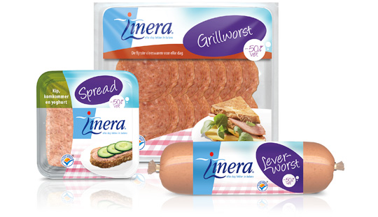 Linera is long known for it�s diet-related products. But The Times They Are A-Changin’ and so does our perception of healthy living, which is more based on a healthy diet as being a lifestyle then occasionally being on a strict diet. So Linera asked Stepfive to redesign the packaging design of their current line of products in order to fit this modern take on healthy living. Therefore, Linera set some basic rules: the Linera branding must not be altered. Nor should the focus on the target group, which consists mainly of female consumers. Furthermore, the design must be colourful and have an active feel to it.
We think we managed to do just that. We�ve gained Linera�s presence by adding a big purple oval in which the product-type is communicated. The result is this highly recognisable line of modern Linera-products that can stand the times for at least a number of years.

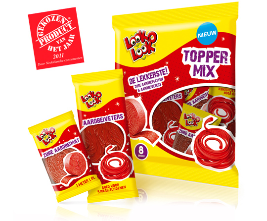 A kick-start of 2012 with this news. Look-O-Look’s Toppermix was voted Product of the Year 2011! A representative panel of 6,000 Dutch consumers criticized it best among all others. A reason to be cheerful and so are we at Stepfive headquarters!
More on Look-O-Look’s winning Toppermix (design by Stepfive) here.

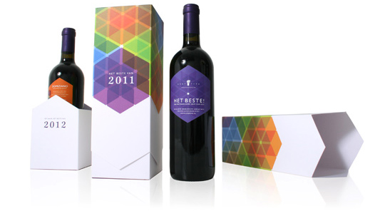 It’s that time of the year again. And as we’re used to, we like to thank our clients and other relations with a special gift for the successful cooperation this past year.
This years theme is ‘All the Best!’ (‘Het Beste’ in Dutch). Not only because the wine, a Domiziano Negroamaro del Salento, is best judged by a professional specialist journal, but also because we launched our renewed website this week. You can find all the best of our latest and past projects with our clients over there.
Stepfive Communication & Design wishes you All The Best for 2012!


