At this years CES 2011, Fulton Innovation makes the power of wireless energy visible. The video above shows light up wireless animated cereal boxes powered by inductive coupling technology. The idea is to have wireless power available in everything, from tabletops to grocery aisles to parking garages.
A pretty cool innovation and an excellent way to push packaging design to the max.


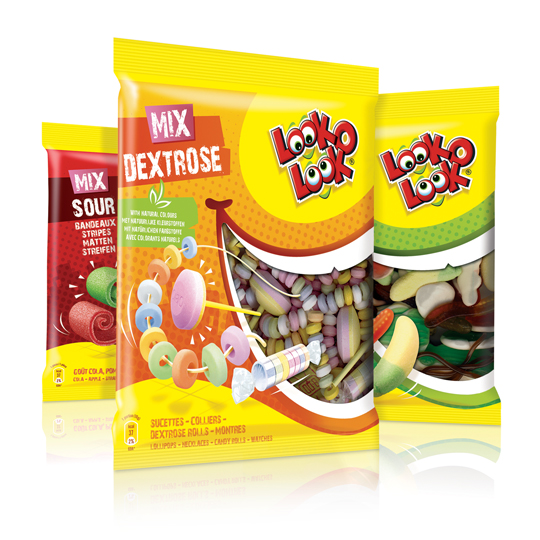 After a successful redesign of Look-O-Look’s Toppermix, the redesign and packaging for the familybags of Look-O-Look is done by Stepfive Communication & Design too.
The Dutch candy producer with ”The most delicious candies in one bag” wanted a fun and diverting familybag, appealing for all family members, young and old. Each different bag has its own colour coding, but all bags have the same window (a laughing mouth shape) and illustrated candies, drawn in comic style.

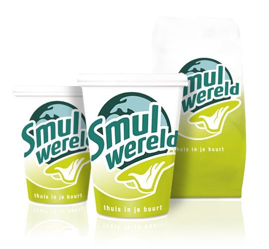 FFC (Franchise Friendly Concepts) is the largest independent Dutch food franchise organization with several success formulas. One of them: Smulwereld. The new logo created for their rebranding is modern with a healthy look and symbolizes the propositions. Along with this rebranding a complete range of disposables was designed. This rebranding was implemented in all 100 Smulwereld companies in The Netherlands, together with signings and interior adjustments.

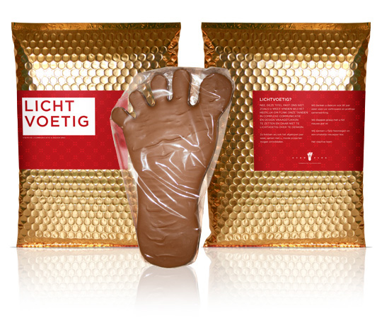 Light-footed (in Dutch: lichtvoetig) ain’t a title that fits Stepfive Communication & Design too well. Contrary, we just love to do complex and new issues concerning packaging design and other graphic jobs for our clients! And we do love a chocolate bite too. That’s why we gave our clients this delicious chocolate foot last december as a new years present: to eat your heart out with Stepfive.

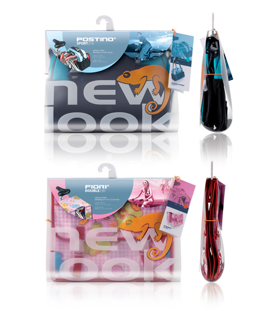 Recognition and a powerful brand experience of New Look were the main starting points for both the single and double bike bag packaging design. The final design conveys the value of the product and the image of the brand which is stylish, colourful and modern, in yet a distinctive manner. Beside this sparkling new Dutch packaging design a whole line of supporting materials such as labels, cards and action banners have been developed for New Look bike bags in The Netherlands.

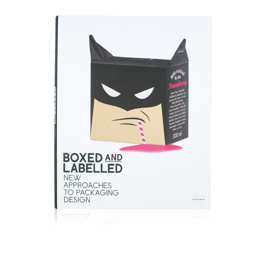 Boxed and Labeled: the inspiring book for the “out-of-the-box” thinking packaging designer. Some of the designs seem to be almost impossible to make and extremely creative, others are beautifully stylish. But all expand the way of thinking about packaging design. For sure al designs strengthen the appearance of the products being packed. Published by Gestalten, Berlin 2009

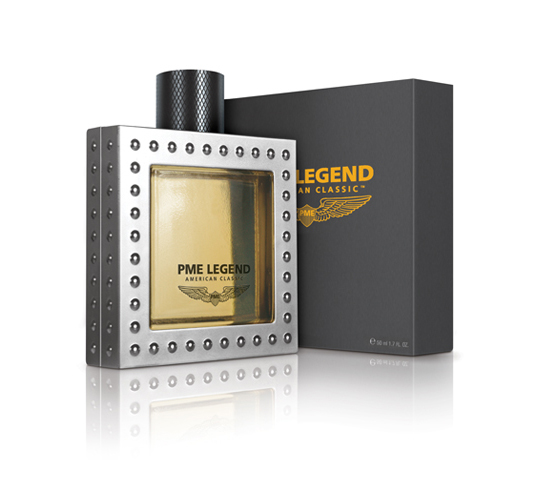 The design of the new Pall Mall Export fragrance ‘PME Legend’ is a tough men’s line, inspired by the online PME commercial with a DC3. The matte silver metal framing combined with a classic and simple rectangular bottle form makes the packaging design for this eau de toilette a very masculine must-have. PME Legend contains notes of cardamom, pepper, coriander, orange, sandalwood, vanilla and musk and was successfully launched all over Europe.

 Dutch entrepeneurs in the food industry are producing durable products more and more often. It appears consumers choose durably produced food over regularly produced food and because of that, the Ministry of EL&I wants to increase the supply of durable products on the market.
These are some conclusions that were made during the ‘Duurzaam Food Congres’ (Durable Food Congress) that took place the 25th of january.
Read more

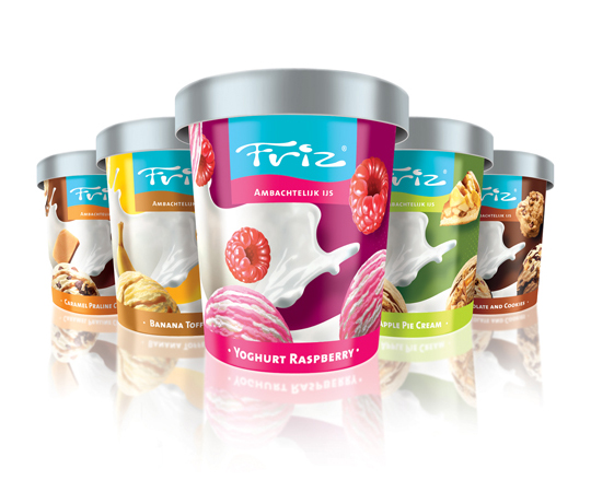 The new ice cream ‘Friz’ is developed for FFC (Franchise Friendly Concepts), the largest independent Dutch food franchise organization with several success formulas. The complete brand identity and packaging design is based on the fresh and round Friz logo, attractive to young and old. This organic ice cream with a fresh and funky look comes in five flavours and was successfully introduced within all the FFC formulas.

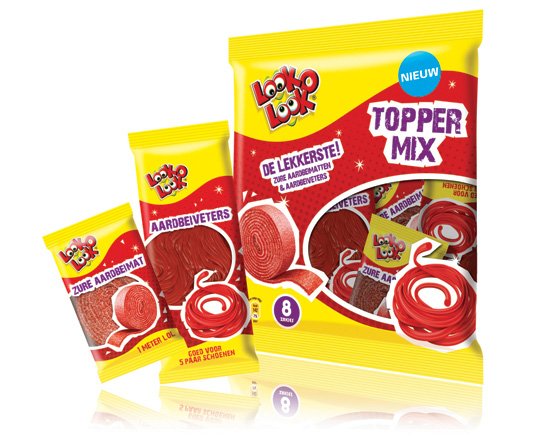 ”The most delicious candies in one bag”. A new design in a tough and streetwise style that also fits to the regular Look-O-Look brand identity. The products: sour strawberry stripes and laces. This packaging design with a clear product communication is appealing for kids and tweens as it shows quite clearly ‘what’s in it for them’. Literally that is.


