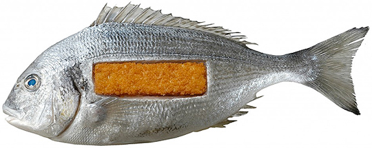
 In De Etende Mens (Food Culture: Eating by Design) Premsela explores how design can enable us to make the changes to our food chain that are necessary to ensure a healthy future. Mediamatic’s High Density Aquaponics Edifice and the Diesel Kantine (a collaboration with Jo�o Negro) are featured in the exhibition.
The exhibition De Etende Mens showcases work by designers who concern themselves with the relationship between design, food, and (the origins of) what we eat. Curated by Marije Vogelzang, the works on display map people�s complex relationship with food and make visitors aware of how our food is produced.
Throughout the year, Premsela offers educational activities in connection with the Designhuis exhibitions for students in Dutch secondary and higher education. De Etende Mens is on view until January 6, 2013 at the Designhuis in Eindhoven. The exhibition is open from Tuesday till Sunday, from 11.00-18.00. Entrance fee is 5,-. Go to the Designhuis website for more information.


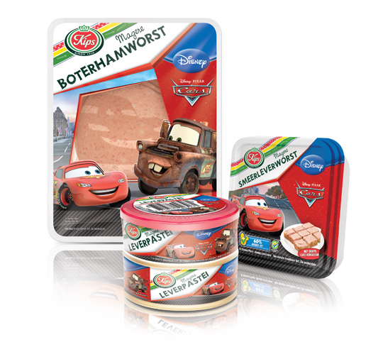 The packaging design for Disney Cars baloney and liver pat� was created by Stepfive, commissioned by Zwanenberg Food Group. This delicious sandwich filling for children appeals not only to the youngest ones. Due to it’s strong presence, it also looks very desirable on the shelf. Disney Cars makes lunch and breakfast even more fun!

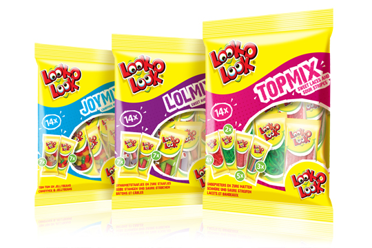 After a successful redesign of Look-O-Look’s Family Bags, Flowpacks and Toppermix, the redesign and packaging for the international Mix Bags of Look-O-Look is done by Stepfive Communication & Design too. The Dutch candy producer with “The most delicious candies in one bag” wanted a fun and diverting bag with small flowpacks in it, appealing to all family members, young and old. These Mix Bags differ from the other Look-O-Look bags by having small and handy portion packs in each mix bag. Each different bag has its own colour coding, visuals of aforementioned small portion packs/flowpacks (drawn in realistic style) and a large window for optimal visibility of the delicious candies.

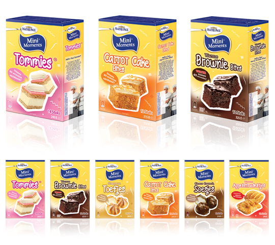 Stepfive created new packaging design for Ma�tre Paul�s MiniMoments range, a range of small pastries that are the perfect treat for ‘those special little moments’. The MiniMoments are nice to give and fun to get! The goal was to create a visually appealing and recognizable range.

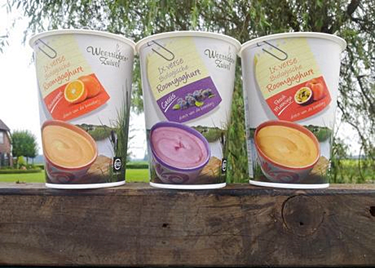 In addition to this restyling, a new organic cream yoghurt (with fruits) packaging design was created for Dutch company Weerribben Zuivel. Fresh and natural visuals on the packaging are showing us the origin of this organic cream yoghurt: National Park �De Weerribben� in The Netherlands. These visuals and the coloured shopping list on top derives from the complete restyling by Stepfive of all the other Weerribben products and herewith makes it into a coherent and appetizing product range. Also to distinguish the cream yoghurts from the other yoghurts, we’ve added visuals of the fruits used in the yoghurt.

 For the Dutch brand Kips, Stepfive created two reclosable ‘out of home’ freshpacks for cheeses and meats including printable stickers. Each freshpack contains ten slices and is designed with an apparent color setting (yellow for cheeses and red for meats). The packs have a basic, clean design with clear Kips branding for optimum product visibility that convey top quality products. Kips is a brand of Zwanenberg Food Group.

 Packaging products are designed to last as long as possible before recycling, where the vital process starts all over again. The importance of recyclable packaging is clearly recognised by all market sectors; either because the product itself is natural and eco-friendly or manufacturers wish to draw attention to the essence of the product. On the whole, awareness as regards the importance of recycled products is gradually increasing.
View pages and read more, or buy here.

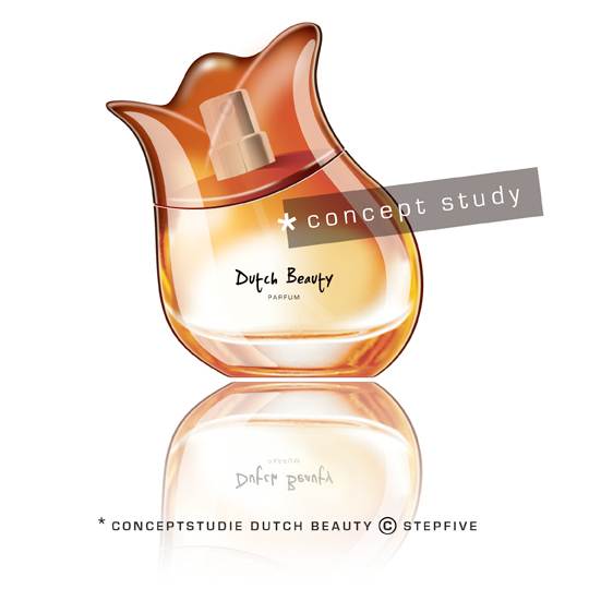 Stepfive develops new brands and concepts for the foodbranche, beverages and luxurious products (i.e. cosmetics) on a daily basis. We analyze various markets in search of opportunities commissioned by our clients, but also on our own initiative.� This perfume “Dutch Beauty” is a fine example of said initiative and is developed to spread the wonderful sent of Dutch tulips all around the world. The shape of the bottle is based on (obviously) a tulip, the top of the bottle can be removed and the perfume can be applied by using the dispenser. The bottle is made of glass except for the top which is made of glossy plastic. Are you interested in this concept? Please contact us www.stepfive.nl

 On January 1st, 2013, taxes on packaging in The Netherlands will possibly be abolished. Owing to an agreement between Dutch State Secretary Joop Atsma (Infrastructure and Environment) and the business world, manufacturers, importers and sellers of packaged products will be responsible for the costs of collection and recycling of plastic packaging over the next ten years.
Read the complete article (in Dutch).

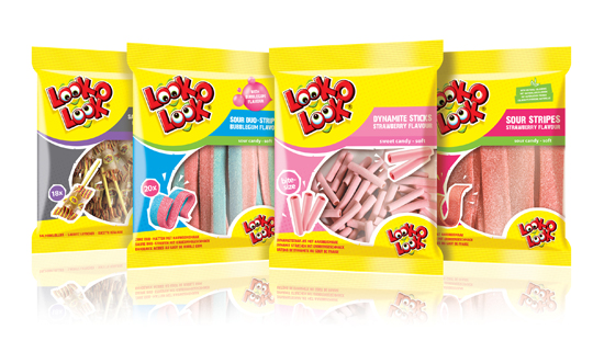 After a successful redesign of Look-O-Look�s Flowpacks and Toppermix, the redesign and packaging for the international familybags of Look-O-Look is done by Stepfive Communication & Design too.
The Dutch candy producer with �The most delicious candies in one bag� wanted a fun and diverting familybag, appealing for all family members, young and old. Each different bag has its own colour coding, illustrated candies on the front (drawn in realistic style) and a large window for optimal visibility of the delicious candies.


