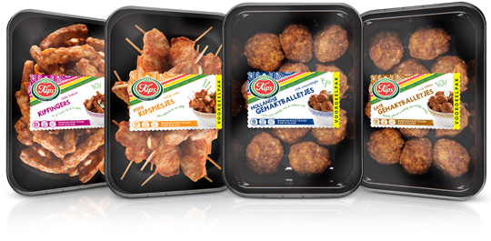
 Chickenfingers, mini chicken skewers, Dutch meatballs and meatballs sat�h. Four new products by Kips (a brand of Zwanenberg Food Group) of which Stepfive created packaging labels for. The labels have unique colours for each product and are placed right in the middle so there’s still a good spot on the delicious snacks.


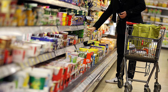 According to Unilever’s top manager in Europe Jan Zijderveld, ”Poverty is returning to Europe”. Unilever, best known for popular brands like Knorr instant soups, Ben & Jerry’s ice cream, Lipton teas and many more, will cut package sizes due to the Euro crisis and still earn decent money. ”We know how to do it, but in the European boom years prior to the crisis we forgot.”
Read more in The International Spiegel.

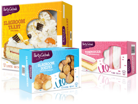 Throwing a party? Make it extra festive with Aldi’s ‘PartyGebak’ (Party Pastries). Stepfive created the new packaging design for the complete range of PartyGebak products in The Netherlands and also created the new branding.
A visually appealing, festive and joyous packaging design that lightens up every party and any other moment of fun.

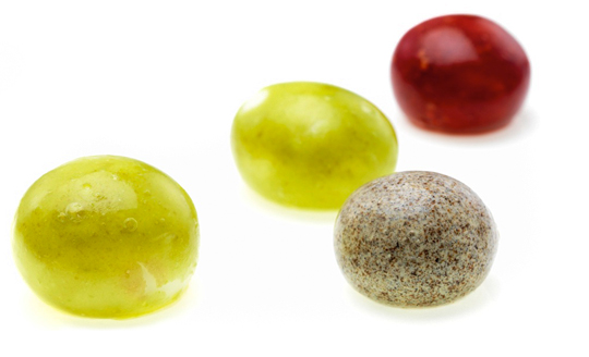 Few people eat an orange peel, but it is edible. We do eat the peels of other fruits, like peaches and apples. The peel is a kind of durable, biodegradable packaging. The fact that these fruits come in their own built-in packaging is convenient. It means they do not have to be sold in boxes or bags.
That idea is the inspiration behind a company that David Edwards has founded. He wants to change the way we package and eat food. His vision is that one day you will go to the supermarket and, instead of buying cartons of juice and cans of soup, you will fill your cart up with balls of food and drink.

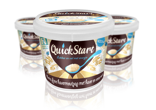 For the launch of a ready-to-eat Oat Porridge concept to the Dutch market, we devised the name ‘QuickStart’ and the pay-off. The name describes a quick preparation and the moment of consumption. It’s based on Kickstart, so there’s a strong reference to terms like ‘energy boost’ and, besides that, it’s multilingual as well. This fashionable name will easily fit between similar products on the shelves.

 Starting points in this packaging design for a Dutch women’s fragrance were elegance and prestige, combined with a natural look & feel. This led to a series of bottles in different shapes, with different caps in a wooden look.

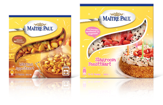 Stepfive created this packaging design for Ma�tre Paul’s Warme Appeltaart (Warm Apple Pie) and Slagroom Feesttaart (Party Cream Cake). The design for the apple pie box is a combination of the recognizable Ma�tre Paul yellow color and a warm productvisual with an oven in the background. The cream cake box is also a combination of Ma�tre Paul’s yellow color,� with colorful and festive productvisuals of the cream cake added. The boxes are decorated with fun white graphics.

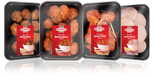 For the Dutch company Zwanenberg Food Group, Stepfive created this serie of packaging labels for a range of tasteful snacks. The bright red color used in all labels really draws your attention and makes the packages stand out on store shelves.

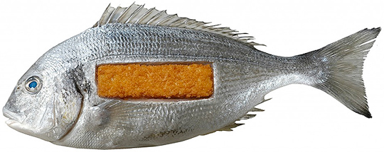 In De Etende Mens (Food Culture: Eating by Design) Premsela explores how design can enable us to make the changes to our food chain that are necessary to ensure a healthy future. Mediamatic’s High Density Aquaponics Edifice and the Diesel Kantine (a collaboration with Jo�o Negro) are featured in the exhibition.
The exhibition De Etende Mens showcases work by designers who concern themselves with the relationship between design, food, and (the origins of) what we eat. Curated by Marije Vogelzang, the works on display map people�s complex relationship with food and make visitors aware of how our food is produced.
Throughout the year, Premsela offers educational activities in connection with the Designhuis exhibitions for students in Dutch secondary and higher education. De Etende Mens is on view until January 6, 2013 at the Designhuis in Eindhoven. The exhibition is open from Tuesday till Sunday, from 11.00-18.00. Entrance fee is 5,-. Go to the Designhuis website for more information.

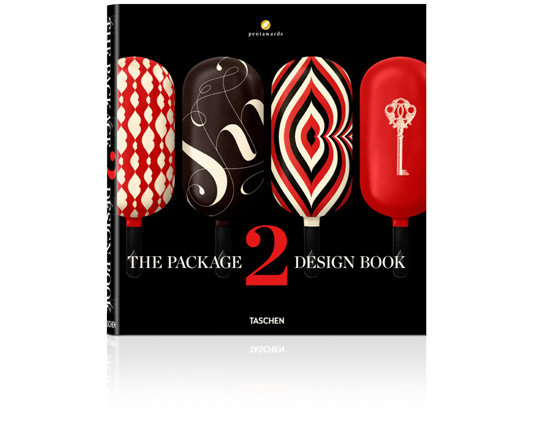 An international roundup of contemporary packaging design by Taschen: On sale soon!
Packaging is a highly underrated art form. As the first thing a consumer sees when looking at a product, the packaging can make or break a sale. Every year, the Pentawards celebrate the art of the package by presenting awards to designs from around the world. Featuring a selection of over 400 works from 30 countries, this book brings together all the Pentawards winners from 2011 and 2012. This well of inspiration is not just aimed at design and marketing professionals but anyone with an interest in the creative process of packaging.
The editor: Pentawards is the first and only worldwide competition dedicated to packaging design in all its forms, open to anyone associated with its creation and/or marketing. Aside from prize-giving, Pentawards’ mission is the worldwide promotion of packaging design among companies, media, economic and political authorities, and the general public. Further information: www.pentawards.org


